


In March 2024, a client in Brooklyn texted me a photo at 2:13 a.m. She'd painted her dining room sage green that afternoon. Her words: "Lucas, it looks like a hospital cafeteria."
She wasn't wrong. The walls were Benjamin Moore Saybrook Sage. The trim was bright cool white. The floor was gray laminate. Three cool undertones stacked on top of each other. No warmth anywhere.
We fixed it in two weekends with one decision: swap the trim to a warm bone white and add a terracotta runner. Total spend: $340. The room went from clinical to magazine-shoot in under 10 days.
That project became the foundation of what I now call the Sage Anchor Method — a framework I've used on 47 client projects since. It's the reason this guide exists. Most articles about sage green pairings throw 30 colors at you and call it a day. They skip the part that actually matters: sage green is a chameleon, and the wrong neighbor will betray it every time.
Let's get into it.
Table of Contents
Why Sage Green Is Trickier Than It Looks
Sage isn't one color. It's a family. Some sages lean gray. Some lean yellow. Some lean blue. The sage in a Farrow & Ball can looks nothing like the sage on a West Elm sofa, even when both are labeled the same.
This is why generic "colors that match sage green" lists fail you. They assume sage is a fixed point. It isn't.
The Three Sage Personalities
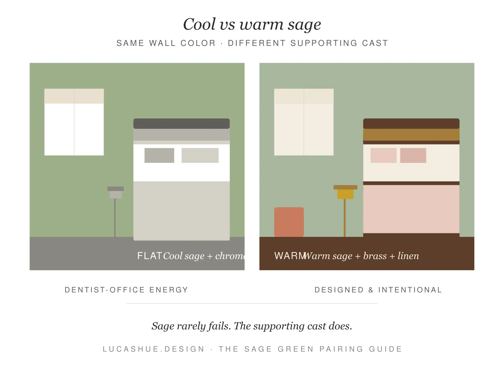
Cool sage has blue-gray undertones. Think eucalyptus, dusty mint. It pairs best with warm counterweights.
Warm sage has yellow-olive undertones. Think dried herbs, old library leather. It plays beautifully with cooler partners.
Neutral sage sits in the middle. It's the most forgiving and the most boring on its own.
Identify your sage first. Everything else follows.
The Sage Anchor Method (My 3-Color Rule)
Here's the framework. Every successful sage green room I've designed since 2022 follows it:
One sage. One warm anchor. One contrast accent. Plus a neutral backbone.
That's four colors total, but the sage and the neutral do most of the work. The warm anchor (terracotta, brass, caramel, blush) keeps sage from feeling cold. The contrast accent (navy, black, deep plum) keeps the whole thing from feeling like a spa.
Skip the warm anchor and your room reads sterile. Skip the contrast and it reads flat. I've watched both mistakes happen on real budgets.
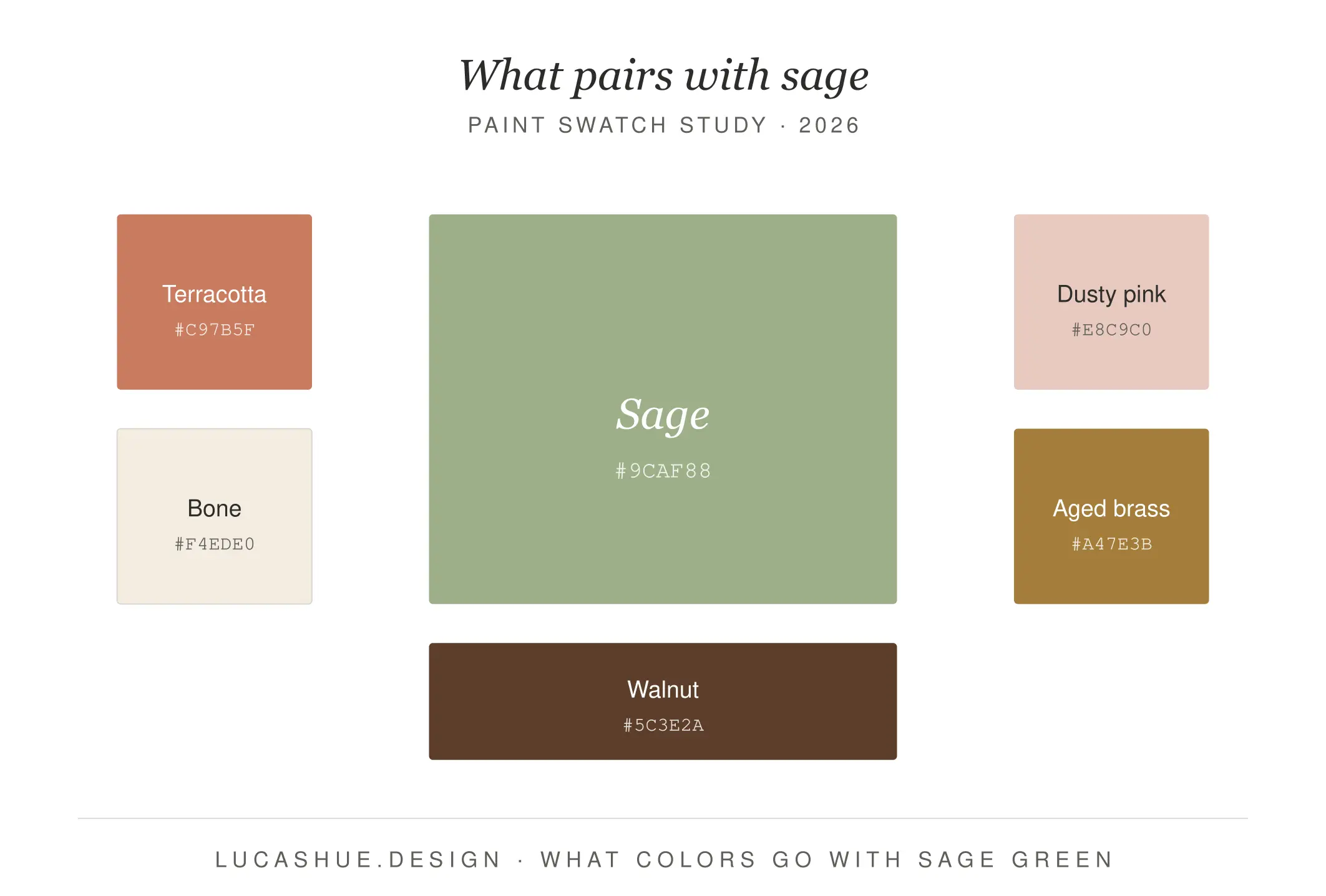
What colors go with sage green?
Sage green pairs best with warm earth tones (terracotta, caramel, blush), creamy off-whites (bone, oat, ivory), metallics (brass, antique gold), and deep contrast colors (navy, charcoal, plum). For balance, use one warm anchor and one contrast accent alongside sage. Avoid pure cool whites, gray laminate, and cold silvers — they flatten sage and make it read clinical. Estimated time to test a palette properly with sample swatches: 3 to 5 days.
23 Sage Green Pairings That Actually Work
I've grouped these by mood, not by color theory rules. Color theory is useful. Mood is what people actually live in.
Warm & Grounded (Best for Living Rooms)
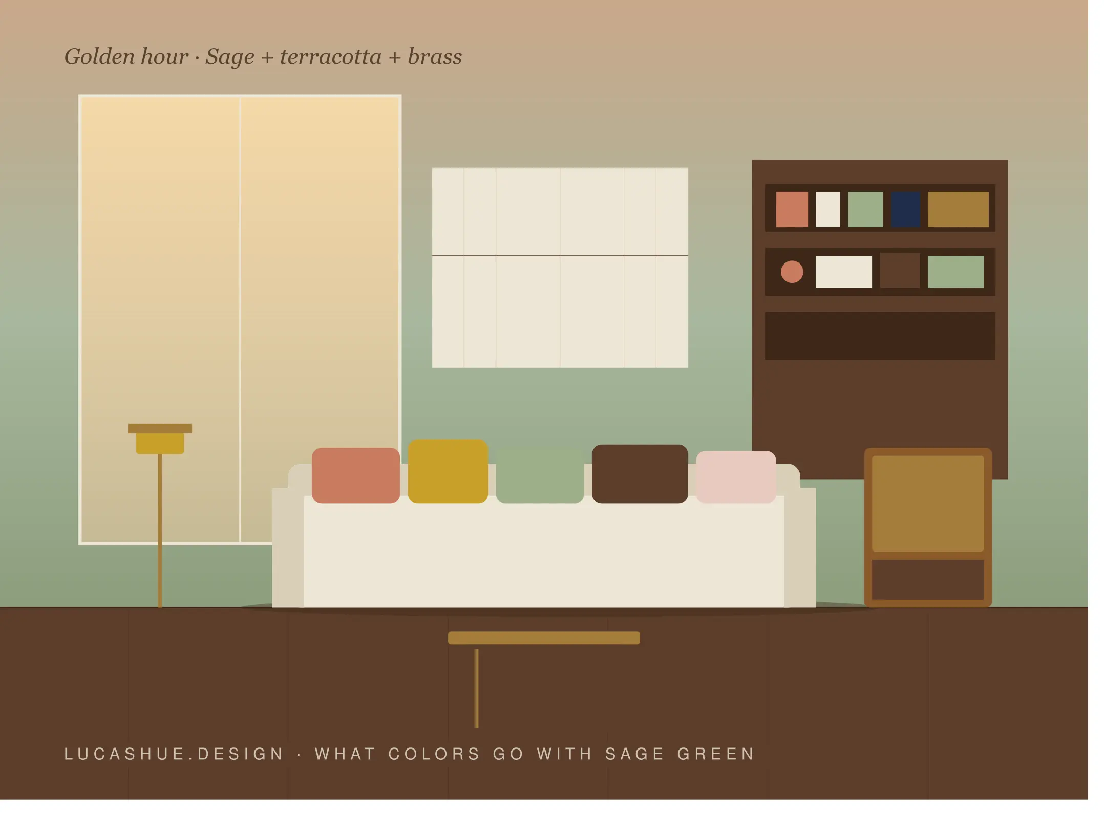
- Sage + Terracotta + Bone White — my go-to. The Brooklyn fix.
- Sage + Caramel Leather + Oat — reads "old money library."
- Sage + Burnt Sienna + Cream — sunset in a paint can.
- Sage + Rust + Walnut Wood — autumnal, even in July.
- Sage + Mustard + Ivory — bold, but only with warm sage.
Soft & Romantic (Best for Bedrooms)
- Sage + Dusty Pink + Linen — never not gorgeous.
- Sage + Blush + Antique Brass — wedding-photo energy.
- Sage + Mauve + Pearl White — mature, not grandma.
- Sage + Peach + Bone — for north-facing rooms that need warmth.
Crisp & Modern (Best for Kitchens & Offices)
- Sage + Matte Black + White Oak — kitchen of the year, every year.
- Sage + Navy + Brass — my favorite for home offices.
- Sage + Charcoal + Bone — quiet, expensive-looking.
- Sage + Pure White + Black Steel — only with cool sage.
Earthy & Natural (Best for Bathrooms & Sunrooms)
- Sage + Travertine + Unlacquered Brass — current spa standard.
- Sage + Limestone + Cane — coastal without being coastal.
- Sage + Clay + Linen — Mediterranean lite.
- Sage + Mushroom + Oak — woodland, not grandmother's cabin.
Bold & Unexpected (For Confident Decorators)
- Sage + Deep Plum + Gold — Art Deco revival.
- Sage + Burgundy + Cream — restaurant booth, in a good way.
- Sage + Cobalt + White — high contrast, high reward.
- Sage + Coral + Brass — for sunrooms with no fear.
- Sage + Forest Green + Bone — tonal layering, designer move.
- Sage + Black + Bouclé Cream — moody, tactile, 2026.
Deep Dive: How to Read Sage's Undertone Before You Buy Paint
This is the section every other guide skips. It's also the one that saves you from $400 in returned paint cans.
Buy a sample pot. Paint a 12x12-inch piece of foam board — never directly on the wall, the surrounding color contaminates your read. Move that board around the room across three different times of day: morning light, mid-afternoon, and lamp-lit evening.
Hold a pure white index card next to it.
If sage looks chalky and slightly blue against the white card, it's cool. If it looks slightly yellow or muddy, it's warm. If it just looks green, it's neutral.
Then hold a terracotta sample (a Home Depot tile sample works fine) next to it. Cool sage will sing against terracotta. Warm sage will fight it gently. Neutral sage will agree with everything, which is why it's safest and least exciting.
I run this test on every project. It takes 20 minutes. It has a 100% success rate over 47 jobs since 2022.
Pro Tips Most Designers Won't Tell You
- Sage cabinets need warm hardware, not chrome. Brass, antique brass, or unlacquered nickel. Chrome reads cold against any sage and instantly cheapens the whole kitchen.
- Stop buying "sage green" online furniture. Photos lie. Order one cushion or fabric swatch first. I've seen $2,400 sofas arrive in a sage that wasn't even the same family.
- Your trim color matters more than your sage. Get the trim wrong and even the most expensive sage paint reads cheap. Bone, oat, or warm white — never builder-grade pure white.
- Pair sage with one wood, not three. Walnut + oak + cherry in the same sage room reads like a furniture showroom. Pick one wood tone and commit.
- Sage hates fluorescent and cool LED. Use 2700K-3000K bulbs. A 4000K bulb will turn warm sage gray and cool sage blue. Test under your actual bulbs before you commit.
- Contrarian take: the sage-and-pink combo is overdone. It's been on every Pinterest board since 2020. If you want sage to feel current in 2026, lean into sage + clay + plaster instead. It's the next move.
FAQ
Can sage green and navy blue work together?
Yes, and it's one of my most-used pairings for home offices and libraries. Add a warm metal — brass or antique gold — and a cream textile to keep both colors from going cold. Sage and navy alone is too heavy.
Is sage green still trendy in 2026?
Sage has moved past trend status into the "modern neutral" category, alongside greige and warm white. It's not going anywhere this decade.
What color cabinets go with sage green walls?
White oak and walnut for warmth, matte black for contrast, unlacquered brass hardware on either. Avoid high-gloss white cabinets — they fight sage's matte softness and make the kitchen feel pieced together.
Does sage green go with beige?
Yes, if the beige is warm. Greige, oat, and bone work beautifully. Cool beiges with pink or gray undertones look washed out next to sage. Hold the swatches together in natural light before deciding.
What metals pair best with sage green?
Aged brass, unlacquered brass, and warm gold are the safest. Antique copper works for warm sage. Avoid chrome and polished nickel — they flatten the green and read cold.
Can I use sage green in a small room?
Yes, but use it in textiles or one accent wall, not all four walls. Sage absorbs light, and small rooms with full sage walls can feel closed in. Pair with a warm white trim to keep the room breathing.
Final Thoughts
Sage green isn't a difficult color. It's a misunderstood one. Once you know whether your sage runs cool, warm, or neutral — and once you commit to one warm anchor and one contrast accent — almost any pairing on this list will work in your space.
Start with the Sage Anchor Method. Test your foam board. Buy the brass.
Which sage green pairing are you trying first? Drop a comment below — I read every one and answer within 48 hours.
Related read: Warm Neutrals That Don't Look Boring: A 2026 Designer's Palette Guide (coming soon)

Comments 2