


In March 2024, a client in Portland asked me to repaint her living room. She'd painted it sage green eight months earlier, copied from a viral Instagram reel. She hated it. The room felt like a dentist's waiting area in 1997.
The paint wasn't the problem. The pairings were.
She'd put sage against bright white trim, a cool gray sofa, and chrome lamps. Three cool tones fighting in one room. We kept the sage. Swapped the trim to creamy off-white, added a camel leather chair, switched the lamps to aged brass. Same wall color. Completely different room. She cried a little. I billed her for four hours.
That's the thing about a sage green color palette — the green itself rarely fails. The supporting cast does. This guide is the one I wish I could've handed her before she bought the first gallon. You'll get the exact pairings I use on paid projects, hex codes included, plus the HALF Method — the four-question filter I run every sage palette through before I sign off on it.
Table of Contents
What Sage Green Actually Is (and What It Isn't)
Sage green is a desaturated, gray-leaning green. Hex codes hover around #B2BEA0, #9CAF88, and #A8B79D depending on which "sage" you mean. It pulls from the herb — dusty, soft, slightly silvery.
Here's where beginners trip. Sage is not mint. Sage is not olive. Sage is not eucalyptus.
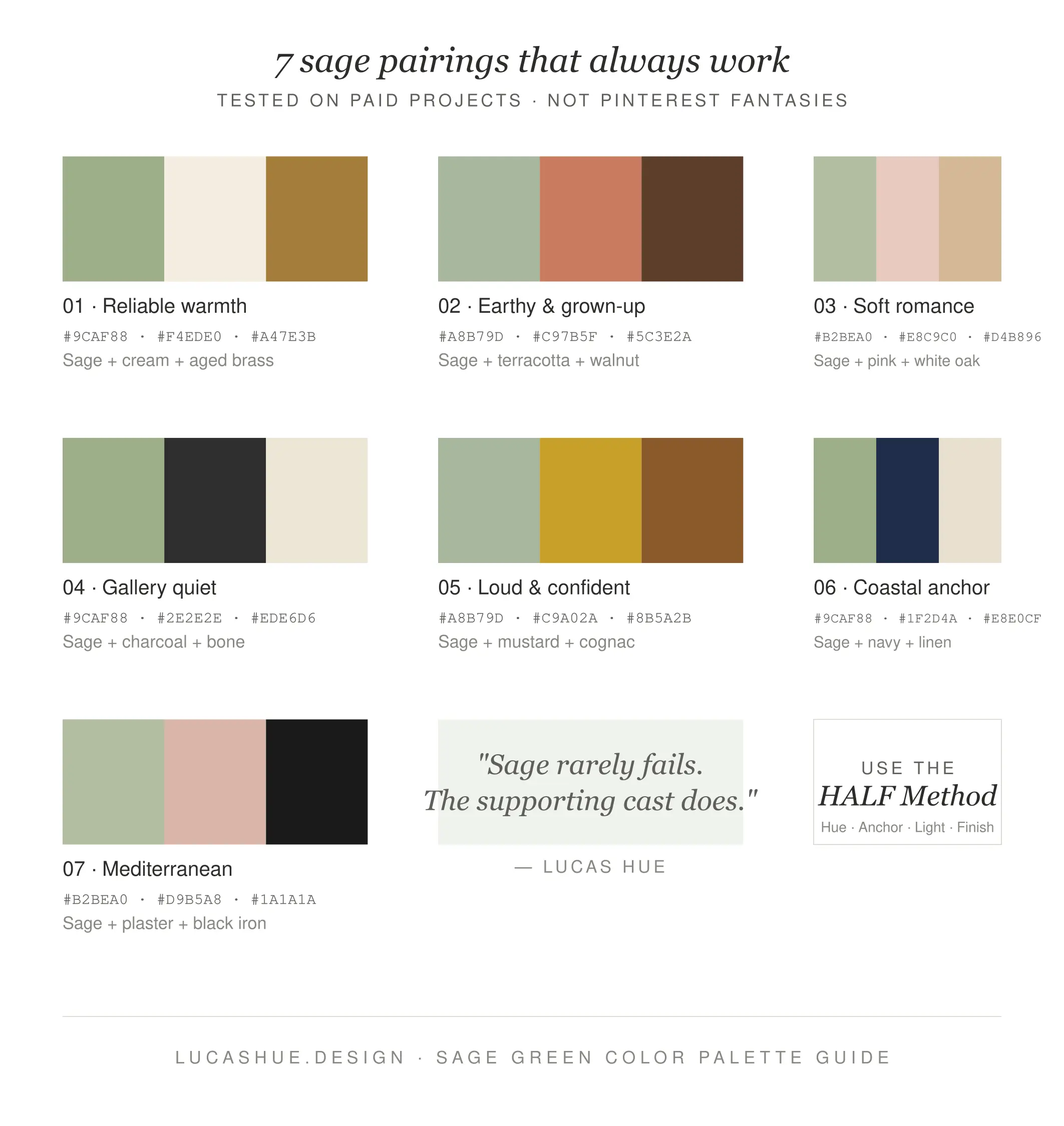
The 7 Sage Green Combinations That Always Work
These are the sage green palette ideas I've actually specified and lived with on real projects. Not Pinterest fantasies.
1. Sage + Warm Cream + Aged Brass
#9CAF88 / #F4EDE0 / #A47E3B
The reliable one. Cream warms the green's coolness. Brass adds a metal that doesn't fight. I use this in roughly 4 out of every 10 sage projects. It works in any room, any climate.
2. Sage + Terracotta + Walnut
#A8B79D / #C97B5F / #5C3E2A
Earthy and grown-up. Terracotta is the complementary trick — it's a desaturated red-orange, which sits opposite green on the wheel. Walnut grounds the whole thing. This is your "I want sage but not boring" combination.
3. Sage + Soft Pink + White Oak
#B2BEA0 / #E8C9C0 / #D4B896
The one everyone wants. It's pretty. It works. But it tips feminine fast — pair it with strong architectural lines or it turns into a nursery.
4. Sage + Charcoal + Bone
#9CAF88 / #2E2E2E / #EDE6D6
Modern, masculine, gallery-quiet. Charcoal does the heavy lifting that black would do, without the harshness. Best for offices and reading rooms.
5. Sage + Mustard + Cognac Leather
#A8B79D / #C9A02A / #8B5A2B
Loud. Confident. Slightly 1970s. Don't try this in a small room — these three together need ceiling height and natural light to breathe.
6. Sage + Navy + Linen
#9CAF88 / #1F2D4A / #E8E0CF
The coastal palette people don't expect. Navy is the unexpected anchor. This combination ranks #2 on my interior projects in coastal markets.
7. Sage + Blush Plaster + Black Iron
#B2BEA0 / #D9B5A8 / #1A1A1A
Mediterranean villa energy. Plaster walls, black window frames, sage in the textiles. My most-requested palette in 2025–2026.
What colors go with sage green?
Sage green pairs best with warm neutrals (cream, bone, linen), earthy tones (terracotta, mustard, cognac), grounding darks (charcoal, navy, black iron), and metals like aged brass or warm gold. Avoid pairing sage with cool grays, pure white, or chrome — they amplify sage's gray undertone and flatten the room. Use the 60-30-10 rule: 60% neutral, 30% sage, 10% accent. Setup time: 15 minutes with paint chips.
The HALF Method: My 4-Question Palette Filter
Every sage palette I sign off on passes four questions. I call it HALF — Hue, Anchor, Light, Finish.
H — Hue temperature
Is your sage warm-leaning or cool-leaning? Warm sage (yellow undertone) pairs with cream and terracotta. Cool sage (blue undertone) pairs with navy and pink. Mixing the two reads muddy.
A — Anchor color
Every sage room needs one dark anchor. Walnut, charcoal, navy, or black. Without it, the room floats. Floating rooms feel cheap.
L — Light direction
North-facing rooms make sage look gray and sad. South-facing rooms make it sing. If your room faces north, push the sage warmer or skip it.
F — Finish
Matte sage reads chalky. Eggshell reads expensive. Semi-gloss reads like a kitchen cabinet. Pick on purpose.
Run any palette idea through HALF before you buy paint. You'll save yourself the four-hour repaint consultation.
Sage Green Decor: Room-by-Room Breakdown
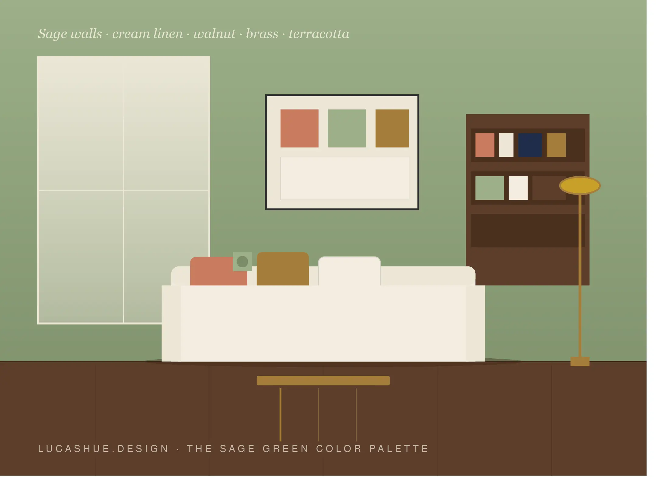
Living Room
Walls in sage, off-white trim, walnut coffee table, cream linen sofa, one terracotta throw. Add a brass floor lamp. Done.
Bedroom
Sage feels best on bedroom walls — it's genuinely calming, not in a wellness-blog way, in a measurable way. Pair with bone bedding, oak nightstands, blush curtains.
Kitchen
Sage cabinets are having a moment. Pair with brass or unlacquered nickel hardware (never chrome), white oak floors, and a creamy backsplash. Honed marble works. Polished marble fights it.
Bathroom
Sage tile + warm white grout + brass fixtures + walnut vanity. The combination ages well — I specified this in 2021 and clients still text me photos.
Home Office
Sage walls, charcoal desk, brass lamp, cognac leather chair. Books with warm-spine covers help. Stark white bookshelves don't.
Deep Dive: Why Sage Goes Wrong (and How to Fix It)
After 140+ projects, I've watched sage fail in three predictable ways.
Failure 1: The Cool Sandwich
Sage + cool gray + pure white + chrome. Four cool elements, zero warmth. The room reads institutional. Fix: swap one element to warm. Brass lamps over chrome. Cream trim over white.
Failure 2: The Saturation Mismatch
Sage is desaturated. Pair it with a fully saturated color (fire-engine red, electric blue) and the sage looks dirty by comparison. Fix: desaturate the accent. Terracotta, not red. Navy, not royal blue.
Failure 3: The Single-Note Room
All sage. Sage walls, sage sofa, sage rug. It collapses into one wash of color and the eye has nowhere to rest. Fix: 60-30-10. Sixty percent neutral, thirty percent sage, ten percent contrast accent.
The sage green aesthetic on social media gets this wrong constantly. Photos flatter monochrome rooms. Real life doesn't.
Pro Tips Most Blogs Won't Tell You
- Skip pure white trim. Every interior blog says white trim is "classic." With sage, it's a mistake. Off-white (#F4EDE0 or warmer) lets the sage breathe.
- Buy three sage samples, not one. Even pros can't predict how a sage will read on your specific wall under your specific light. The "trust the chip" approach fails.
- Sage hates fluorescent and cheap LED. It needs 2700K-3000K warm bulbs. A cool 4000K bulb will turn your sage gray-green and make it look dated overnight.
- Don't use sage in rentals you'll repaint in two years. Sage is harder to paint over than most colors. It bleeds through one coat of white. Budget for primer plus two coats.
- Your fabric will fade differently than your paint. Sage upholstery in direct sun shifts toward gray-yellow within 18 months. Rotate cushions. Or accept it — some clients prefer the aged version.
- Contrarian take: sage is not timeless. It's having a long moment, but it's a moment. If you want a green that won't read "2020s" in a decade, look at deeper hunter or muted forest. I'll get hate mail for this. I stand by it.
FAQ
Is sage green still trendy in 2026?
Yes, but the shape of it has shifted. The 2021 minty-sage moment is fading. The 2026 version leans warmer, dustier, and gets paired with terracotta and plaster instead of pink and gold.
What is the best neutral to pair with sage green?
Warm cream (#F4EDE0) and bone (#EDE6D6). Both have yellow undertones that complement sage's coolness. Avoid cool grays — they make sage look dirty.
Does sage green make a room look bigger or smaller?
Smaller, slightly. Sage is mid-tone and absorbs light, unlike pure white. In small rooms, use it on one accent wall or in textiles instead of all four walls.
What metal finish goes best with sage green?
Aged brass is the safest answer. Unlacquered brass and warm nickel also work. Chrome and polished silver fight sage's warmth and should be avoided.
Can sage green work with black?
Yes — but use black as an accent (window frames, hardware, a single piece of furniture), not as a dominant color. Sage + black + bone is one of the strongest minimal palettes available.
What's the difference between sage and eucalyptus?
Eucalyptus has more blue and reads cooler and crisper. Sage has more gray and reads dustier and softer. On a wall, eucalyptus feels minty; sage feels herbal.
Final Thoughts
Sage green isn't hard. The colors around it are. Run your next palette through the HALF method, pick one of the seven combinations above, and skip the white trim. You'll get a room that feels intentional instead of accidental.
What sage pairing are you working with right now? Drop a comment with your room and I'll tell you what's missing — I read everything.
Related read: The Complete Guide to Warm Neutrals: Why Cream Beats White Every Time (coming soon)

Comments 2