


In March 2025, a client called me in a panic. She'd just rolled the second coat of "warm terracotta" across her dining room and the whole space looked like a Pizza Hut from 1997. Wrong undertone. Wrong sheen. Wrong supporting cast. We pulled it back to bare drywall and started over.
That call is the reason this guide exists.
Terracotta is the most-searched warm tone in interior design right now, and it's also the one beginners get wrong most often. Not because the color is hard. Because nobody tells you the truth: terracotta is a supporting actor that thinks it's the lead. Treat it that way and you get a magazine room. Treat it like a hero color and you get a chain restaurant.
This post is what I wish someone had handed my client before she opened that first paint can.
Table of Contents
- What Terracotta Actually Is (And Isn't)
- The 60-25-15 Terracotta Rule
- Five Terracotta Color Combinations That Actually Work
- Terracotta and Sage: The Pairing Everyone Asks About
- Building a Full Terracotta Decor Palette
- Deep Dive: Why Most Terracotta Rooms Look Cheap
- Pro Tips From 10 Years of Color Mistakes
- FAQ
- Final Thoughts
What Terracotta Actually Is (And Isn't)
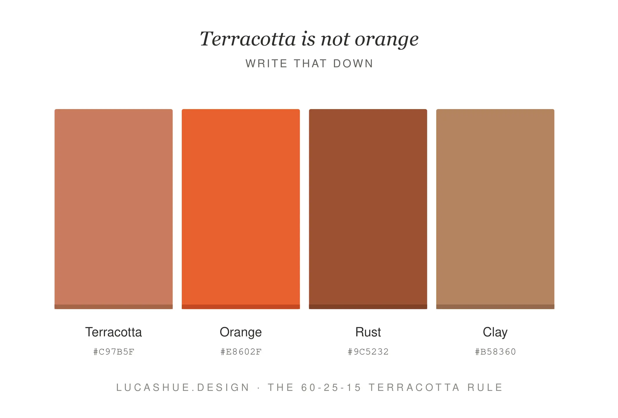
Terracotta is not orange. Write that down.
The word means "baked earth" in Italian, and the color sits at roughly hex #E2725B to #C56A4D — a dusty, clay-based red-orange with brown undertones pulling it down from anything too cheerful. The brown is what saves it. Strip the brown out and you get a traffic cone.
Earthy terracotta colors fall into three families I sort clients into:
- Sun-baked terracotta — peachier, lighter, leans Mediterranean
- Burnt terracotta — darker, redder, leans Southwestern
- Clay terracotta — softer, browner, leans Scandinavian-warm
The family you pick decides every other color choice in the room. Skip this step and you're guessing.
What is the 60-25-15 Terracotta Rule?
A working terracotta color palette uses 60% warm neutral (cream, oat, warm white), 25% terracotta as the anchor, and 15% split between a green or blue counterpoint and a deep grounding tone like espresso or charcoal. This balance works in roughly 2 weekends of paint and styling for an average room.
The 60-25-15 Terracotta Rule
The classic designer formula is 60-30-10. For terracotta, it doesn't work. The color is too saturated to carry 30% of a room without dominating. I shifted to 60-25-15 around 2022 after a sage-and-clay project that kept reading as "themed" instead of designed. Pulling terracotta down five points and giving the supporting colors more room fixed it immediately.
Here's the breakdown:
The 60% — Your Warm Neutral Base
Walls, large rugs, sofas. Pick from oat, bone, putty, or warm white. Avoid cool grays. They fight terracotta on the undertone level and your eye will read the room as "off" without knowing why.
The 25% — Terracotta Itself
Accent walls, large textiles, curtains, a statement chair. One major moment, one medium moment.
The 15% — Counterpoint and Grounding
This is where the room earns its keep. Half goes to a cool counterpoint (sage, dusty teal, dusty blue). Half goes to a deep grounding tone (black, espresso, charcoal). Without the grounding tone, terracotta floats.
Five Terracotta Color Combinations That Actually Work
I've used these in client projects between 2019 and 2025. None of them are theoretical.
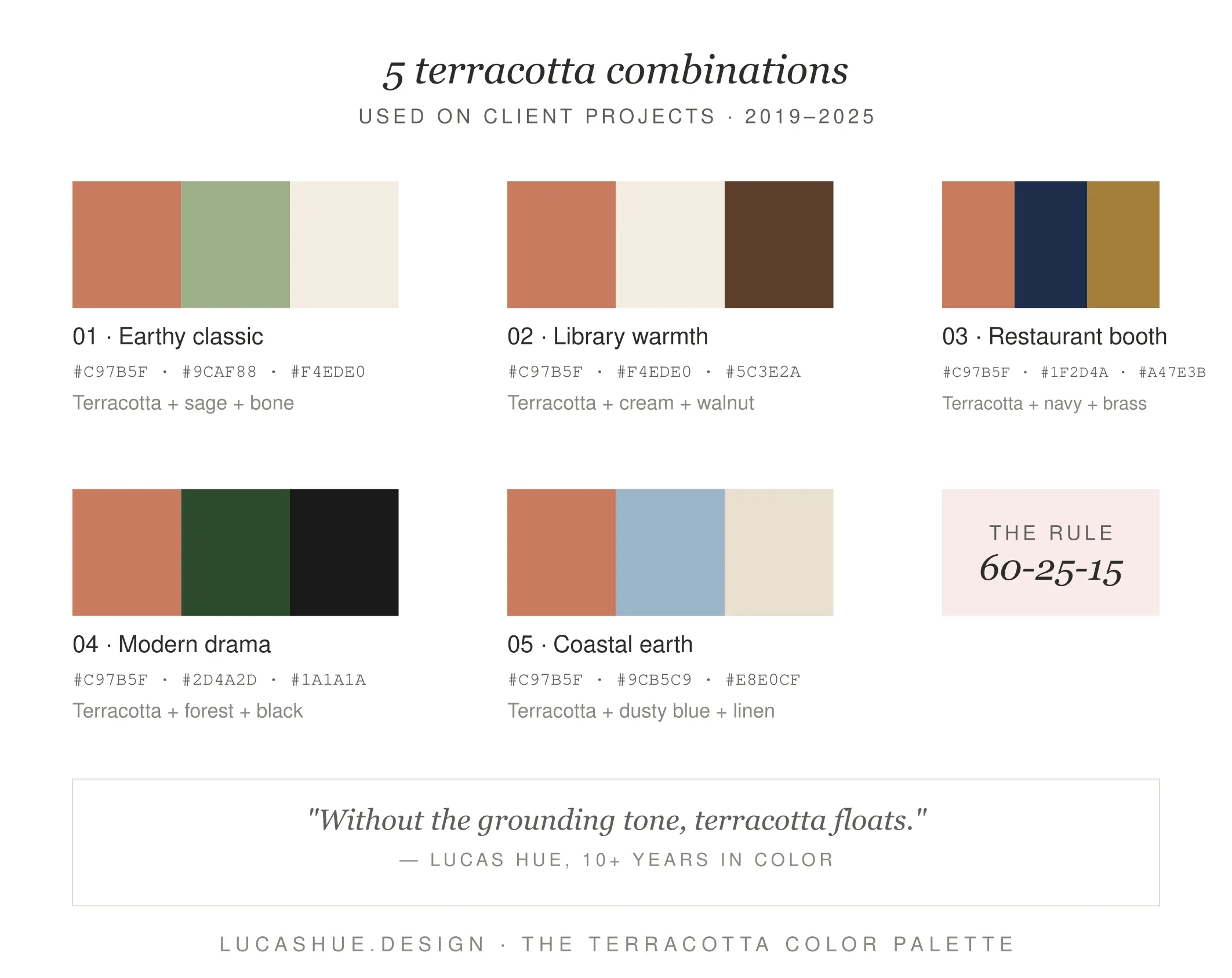
1. Terracotta + Sage + Cream + Black
The crowd-pleaser. Works in 90% of homes.
2. Terracotta + Dusty Blue + Oat + Walnut
My favorite for bedrooms. Calming without being cold.
3. Terracotta + Forest Green + Bone + Brass
High-drama. Best for dining rooms and small bathrooms.
4. Terracotta + Mustard + Warm White + Charcoal
A warm earth tone palette that leans bold. Use mustard sparingly or it tips into Halloween.
5. Terracotta + Soft Pink + Cream + Espresso
The "dusty desert" combo. Surprisingly elegant in north-facing rooms.
Steal them. Adapt them. They work.
Terracotta and Sage: The Pairing Everyone Asks About
This one deserves its own section because beginners ask about it constantly and most blogs answer with vibes instead of specifics.
Terracotta and sage works because they're near-complementary on the color wheel — close enough to feel related, far enough to feel intentional. The red-orange of terracotta and the grey-green of sage share a muted, dusty quality. Neither shouts.
The rule I follow: whichever one you put on the wall, the other goes on textiles. Sage walls + terracotta cushions, throws, and pottery. Or terracotta walls + sage velvet on a single chair. Splitting them 50/50 across architecture turns the room into a color study and kills the harmony.
A 2024 project I did in Brooklyn used Farrow & Ball's Card Room Green on the lower wall paneling and a custom-mixed terracotta on the upper walls. The split was 40% sage / 30% terracotta / 30% cream. It photographed in three magazines. The reason it worked? The grounding — black window frames and a dark walnut floor. Without those, the room would have looked like a salad.
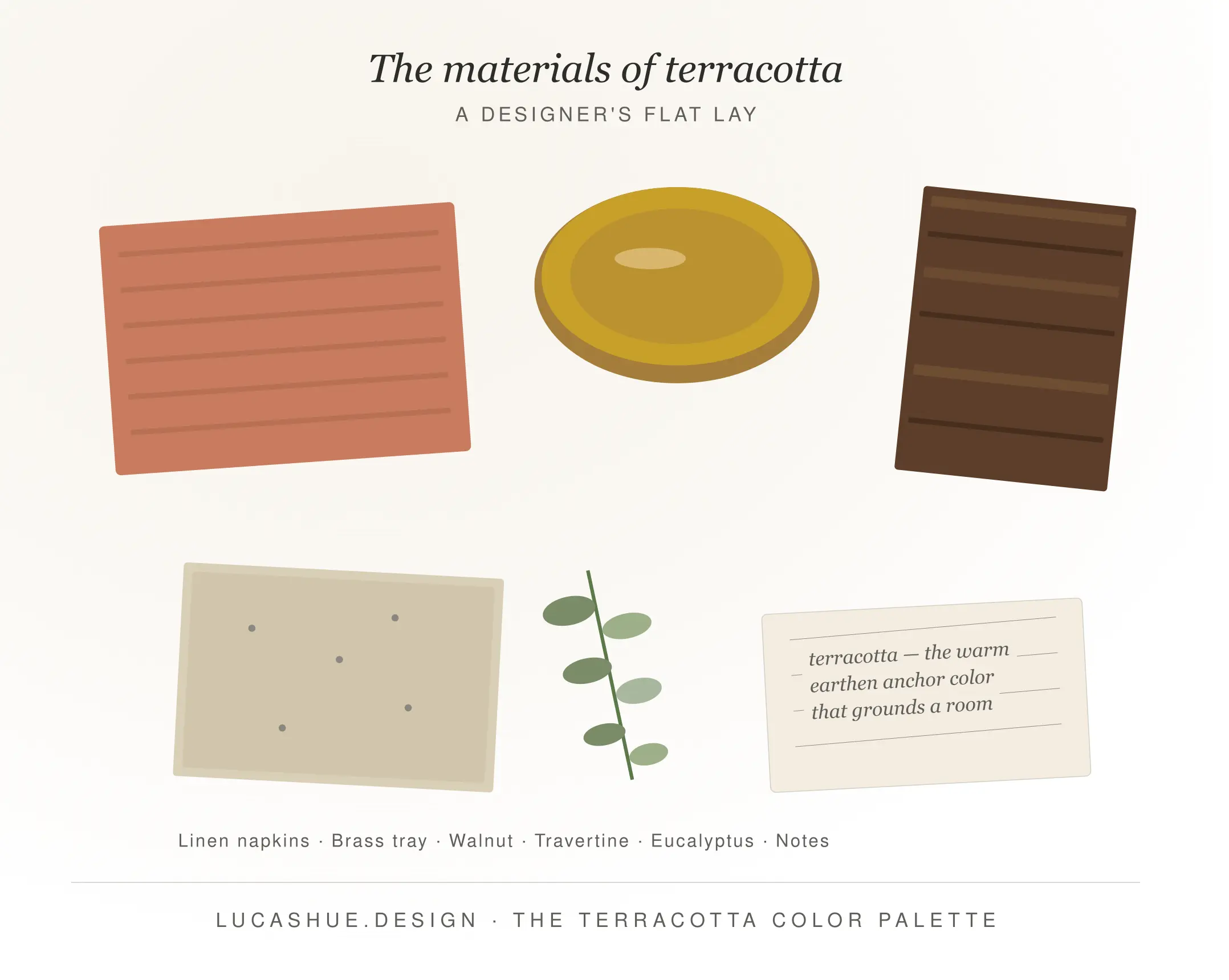
Building a Full Terracotta Decor Palette
A terracotta decor palette isn't just paint. It's materials. This is where most beginners stop too early.
Wood: Walnut, white oak with a warm stain, or cherry. Avoid cool-toned woods like raw maple or grey-washed oak.
Metals: Brass, antique brass, aged copper. Chrome and polished nickel will make terracotta look orange — a discovery I made in 2021 in a kitchen I'd love to forget.
Textiles: Linen, raw cotton, boucle, jute, sheepskin. The texture matters more than the color. Smooth synthetic fabrics flatten terracotta into something plastic-looking.
Ceramics and stone: Travertine, unglazed terracotta tile, soapstone, limestone. These materials are the palette — they don't just match it.
Plants: Olive trees, fiddle leaf figs, dried pampas, eucalyptus. The grey-greens of olive foliage pair with terracotta the way salt pairs with caramel.
Deep Dive: Why Most Terracotta Rooms Look Cheap
I've seen roughly 200 terracotta rooms in client homes, real estate listings, and Instagram tags since 2020. The bad ones share four problems. Always the same four.
Problem 1: One terracotta, everywhere
The color needs tonal variation. A single terracotta repeated across walls, pillows, and pottery flattens the space. Use three values — light, medium, deep — minimum.
Problem 2: Wrong undertone in the supporting whites
Cool whites (Decorator's White, Chantilly Lace) make terracotta look muddy. Warm whites (White Dove, Swiss Coffee, Alabaster) let it sing. This is the single biggest fix I make on client projects.
Problem 3: No black
Terracotta without a true dark anchor reads as juvenile. It needs at least one black or near-black moment per room — a lamp base, a frame, a door, a piece of hardware. In my own apartment, it's the iron curtain rod. Costs $40. Fixed everything.
Problem 4: Synthetic textures
A polyester throw in terracotta looks like a terracotta-flavored candy. Same color in linen looks like Tuscany. The fiber is doing 70% of the work.
The contrarian take that most blogs won't print: terracotta walls are usually a mistake for beginners. Start with terracotta in 25% of the room — a chair, curtains, a rug — before you commit it to architecture. You'll learn the color's personality first. I've talked more clients out of terracotta walls than into them, and not one has regretted it.
Pro Tips From My 10 Years of Experience
- Sample at 4pm, not noon. Terracotta shifts dramatically in warm afternoon light. The color you fall in love with at 12pm will look different at dinner. Test it during the hours you actually use the room.
- Buy paint in eggshell, not matte. Matte terracotta absorbs light and turns murky. Eggshell holds the color's depth without going shiny.
- Skip the orange-undertone wood. Mid-century teak and cheap pine pull the room toward retro. Stick to walnut, white oak, or painted wood.
- One terracotta saturation per room. Mixing a dusty clay pillow with a bright burnt-orange rug creates visual static. Pick a lane.
- North-facing rooms need warmer terracotta. Cool light drains the warmth. Push toward the peach end of the family — #D08B6B rather than #A0522D.
- Terracotta hates fluorescent light. If your kitchen has tube lighting, change the bulbs to warm LED (2700K) before you paint a single wall. I've watched terracotta turn salmon-pink under cool fluorescents and it's not recoverable without replacing the fixtures.
FAQ
Is terracotta still trendy in 2026?
Yes, but the conversation has shifted. Designers are pairing terracotta with mossy greens, ochre, and softened blues rather than using it as a standalone statement. The color is moving from "trend" to "established neutral with warmth."
What's the difference between terracotta, rust, and clay?
Terracotta sits in the middle. Rust is darker and redder with iron-oxide undertones. Clay is lighter and browner with more grey. Rust is moodier; clay is softer. All three belong to the warm earth tone palette family.
Does terracotta work in small rooms?
Yes — and often better than in large ones. Small rooms benefit from saturated color because they don't have to sustain it across a long sightline. A powder room in deep terracotta feels like a jewel box. The same color in a 400-square-foot living room can feel oppressive without enough light.
What colors should I never pair with terracotta?
Cool grey, true cobalt blue, lavender, and pure black-and-white contrast schemes. They fight the warmth. Hot pink also clashes — it competes for the same emotional space.
Can I use terracotta in a modern home?
Absolutely. Modern terracotta works best in tonal washes (color drenching), paired with clean-lined furniture, matte black hardware, and minimal accessories. The 1970s associations come from heavy patterned fabrics and dark wood — not the color itself.
How do I know if my room has warm or cool light?
Hold a sheet of pure white printer paper against the wall at the time you most use the room. If it looks creamy, you have warm light. If it looks blue-grey, you have cool light. Terracotta needs warm light or warm bulbs to read correctly.
Final Thoughts
Terracotta is not difficult. It's just unforgiving when you skip steps.
Pick your terracotta family first. Lock in your warm neutral. Add the cool counterpoint. Ground it with black. Layer in real materials. Sample in afternoon light. That's the whole job.
If you're staring at paint chips right now, scared of making the wrong call — start with a single terracotta chair or a pair of curtains. Live with it for a month. The right palette will tell you what it wants to be.
Tried one of these combinations? Drop a comment below — I read every one and I'm always curious which pairing readers gravitate toward.
Related read: Sage Green Color Palette: A Designer's Guide
