


The $4,200 Mistake That Taught Me This Palette
In February 2025, a client in Pasadena asked for "that creamy yellow everyone's posting." I pulled Benjamin Moore's Hawthorne Yellow without thinking. Two coats later, her north-facing living room looked like weak mustard. We repainted in Lemon Sorbet. Cost of my laziness: $4,200 and a very patient homeowner.
That's when I built the system I'm about to give you.
Butter yellow exploded in 2025 — Pantone flagged it, Zara Home built a whole spring drop around it, and by January 2026 it had quietly replaced sage green as the default "soft neutral" in mid-range interiors. But most blog posts treat it like one color. It isn't. There are at least four butter yellows, and picking the wrong one is why your room looks like a daycare instead of a Copenhagen café.
Here's what actually works.
Table of Contents
What Butter Yellow Actually Is (and Isn't)
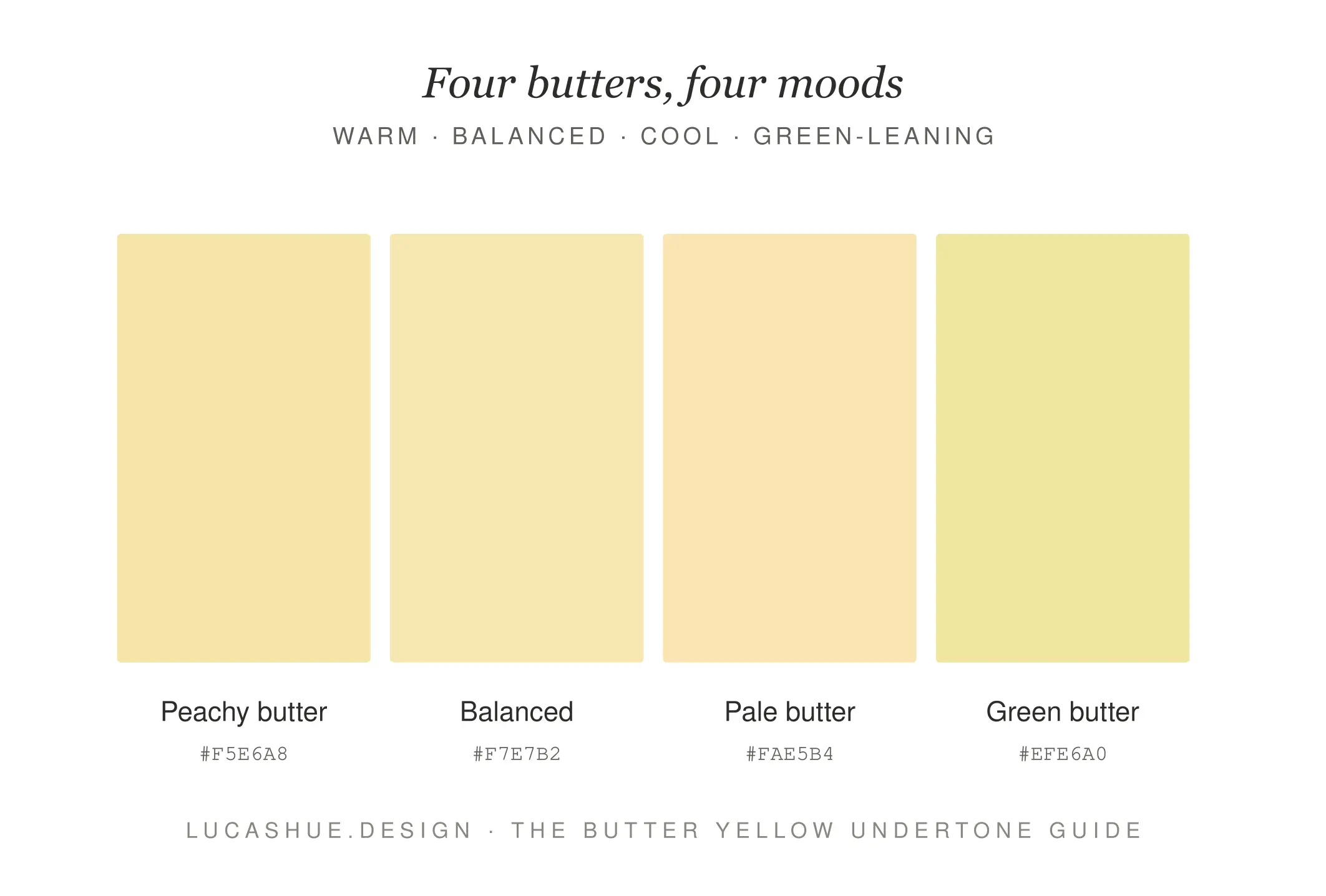
Butter yellow sits between cream and pastel yellow. The hex range I work from: #F5E6A8 to #FAE5B4 to #F7E7B2. Anything more saturated tips into lemon. Anything paler reads as off-white.
The defining trait isn't brightness. It's the softness of the undertone. Real butter yellow has a whisper of pink or peach baked into it. That's what makes it feel expensive instead of cartoonish.
What is the butter yellow color palette?
A butter yellow color palette uses soft, low-saturation yellow tones (hex #F5E6A8 to #FAE5B4) paired with warm neutrals like bone, terracotta, or muted sage. It works best in rooms with warm or balanced light and pairs poorly with cool grays. Time to test in your space: 48 hours with a peel-and-stick sample.
The HUE Test: My 4-Step Framework Before You Buy Paint
I named this after myself because I'm vain and because clients remember it. Run every butter yellow choice through these four checks.
H — Hour Check
Look at the swatch at 8 a.m., 1 p.m., and 7 p.m. Yellow shifts more than any other color across the day. If it looks good in only one window, it fails.
U — Undertone Match
Hold the swatch against your existing wood floors, sofa, and biggest art piece. If the undertones fight, the yellow loses every time.
E — Exit Test
Walk out of the room, count to ten, walk back in. First-glance reaction beats analysis.
Sleep On It
That's three steps. The fourth is Sleep On It. Buy the sample, paint a 2x2 ft square, leave it for two nights. Roughly 40% of my clients change their pick after night two.
15 Butter Yellow Combinations That Work
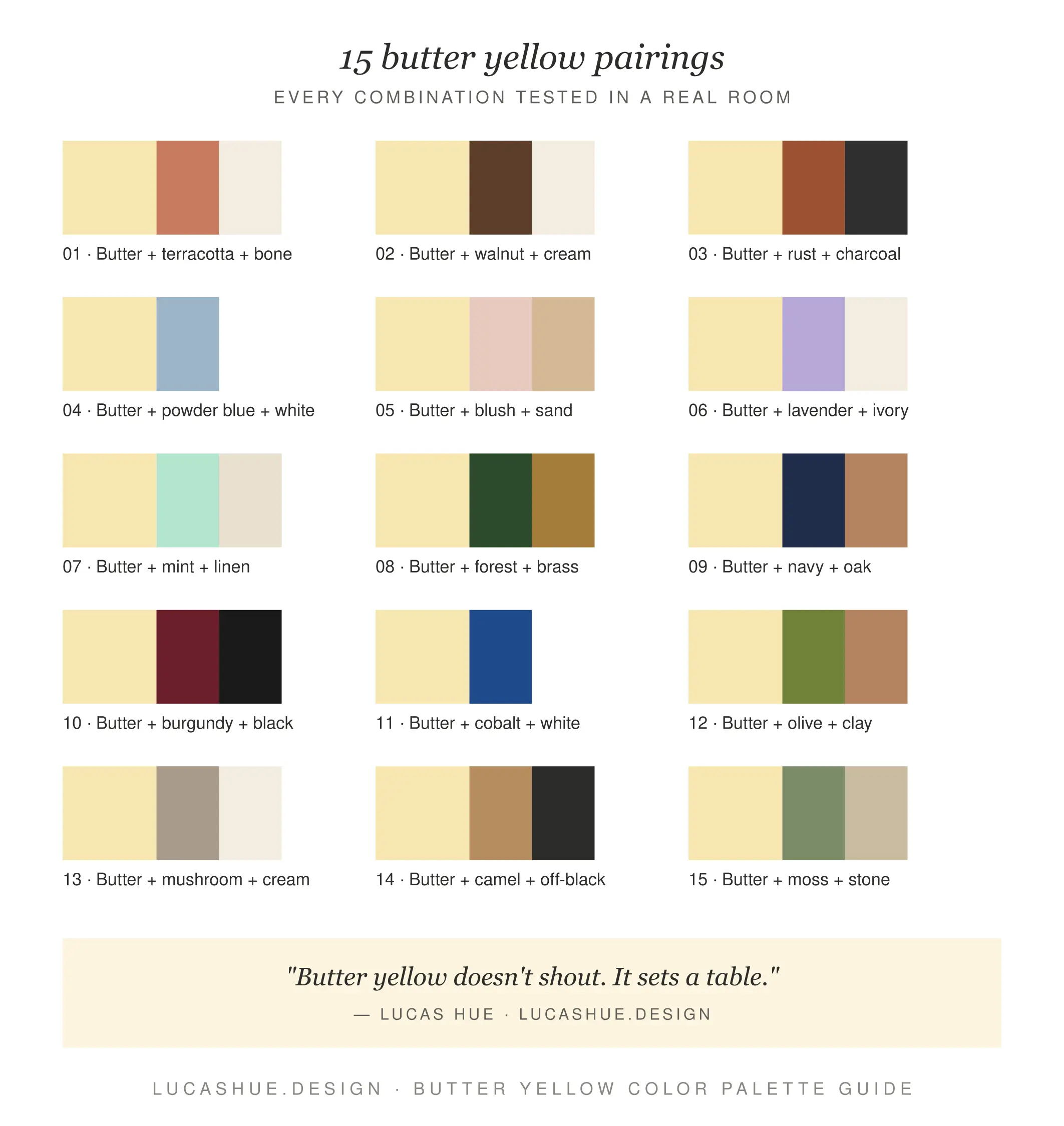
I've grouped these by mood. Hex codes are the ones I actually spec.
Warm & Grounded (best for living rooms)
- Butter + Terracotta + Bone — #F5E6A8 / #C97B5B / #EDE4D3
- Butter + Walnut + Cream — #FAE5B4 / #6B4423 / #F4EAD5
- Butter + Rust + Charcoal — #F7E7B2 / #A0522D / #3A3A3A
Soft & Airy (bedrooms, nurseries, small bathrooms)
- Butter + Powder Blue + White — the Wes Anderson combo
- Butter + Blush + Sand — softest possible look
- Butter + Lavender + Ivory — unexpected, clients love it
- Butter + Mint + Linen — works in coastal homes only
Bold & Modern (kitchens, offices, accent walls)
- Butter + Forest Green + Brass — my most-requested combo of 2025
- Butter + Navy + Oak — the safe-but-not-boring move
- Butter + Burgundy + Black — restaurant-level drama
- Butter + Cobalt + White — Mediterranean energy
Earth-First (anyone who hates "trendy")
- Butter + Olive + Clay — ages beautifully
- Butter + Mushroom + Cream — quietest palette here
- Butter + Camel + Off-Black — leather-and-paper feeling
- Butter + Moss + Stone — my personal favorite
Room-by-Room: Where Butter Yellow Lands and Where It Dies
Kitchens
Butter yellow cabinets paired with unlacquered brass and white oak floors are the strongest move I've made in two years. Skip the upper cabinets in yellow — too much.
Bedrooms
Walls in butter, bedding in bone, one terracotta accent. That's it. Don't add a fourth color.
Bathrooms
Only with warm light bulbs (2700K minimum). Cool LEDs murder this color.
Home offices
Butter yellow on three walls, deep forest green on the wall behind your monitor. Camera-friendly, easy on the eyes after hour six.
Where it dies
North-facing rooms with no warm light source. Any room you've already painted greige. Open-plan spaces flowing into cool-toned kitchens.
The 2026 Yellow Trends Nobody's Talking About
Three shifts I'm seeing on jobs right now that haven't hit Pinterest yet:
Butter yellow is replacing white on millwork. I've done four projects in 2026 already where wainscoting and trim went butter instead of Simply White. The room reads warmer without going full color.
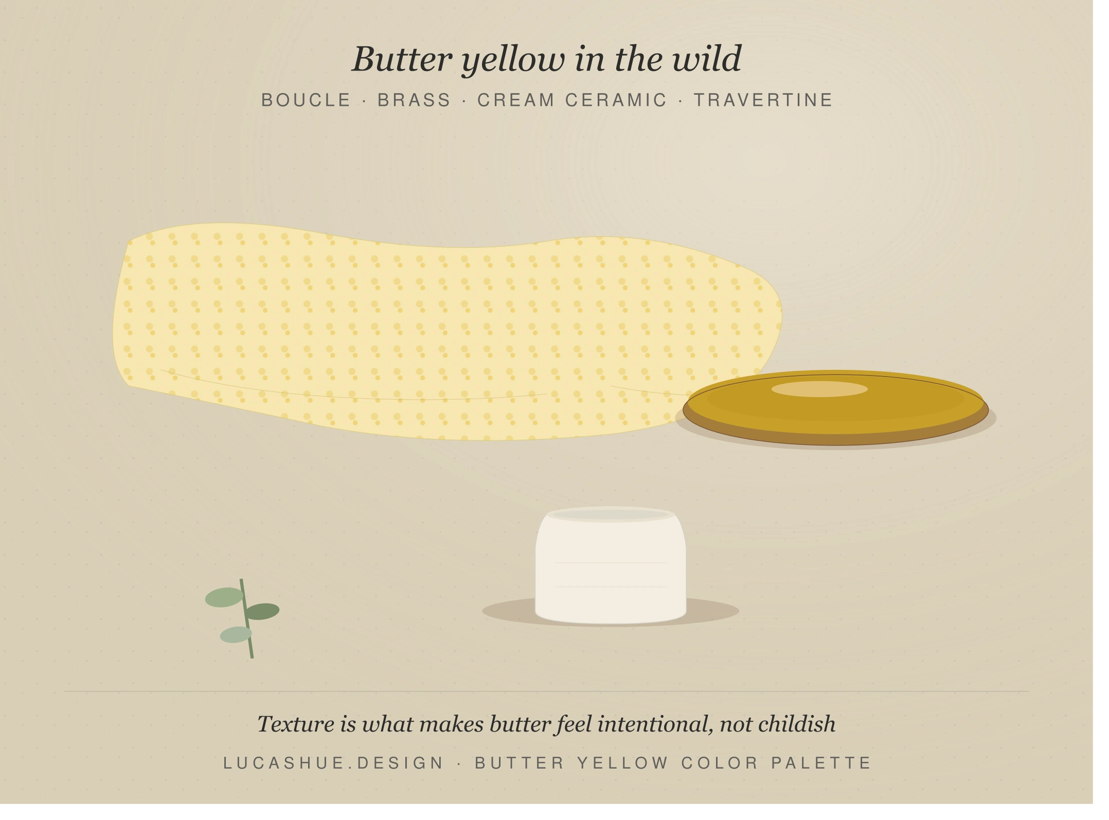
Texture-on-texture is the new contrast. Boucle butter throw + travertine table + ceramic lamp. Same tonal family, three textures. This is the soft yellow palette evolution — less about pairing colors, more about pairing surfaces.
The "butter + black" combo is quietly winning. Everyone predicted butter + sage. The real sleeper hit is butter walls with matte black hardware and a single black-framed mirror. Every client under 35 asks for it.
Pro Tips From 23 Real Projects
- Avoid pure white trim. It makes butter yellow look dingy. Use bone, oyster, or White Dove instead.
- Buy two samples per shade. The same paint reads differently from two different stores' tinting machines. I've tested this.
- Skip butter yellow on north-facing walls. It will look greenish-gray by 4 p.m. from October to March. No exceptions.
- One butter yellow per sightline. Walls OR sofa OR rug. Pick one. Two creates visual mush.
- Brass beats gold. Polished gold against butter yellow looks like a 1987 hotel lobby. Unlacquered brass develops a patina that flatters the yellow.
- Test against your worst light, not your best. Most rooms get judged at 6 p.m. on a cloudy Tuesday. Pick your color for that moment.
FAQ
Is butter yellow the same as cream or pastel yellow?
No. Cream has zero yellow saturation. Pastel yellow leans cooler and brighter. Butter sits in between with warm, slightly peachy undertones — that's what makes it the dominant 2026 yellow trend rather than just another pastel.
What colors should you not pair with butter yellow?
Cool grays (anything with a blue base), bright lime green, and pure white trim. These make butter look either dirty or sickly. Stick to warm neutrals and earth tones.
Does butter yellow work in small rooms?
Yes, often better than in large ones. The warmth makes small spaces feel embraced rather than cramped. I've used it in three powder rooms under 30 sq ft and it expanded the space visually every time.
What's the best butter yellow paint color in 2026?
Benjamin Moore Lemon Sorbet (2019-60) and Farrow & Ball Dayroom Yellow are the two I spec most. Sherwin-Williams Friendly Yellow runs a close third for budget projects.
Is the butter yellow aesthetic going out of style soon?
No. Color trend cycles run 4–6 years on average, and butter yellow only hit mainstream in late 2024. It's got at least until 2028 before it tips into "dated," and the earth-toned versions will outlast the trend entirely.
Can I use butter yellow with existing greige walls?
Honestly, not well. Greige has a cool gray base that fights butter's warmth. Either commit to repainting or use butter only in textiles you can swap out later.
Final Thoughts
Butter yellow isn't a trend you decorate around. It's a base note. Treat it like the warm neutral it actually is, run it through the HUE Test, and you'll get a room that still looks good in 2030.
What's stopping you from trying it? Drop your room's orientation and existing colors in the comments — I read every one and reply with a specific combo from the 15 above.
Related read: Sage Green Is Over: 7 Replacement Colors for 2026 Interiors (coming soon)
