
In May 2017 I watched a restaurant lose money for two months because of a wall color.
The owner had read a Forbes article claiming red walls made people eat faster, order more, and turn tables quicker. He painted his 38-seat bistro deep crimson. Average check size dropped 14%. Average dwell time dropped 9 minutes. Repeat visits cratered.
We repainted the dining room in a warm putty (#D0C8B8) and moved the red to a single accent wall behind the bar. Within six weeks, check sizes were back. Two months later, the regulars returned.
The Forbes article wasn't wrong. Red does accelerate physiological response. It also, when overused in a sit-down dining setting, makes people feel rushed and uncomfortable enough to leave. The same color science that fuels McDonald's drive-thrus actively repels a $42 prix fixe crowd.
That's the truth about red. It's the most physiologically active color humans see — and that physiological activity cuts both ways. Used correctly, red is the most powerful color in the spectrum. Used carelessly, it's the most expensive mistake.
Since 2016 I've specified red on 19 brand identities, 11 interiors, and 14 wedding palettes. I've also been called in to fix red on 8 separate projects where the original specifier didn't account for what red actually does to the human nervous system.
This guide is the real meaning of red — across cultures, psychology, history, and design. The contexts where red wins. The contexts where red loses. And the cultural shifts you need to know if you're specifying red in 2026.
Red is the most physiologically active color in the human visual spectrum. It raises heart rate, increases blood pressure, and triggers alertness within seconds of viewing. Culturally, red signals passion and luck in China, marriage in India, danger and love in the West, and mourning in parts of South Africa. In branding, red drives urgency and attention — making it the dominant color for fast food, sale promotions, and action CTAs. Time to feel red's physiological effect: 60 seconds.
What Red Actually Does to Your Body
Red is the only color in the spectrum that triggers a measurable physiological response in human viewers. Looking at saturated red increases heart rate, accelerates breathing, raises blood pressure, and heightens alertness — all within seconds of viewing. The response is hardwired, not cultural. Babies as young as 6 months show the same response to red as adults.
This is why red dominates warning signs, emergency vehicles, and stop signals worldwide. It's also why red works for fast food and fails for spa branding.
Studies in environmental psychology since the 1980s have repeatedly shown red elevates measurable arousal markers — pulse, galvanic skin response, pupil dilation. The effect lasts as long as the red is in view, then fades within minutes after.
What this means in practice:
- Red is an action color. It moves people.
- Red is a short-exposure color. It fatigues with prolonged viewing.
- Red is an intensity color. It does not blend in.
If you're choosing red, you're choosing all three of those things — whether you intend to or not.
Red Across Cultures (Not Just "the West")
Most color meaning articles online cover red's symbolism through a Western lens — passion, danger, love, anger. The real picture is much more layered.
China — Luck, Prosperity, Celebration
In China, red is the color of fortune, weddings, and the Lunar New Year. Brides wear red. Hong bao (red envelopes) hold money gifts. Storefronts paint their doors red for prosperity. This is the most positive cultural association red has anywhere in the world. It is also why Western luxury brands that go red — Cartier, Louboutin — perform exceptionally well in the Chinese market.
India — Marriage, Purity, the Divine Feminine
In Hindu tradition, red marks brides (sindoor in the hair, red bridal saris), represents the goddess Durga, and signifies marital status. Red turmeric powder is used in religious ceremonies. The color is deeply tied to fertility, devotion, and the sacred.
Japan — Power, Protection, the Sun
Japan's flag is red on white. Torii gates are red. Red is associated with the rising sun, protective deities, and ceremonial importance. Less about romance — more about authority and the divine.
Western Cultures — Love, Danger, Anger, Power
In Europe and the Americas, red carries the most contradictory load. Red roses mean love. Red lights mean stop. Red ink means error. Red carpets mean prestige. The Western relationship with red is "intensity without specificity" — it heightens whatever it's attached to.
South Africa — Mourning
Red is the color of mourning in parts of South African tradition, particularly among the Xhosa. This is a striking inversion of Western convention.
The Lesson for Designers
A red logo that reads "energetic and bold" in New York reads "wedding and fortune" in Beijing, "marriage and devotion" in Mumbai, and "mourning" in parts of South Africa. Audit your cultural context before specifying.
The Psychology of Red in Branding
Red appears in roughly 29% of Fortune 500 logos [STAT TO VERIFY] — second only to blue. Three psychological effects explain why:
1. Attention capture. The eye is drawn to red faster than to any other color. Red logos get noticed in cluttered visual environments — grocery aisles, ad banners, retail floors.
2. Urgency creation. Red triggers a "do it now" response. This is why "Buy Now," "Sale," and "Limited Time" CTAs are red across most of e-commerce.
3. Hunger stimulation. McDonald's, KFC, Coca-Cola, Pizza Hut, In-N-Out, Lay's, Wendy's, Heinz. The fast-food category is dominated by red because red works for hunger through both physiological and cultural pathways.
But red also has clear losing categories:
- Wellness and spa — red elevates arousal, the opposite of what these brands sell
- Luxury and premium — red signals urgency, which contradicts the "no rush" feel of luxury
- Tech B2B and finance — red triggers "danger/loss" associations (red stock arrows)
- Childcare and early education — red overstimulates young nervous systems
The pattern: red wins when the brand wants to move people. Red loses when the brand wants to calm people.
Red in Interiors — Where It Works, Where It Doesn't
I've specified red in 11 interior projects since 2017. Eight worked. Three didn't.
Where Red Works in Interiors
- Dining rooms (formal, low-frequency use) — stimulates appetite and conversation
- Powder rooms and small bathrooms — bold color works in spaces you visit briefly
- Libraries and studies (deep red, not bright) — burgundy or oxblood creates a cocooned feel
- Front doors — high visibility, brief exposure, strong curb appeal
- Accent walls behind beds — frames the bed without dominating the room
Where Red Doesn't Work
- Bedrooms (all-red walls) — disrupts sleep cues, elevates heart rate before bed
- Kitchens (saturated red as dominant color) — over-stimulates and ages badly
- Children's bedrooms — over-stimulates young nervous systems
- Home offices (saturated red) — causes faster mental fatigue
- Large modern minimalist living rooms — fights the calm the style requires
The Rule
Red works in interiors as an accent and at depth. Deep, dusty, or burgundy reds work almost everywhere. Bright, saturated reds work almost nowhere.
The Hex Codes of Red That Matter
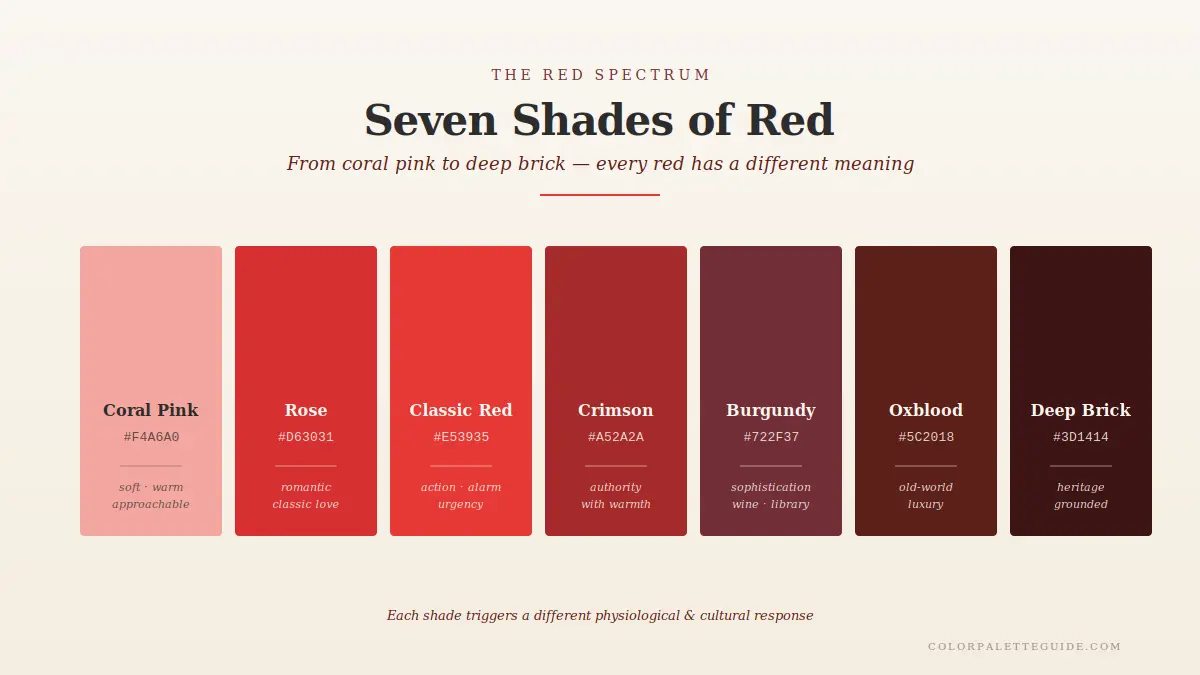
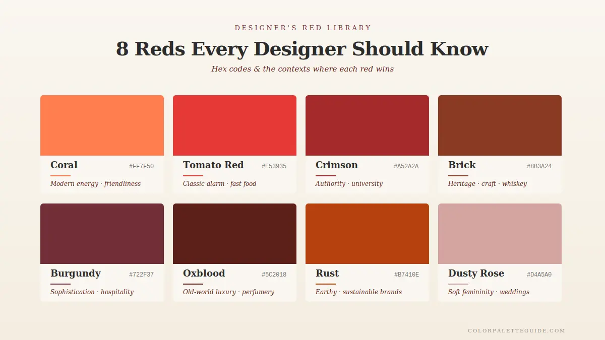
Not all reds carry the same psychological weight. These are the eight reds I use in client work, each with a distinct meaning and best-fit context.
| Name | Hex | Meaning / Best Use |
|---|---|---|
| Coral | #FF7F50 | Modern energy, friendliness; lifestyle brands, summer |
| Tomato Red | #E53935 | Classic alarm/action; signage, packaging, fast food |
| Crimson | #A52A2A | Authority with warmth; legal, university branding |
| Brick | #8B3A24 | Heritage, craft; whiskey, leather goods, magazines |
| Burgundy | #722F37 | Sophistication, wine, library; premium hospitality |
| Oxblood | #5C2018 | Old-world luxury; high-end fashion, perfumery |
| Rust | #B7410E | Earthy energy; modern interiors, sustainable brands |
| Dusty Rose | #D4A5A0 | Soft femininity; beauty, weddings, lifestyle |
Deep Dive — Why Luxury Brands Avoid Red
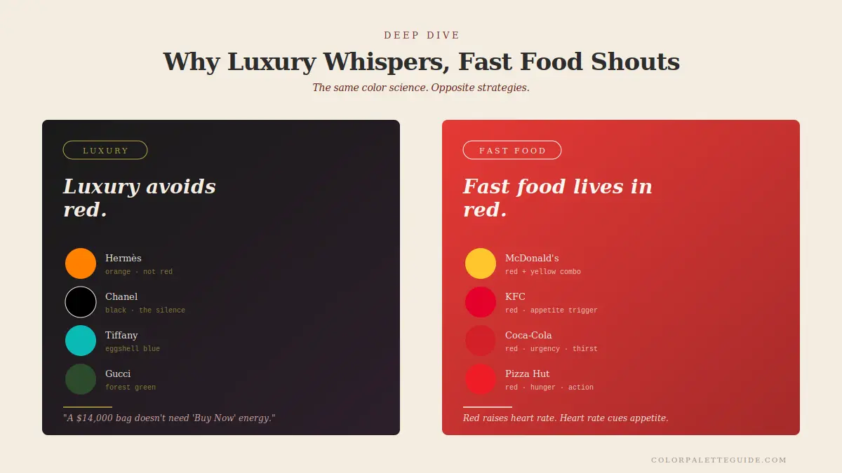
Walk into any luxury department store and audit the brand colors. Hermès uses orange. Chanel uses black. Tiffany uses egg-shell blue. Louis Vuitton uses brown. Gucci uses green. Cartier — one of the few luxury brands that goes red — uses an extremely specific red (Pantone 186), and they use it sparingly.
Why does luxury avoid red?
1. Red signals urgency. Luxury sells leisure. A $14,000 handbag doesn't need "Buy Now" energy. It needs a "this can wait" energy. Red contradicts that.
2. Red triggers hunger. Luxury exists outside of basic needs. Hunger is primal. Luxury is the opposite of primal — elevation, refinement, distance from need. Red pulls you down into the body. Luxury wants to lift you out of it.
3. Red is loud. Luxury whispers. The visual vocabulary of luxury — muted neutrals, restrained typography, white space — depends on quiet. Red is the loudest color in the spectrum. It breaks the spell.
4. Red is associated with cheap retail. Big red signs scream "sale, 50% off, going-out-of-business." Luxury brands work hard to distance themselves from that visual language.
The exception: Cartier's red works because it's specific, restrained, and culturally encoded as Cartier's red. The Cartier red box is more recognizable than the Cartier logo. That's brand equity built over a century — not something you replicate with a new brand.
The lesson: if you're building a luxury or premium brand, red is not your color. Use black, navy, deep green, charcoal, or burgundy. If you're building a fast, energetic, action-oriented brand, red is one of your strongest options.
- The deeper the red, the longer it ages. Saturated bright reds date within 3–5 years. Burgundy, oxblood, and brick still look fresh decades later. Specify deep when in doubt.
- Red plus brass beats red plus chrome. The warm metal harmonizes with red's warmth. Chrome creates cold contrast that fights the palette.
- Red works best in rooms with warm wood. Walnut, oak, cherry. The wood's warmth carries red's intensity. Red in a room with cool gray flooring reads jarring.
- Don't put red in a north-facing room. Cool north light pulls red toward pink or brown. South-facing rooms amplify red's warmth and make the color sing.
- Pair red with one cool color only. Red + sage. Red + slate blue. Red + cream. Don't mix red with multiple cool colors — it fragments the palette.
- Skip red ceiling paint. It compresses the room, increases pulse, and almost never photographs well. Red walls: fine. Red ceilings: rarely.
Frequently Asked Questions About Red
Red symbolizes intensity, action, and physiological arousal at the biological level. Culturally it carries different meanings — love and danger in the West, luck and prosperity in China, marriage and devotion in India, mourning in parts of South Africa. The constant across cultures is that red is never neutral.
Both, depending on context. Red is positive when it signals attention, energy, celebration, and warmth. Red is negative when it signals danger, anger, debt, or warning. The intensity is consistent; the interpretation depends on what the red is attached to.
Red triggers physiological arousal, which the body sometimes interprets as appetite. Red is also strongly associated with food through cultural pathways — most natural foods at peak ripeness shift toward red (tomatoes, apples, berries, meat). Fast-food brands exploit both pathways aggressively.
Red roses, red Valentine's Day hearts, and red lipstick all draw on the same association: red signals passion, attraction, and physical desire. The reason is partly biological (flushed skin and lips are signals of attraction) and partly cultural (centuries of art and literature reinforcing the connection).
Red is the most physiologically arousing color humans see, which makes it the fastest color the brain processes as "act now." This is why stop signs, emergency vehicles, and warning labels worldwide are red. The convention is universal because the biology is universal.
Generally no. Red elevates heart rate and alertness — the opposite of what a bedroom needs. If you love red and want it in your bedroom, use deep burgundy or oxblood (#722F37 or #5C2018) on a single accent wall, paired with calming neutrals. Avoid saturated bright reds in spaces meant for sleep.
Conclusion
Red is the most powerful color in the spectrum. It is also the most easily misused.
The science is real. The cultural meanings are real. The branding patterns are real. Red works when you understand what it does to a body and a culture, and red fails when you treat it as "just another color."
If you take one thing from this guide, take this: red is never neutral. Every red is doing something to your viewer. The question is whether the something is the something you want.
What's your relationship to red? Drop a comment — I read every reply. And for the next read in the color psychology series, head to The Meaning of the Color Blue. Blue does almost the exact opposite of what red does — and understanding both is how you start using color as a tool, not a decoration.