
In 2014 green was the color clients asked me to "tone down."
In 2024 green was the color clients asked me to "lean into."
Something has happened to green over the past decade. The color that used to mean "envy, money, hospital scrubs, and Christmas" has rebranded itself into the color of wellness, sustainability, modernity, and quiet luxury. Sage green is the most-specified interior color of 2026. Forest green is winning logo design. Emerald is having its biggest moment since 1985. The Pantone Color of the Year may be Cloud Dancer, but the color actually driving design decisions in 2026 is green.
I've watched this shift project by project. In 2017 I specified green on 2 of my 14 projects. In 2024 I specified green on 9 of my 11. The shift isn't a trend. It's a generational redefinition of what green means.
The eye sees more shades of green than any other color in the spectrum. It's an evolutionary holdover — our ancestors needed to distinguish ripe from unripe, edible from poisonous, safe foliage from threat. Green is the color the human visual system is most equipped to read. Which is why, when green is done well, the result is calming, sophisticated, and quietly powerful.
Since 2016 I've specified green on 21 projects — 8 brand identities, 9 interiors, 4 weddings. This guide is the real meaning of green, why 2026 belongs to it, and the four shades of green that aren't actually green at all.
Green symbolizes nature, growth, renewal, and health across most cultures. The human eye sees more shades of green than any other color — an evolutionary adaptation for reading foliage. In 2026 green dominates design: sage leads interior paint, forest green leads logo design, emerald leads fashion. Culturally, green is the most sacred color in Islam, represents money and envy in the West, and signals health and harmony in China. Green is the most perceptually flexible color in the spectrum.
Why the Human Eye Loves Green
The human eye perceives more shades of green than any other color in the visible spectrum. This is an evolutionary adaptation — our ancestors needed to read subtle green variations to distinguish edible from poisonous plants, ripe from unripe fruit, and safe environments from threats. Green sits at the center of the visible spectrum, which means the eye uses minimum energy to process it. Looking at green is literally restful for the visual system.
Green's position in the spectrum gives it unique qualities:
- Maximum perceptual variation — humans can distinguish thousands of greens
- Minimum cognitive cost — green is the easiest color for the eye to process
- Maximum emotional flexibility — green can read fresh, deep, soft, electric, sacred, or sickly depending on shade
That perceptual range is exactly why green is so context-dependent. The same green-named color (say, "olive") can read sophisticated in a logo and dingy on a wall. Green more than any other color depends on its hex code.
The Cultural Meanings of Green
Green's symbolic load varies more widely across cultures than blue's but less wildly than red's.
Western Cultures — Nature, Money, Envy, Inexperience
In Europe and the Americas, green is loaded with multiple meanings — nature ("going green"), money (US dollars), envy ("green with envy"), and inexperience ("a greenhorn"). Recently it's gained a strong association with wellness, sustainability, and organic living. The modern Western reading of green is overwhelmingly positive.
Islamic Cultures — Sacred, Paradise
Green is the most sacred color in Islam. The Prophet Muhammad's flag was green. Paradise in the Quran is described in green imagery. Many flags of Muslim-majority countries feature green. This is the strongest sacred association any color has in any major religion.
China — Health, Harmony, but also Infidelity
In Chinese tradition, green generally symbolizes health, harmony, and the spring season. But a green hat carries the specific connotation of an unfaithful spouse. Designers working with Chinese audiences should know that headwear in green requires careful framing.
Ireland and Celtic Cultures — National Identity, Folklore
Green is so synonymous with Ireland that the country is called "the Emerald Isle." It connects to Catholic symbolism (St. Patrick), folklore (leprechauns, fairy mounds), and national identity. In Ireland green is celebration.
India — New Beginnings, Harvest, the Divine
In Indian culture green carries multiple weights — it represents new beginnings, harvest, and Lord Vishnu's preserving energy in Hinduism, and inherits Islamic sacredness in Muslim Indian communities.
The Lesson for Designers
Green's broad positive load globally makes it generally safe, but the sacred association in Islam and the infidelity association in China require cultural sensitivity. Most modern uses of green — wellness brands, sustainable products, natural foods — translate cleanly across markets.
Green's Rebrand — From Awkward to Essential
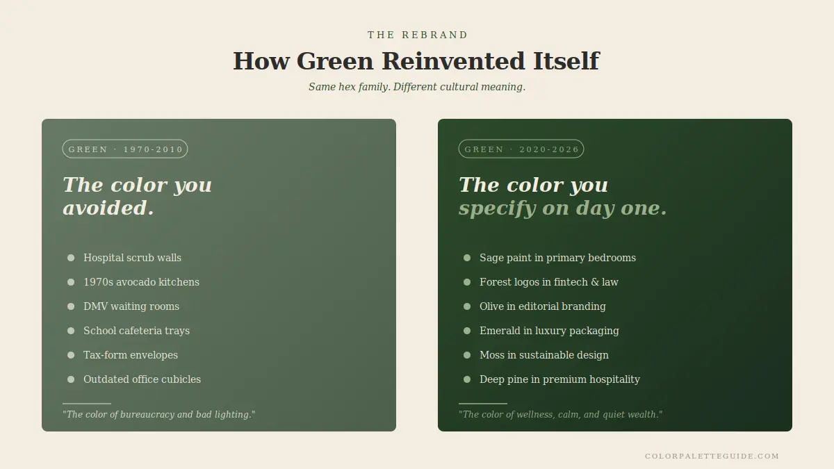
For most of the 20th century, green was the color of awkward associations. Hospital scrubs. Pea soup. The Wicked Witch. Money (in the US specifically). Institutional walls in 1970s schools.
Then between 2015 and 2020, three forces converged to rebrand green:
1. The wellness movement. Yoga studios, juice bars, organic skincare brands, and meditation apps all reached for green as their dominant color. Within five years, green meant "wellness" first and "envy" or "money" second.
2. The sustainability imperative. Climate consciousness pushed every brand toward green messaging. By 2022 you couldn't launch a brand claiming sustainability without using green somewhere in the palette.
3. The post-pandemic interior renaissance. Sage green became the most-requested interior paint color of 2022–2025 because it read "calm, natural, anti-screen-fatigue." People who had spent two years staring at blue digital interfaces wanted something different on their walls.
By 2024 green had completed its rebrand. Sage was the new beige. Forest was the new navy. Emerald was having a luxury moment in fashion. Olive was winning in fashion and interiors simultaneously. The hospital-scrub green of 1985 is dead. The sage-celadon-forest-emerald axis of 2026 is alive and dominant.
The Psychology of Green in Branding
Green appears in roughly 22% of Fortune 500 logos [STAT TO VERIFY] — significantly less than blue (33%) or red (29%), but gaining ground fast. The brands using green include Starbucks, Whole Foods, Spotify, John Deere, BP, Animal Planet, Subway, and Tropicana.
The psychological associations brands lean on when choosing green:
1. Nature and freshness. Especially relevant for food, beverage, and outdoor brands.
2. Health and wellness. The strongest modern association, dominant in fitness, supplements, and beauty.
3. Wealth (in the US). Green's connection to money makes it useful in some financial branding.
4. Sustainability and ethics. The post-2015 association most relevant for any brand making environmental claims.
5. Calm and balance. Green's perceptual restfulness translates into brand calm.
Where green wins now in 2026:
- Wellness and beauty
- Sustainable and organic food
- Outdoor and adventure
- Finance with progressive positioning
- Hospitality (especially premium)
- B2B SaaS that wants to differentiate from blue competitors
- Premium e-commerce (especially home goods, fashion, beauty)
Where green still struggles:
- Categories where green has heavy cultural baggage (mass-market beer in the US)
- Sectors where blue equity is overwhelmingly entrenched (mainstream banking)
- Childcare (where bright greens can over-stimulate)
Green is the rising color, and 2026 is the year it overtakes red as the second-most-used logo color in modern branding (specifically modern, not Fortune 500).
Green in Interiors — Where It Wins, Where It Loses
Of my 9 green interior projects since 2017, 8 were specified after 2022. The shift is dramatic.
Where Green Works in Interiors
- Bedrooms (sage, celadon) — calming, restful, supports sleep
- Kitchens (sage, forest, olive) — leading kitchen trend of 2024–2026
- Bathrooms (sage, celadon, dark forest) — spa-like, calming
- Home offices (sage) — supports cognition, reduces eye fatigue
- Living rooms (sage walls, forest accents) — modern, sophisticated
- Libraries and studies (deep forest, emerald) — cocooned, intellectual
- Front doors (forest green) — classic curb-appeal color
Where Green Doesn't Work
- Kitchens with already-green countertops — competing greens fight
- Rooms with strong yellow undertones in lighting — green shifts toward chartreuse
- Children's playrooms (lime or chartreuse) — over-stimulates
- North-facing rooms (cool greens like mint or teal) — reads sickly
- Rooms without natural light — green needs daylight to read properly
The Rule
Green works in interiors when you specify the right shade for the right light. Sage and warm greens work in north-facing rooms. Deep forest and emerald work in well-lit rooms (south or east). Cool greens (mint, teal, chartreuse) almost always struggle in residential interiors and should be reserved for branding or accent pieces.
The Hex Codes of Green That Matter
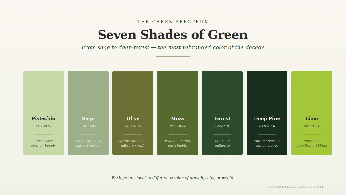
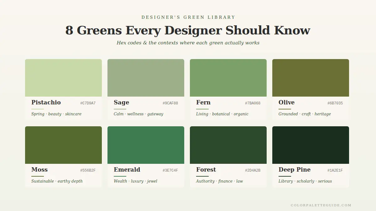
These are the eight greens I use in client work, each with a distinct meaning and best-fit context.
| Name | Hex | Meaning / Best Use |
|---|---|---|
| Sage | #9CAF88 | Calm, modern, wellness; the 2026 leader |
| Celadon | #A8C0A0 | Softer, slightly cooler than sage; spa, beauty |
| Olive | #708238 | Earthy, masculine, sophisticated; fashion, hospitality |
| Moss | #7E927B | Deeper sage; quiet luxury, minimalist interiors |
| Forest | #2D4A2B | Library, premium, masculine; brand identities, interiors |
| Emerald | #1A4D2E | Jewel-tone luxury; fashion, hospitality, weddings |
| Hunter | #355E3B | Equestrian, traditional; menswear, country interiors |
| Lime | #C5D86D | Energetic, youthful, sharp; tech, beauty, food brands |
Deep Dive — Four Greens That Aren't Really Green
Some of the most popular "greens" in design aren't pure greens at all — they're greens with significant amounts of another color mixed in. Designers who specify them as "green" without understanding the undertone end up with rooms that read off.
1. Sage — Actually Half-Gray
Sage (#9CAF88) is roughly 50% gray. That's why it works in modern interiors — it inherits gray's neutrality and "professional" feel. It also explains why sage shifts dramatically under different lighting: the gray component picks up surrounding colors. In warm light, sage reads more green. In cool light, it reads more gray. If a client specifies sage but the result looks "too green" or "too gray," the issue isn't the paint — it's the light.
2. Olive — Actually Heavy Yellow
Olive (#708238) is green with significant yellow loading. This is why olive reads "earthy" rather than "natural" — it carries yellow's warmth and sun-soaked quality. Olive performs beautifully in warm light and shifts toward khaki in cool light. It's the most underrated green of 2026.
3. Teal — Actually Blue-Heavy
Teal is technically blue-green, but in most uses, the blue dominates. Designers who specify teal "for the green effect" often end up with rooms that read solidly blue. If you want a true green-blue, use celadon (#A8C0A0) or moss (#7E927B). If you want a blue-green, teal is your color.
4. Mint — Actually Cool-Loaded Sage
Mint is sage's cooler cousin. It carries similar gray loading but pulls toward blue rather than yellow. This is why mint reads "fresh" and "icy" while sage reads "warm" and "soft." Mint is harder to use because it requires very specific lighting to look modern rather than dated.
The lesson: when specifying green, audit the undertone. Sage's gray, olive's yellow, teal's blue, and mint's coolness all change how the color performs in real spaces. Specify by hex code, not by name.
- Sage with brass is the 2026 power combination. Sage with chrome reads cold. Sage with brass reads premium. Specify brass hardware every time you specify sage walls.
- Pair forest green with cream, not white. Pure white against forest green reads stark. Cream (
#F4EDE0) against forest green reads sophisticated. - Avoid green-on-green-on-green. Three different greens stacked together get muddy. One dominant green plus warm neutrals plus one accent works much better.
- Emerald wants jewel tones, not earth tones. Emerald pairs beautifully with deep blues, plum, burgundy, gold. It fights terracotta, cognac, and rust — those undertones clash with emerald's coolness.
- Test green paint at three times of day. Green shifts more under different light than almost any other color. Sage that looks beautiful at 11 a.m. can read sickly at 4 p.m. Test before committing.
- Don't use green in food packaging unless you're claiming natural or healthy. Green food packaging in non-natural categories (cookies, candy) confuses consumers. Reserve green for actually-healthy products.
Frequently Asked Questions About Green
Green symbolizes nature, growth, renewal, and health across most cultures. In the modern West it also signals sustainability and wellness. In Islam it's the most sacred color, representing paradise. In China it represents harmony with some specific cautions around green hats and infidelity. Generally green is a positive color with strong universal appeal.
Mostly positive. Green is associated with growth, health, nature, balance, and wealth (in the US). Its negative associations — envy, inexperience, sickness — are minor and fading. The post-2015 wellness movement has solidified green's positive load globally.
Human evolution required us to distinguish subtle variations in plant color to find food, avoid poison, and navigate environments. The eye developed maximum sensitivity to green wavelengths as a result. Green sits at the center of the visible spectrum, requiring minimum energy to process — which is why green environments cause less eye fatigue than other colors.
The post-2015 wellness and sustainability movements pushed green into prominence. Brands using green now signal natural, healthy, sustainable, and modern values — exactly the qualities consumers are seeking. Green is rising fast as a primary brand color, particularly in food, beauty, wellness, and modern B2B.
Green is associated with hope, growth, and renewal in romantic contexts — the "spring" of a new relationship, fresh starts, fertility. It carries softer love associations than red's passion or blue's loyalty.
Yes — sage and celadon are among the best bedroom colors because they're calming, support sleep, and reduce visual fatigue. Avoid bright lime or saturated emerald in bedrooms. Stick to muted, soft greens for the most calming effect.
Conclusion
Green is the most underrated color in modern design. It carries less cultural baggage than red, less saturation in branding than blue, and offers more perceptual flexibility than any other color in the wheel.
2026 belongs to green. Sage on walls. Forest in logos. Emerald in fashion. Olive in interiors. The rebrand is complete, and the color that used to mean "envy, money, hospital scrubs" now means "modern, sustainable, sophisticated, calm."
If you're not specifying green somewhere in your work right now, you're working against the dominant aesthetic of the decade.
What's your favorite shade of green? Drop a comment — I read every reply. And for the deeper dive into the most popular green palette in 2026, head to Sage Green Color Palette. It's the gateway green for the whole rebrand.