

Last October, a client sent me a Pinterest board with 84 pins. Every single one was the same: pumpkin orange, cream, and that exhausted shade of rust we've all seen since 2019. She wanted her bakery rebrand to "feel like fall" but also "not look like everyone else." Fair request. Impossible with that board.
So we threw it out.
We rebuilt her palette around a deep fig purple, oat milk beige, and a single hit of persimmon. Sales in her first autumn season jumped 31% over the prior year. The lesson stuck with me, and it's the one I'll hand you today: a working fall color palette isn't about hoarding warm tones. It's about restraint, contrast, and one weird color that doesn't belong.
This guide gives you seven palettes I've actually used on paying projects, the hex codes, and a framework I call the 60-30-10 Autumn Rule so you stop guessing.
Table of Contents
What Makes a Palette Feel Like Fall
Fall isn't orange. Fall is low light.
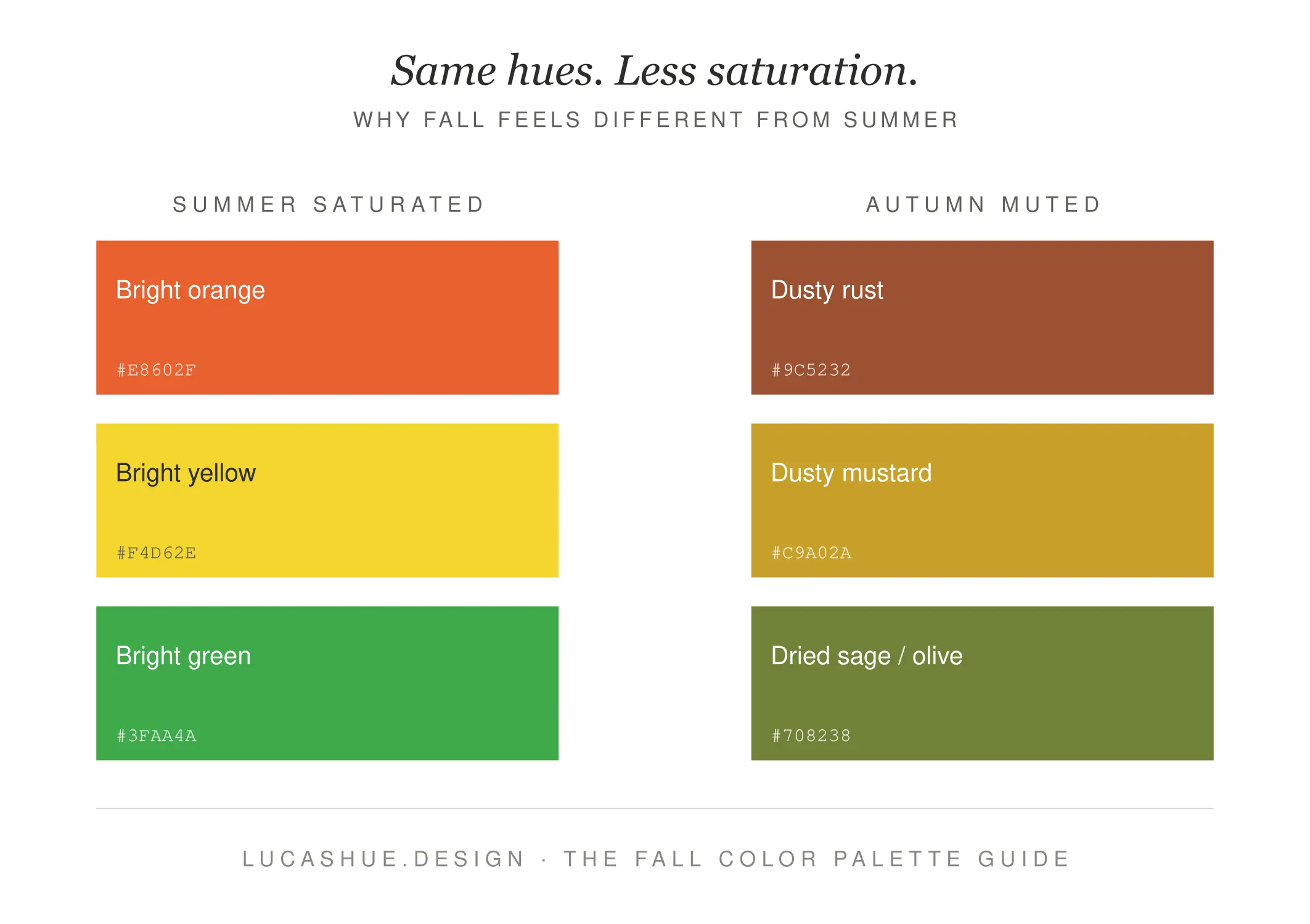
The reason an autumn aesthetic palette reads as autumnal has almost nothing to do with hue and everything to do with value (lightness) and saturation (intensity). Summer palettes are bright and high-saturation. Fall palettes drop saturation by roughly 20-30% and pull values toward the middle of the scale. That's the whole secret. You can build a fall palette using purple, green, and pink if those three colors share a muted, mid-toned quality.
The Three Anchors
Every cozy fall color I've ever specified falls into one of three buckets:
- Earth anchors — clay, terracotta, walnut, moss
- Harvest anchors — persimmon, mustard, fig, pomegranate
- Atmosphere anchors — fog grey, oat, charcoal, smoke blue
Pick one anchor from each bucket. That's a palette. Stop overcomplicating it.
What is the 60-30-10 Autumn Rule?
The 60-30-10 Autumn Rule is a beginner framework for building a fall color palette in under 10 minutes. Use 60% of a soft atmosphere color (oat, fog, cream) as your base, 30% of a grounded earth tone (clay, walnut, moss) as your support, and 10% of a saturated harvest accent (persimmon, mustard, fig) for energy. The 10% accent is non-negotiable — without it, your palette reads as "drab" rather than "cozy." Total setup time: 8-10 minutes.
The 60-30-10 Autumn Rule
This is the rule I teach every beginner client. It works for interiors, branding, wardrobes, and digital design. The math is forgiving. The accent is what saves you.
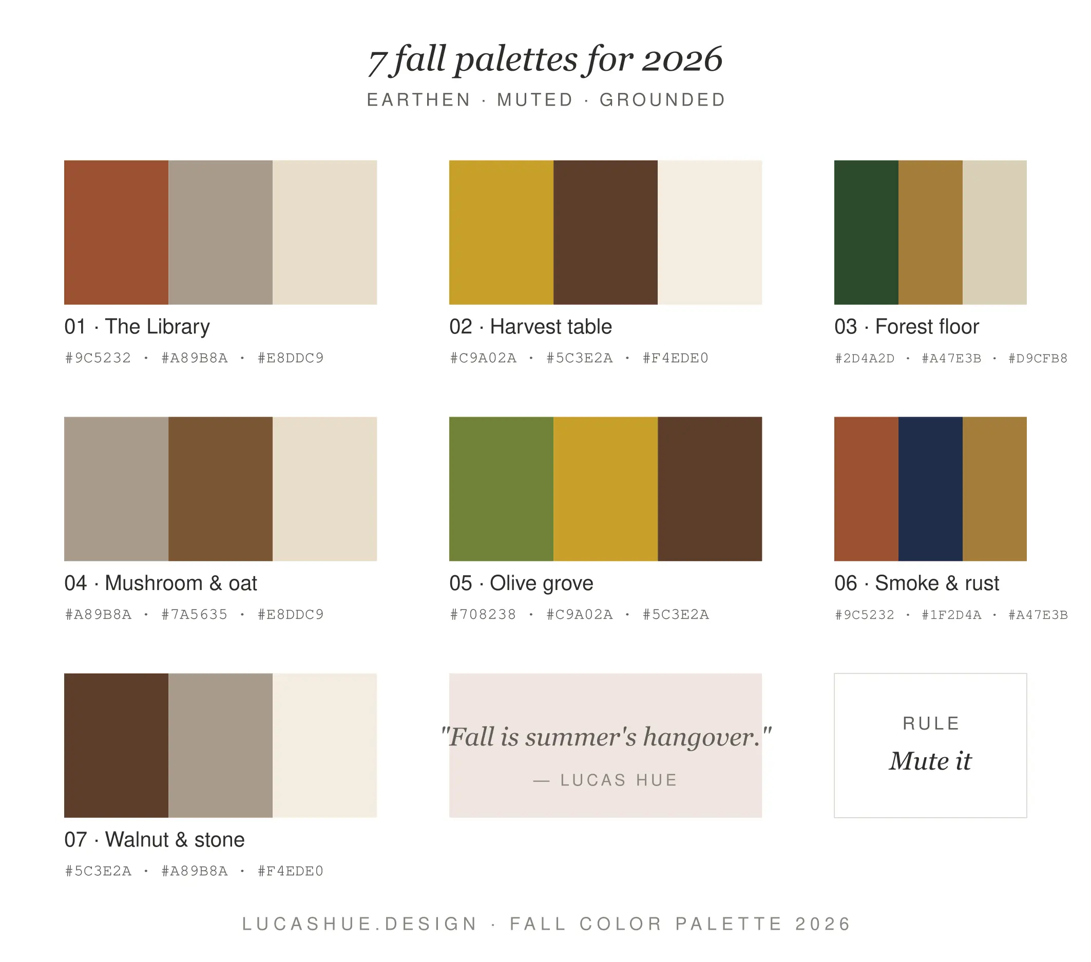
7 Fall Color Combinations for 2026
I pulled these from active 2026 projects and trend forecasting from Coloro and WGSN's autumn reports. Each combo is named, tested, and includes hex codes.
1. Fig & Oat (My Personal Favorite)
- Oat Milk #E8DCC4
- Walnut #5C4033
- Deep Fig #3D2B3D
- Persimmon #D2691E
Where it works: bakeries, bookshops, warm minimalist interiors. The fig is the "weird color." It's what makes this palette feel 2026 instead of 2019.
2. Mushroom & Marigold
- Mushroom Grey #A89F91
- Cream #F2EAD3
- Deep Marigold #C8932E
- Charcoal #2B2B2B
Where it works: editorial design, lifestyle brands, autumn wardrobes. The charcoal grounds the warmth so it doesn't feel saccharine.
3. Pomegranate & Pine
- Soft Cream #F5EFE0
- Pine Green #2C4A3E
- Pomegranate #7E2A1C
- Brushed Brass #B08D57
Where it works: holiday packaging without screaming "holiday." This is the most commercially flexible combo on the list.
4. Smoke & Persimmon
- Smoke Blue #8FA3A8
- Bone #EFE6D6
- Persimmon #D85D2A
- Espresso #3A2A1F
Where it works: men's grooming brands, modern cabins, cafes. The smoke blue is contrarian — most people skip blue in fall. They're wrong.
5. Mulled Wine
- Dusty Rose #C9A39B
- Mulled Wine #5A1F2E
- Antique Gold #A88B4A
- Mushroom #9A8E7E
Where it works: weddings, beauty brands, intimate restaurants. Reads romantic without being precious.
6. Forest Floor
- Moss #5A6B3E
- Bark #3E2C1F
- Mustard #C5A028
- Mist #D8D4C8
Where it works: outdoor brands, wellness, ceramicists. This is the "I bought a cottage" palette and I mean that as a compliment.
7. Toasted Almond (The Quiet One)
- Toasted Almond #C9A678
- Espresso #3D2817
- Cream #F1E8D5
- Burnt Sienna #9C4A2A
Where it works: when you want fall but you also want clients to take you seriously. My most-used palette of 2025.
Deep Dive: Why Most Fall Palettes Fail
I've audited probably 200 fall palettes from clients, students, and Pinterest boards over the last decade. The failure modes are boringly consistent.
Failure 1: Three Versions of the Same Orange
Pumpkin, rust, and burnt orange are not three colors. They're one color wearing different hats. A palette needs value range — a light, a mid, and a dark. If I squint and your palette looks like one beige blob, it's broken.
Failure 2: No Cool Color Anywhere
Every palette needs at least one cool note, even if it's only 5% of the composition. A whisper of grey-blue, sage, or aubergine. Without it, warm palettes turn into orange juice. I learned this the hard way on a 2018 cafe project that I had to redo for free.
Failure 3: Treating "Cozy" as a Color
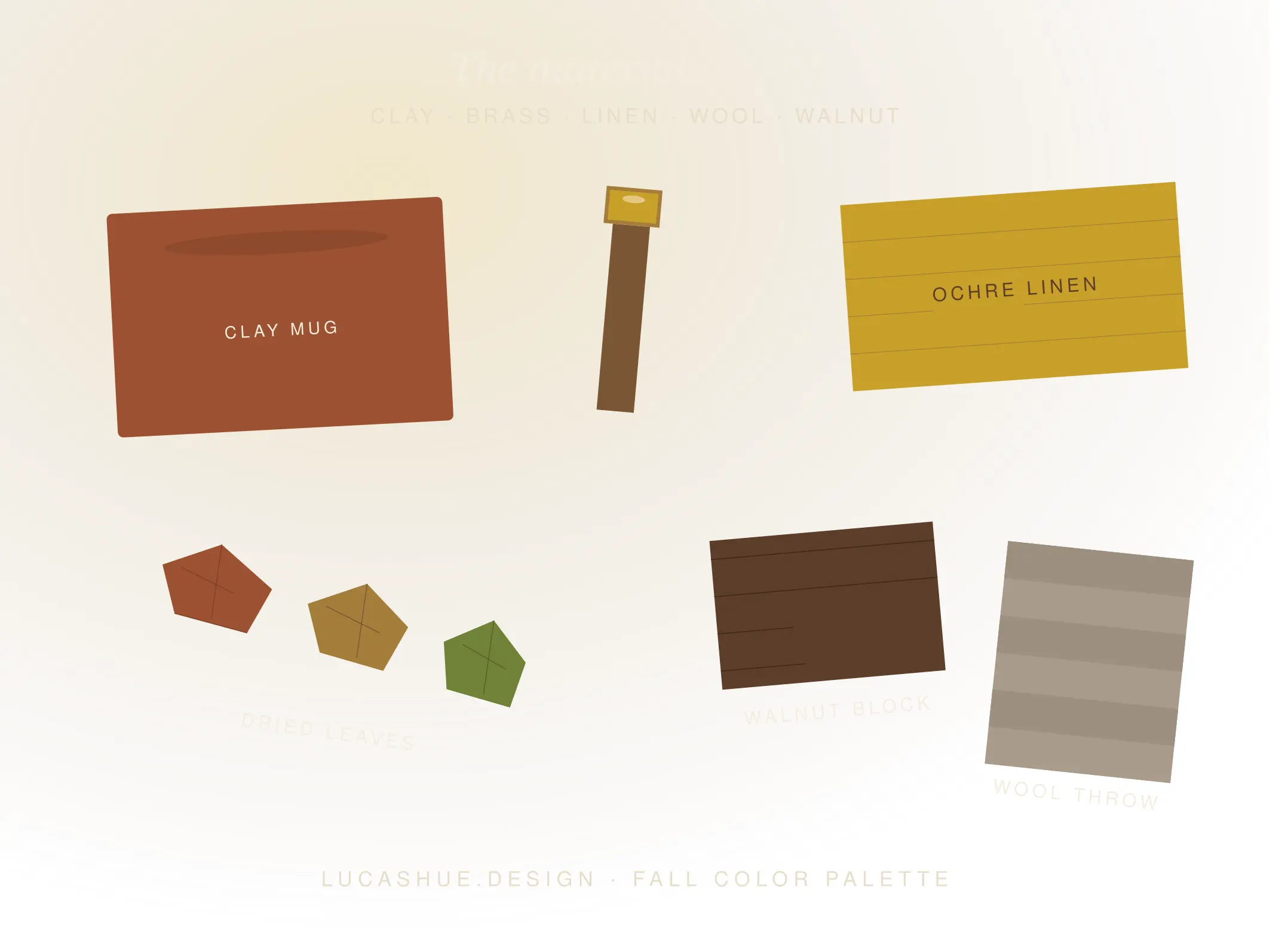
Cozy isn't brown. Cozy is contrast plus texture. The coziest fall color combinations I've built lean on textural contrast — matte clay against polished brass, raw linen against lacquered walnut. Color does maybe 60% of the work. Material does the rest.
Failure 4: Skipping the Accent
Beginners often kill the 10% accent because it "feels too loud." Then they wonder why the room looks sad. The accent is the entire reason the palette has energy. Keep it. Even if it scares you.
Pro Tips From 10 Years of Color Work
- Test every palette under warm 2700K bulbs. Fall colors collapse under cool LED lighting. If your palette only works in daylight, you don't have a fall palette — you have a summer palette in a cardigan.
- The most modern fall 2026 colors aren't orange — they're purple. Deep fig, aubergine, and plum are the colors quietly replacing rust on commercial mood boards this year.
- Avoid pure black. Use espresso #3D2817 or charcoal #2B2B2B instead. Pure black #000000 reads cold and breaks the autumn mood instantly.
- Three colors beats five. Beginners overload palettes thinking more equals richer. The opposite is true. Lock three, add a fourth only if a project demands it.
- Steal from paintings, not Pinterest. Andrew Wyeth's autumn work and Wayne Thiebaud's pies will teach you more about fall palettes in 20 minutes than 200 Pinterest pins.
- Sample at 100% before committing. Paint a full A4 swatch. Look at it for 24 hours. Colors lie at thumbnail size.
FAQ
What is the most popular fall color palette for 2026?
Mushroom, fig, and persimmon dominate 2026 forecasts. The shift is away from rust-heavy palettes toward grounded purples and warm neutrals with a single saturated accent.
What colors should I avoid in a fall palette?
Pure black, neon shades, and high-saturation primaries. Also avoid using more than one bright accent — fall palettes need restraint to read as autumnal rather than chaotic.
Can I use pink in an autumn color palette?
Yes, if it's muted. Dusty rose #C9A39B and antique pink work beautifully alongside walnut and mulled wine. Skip bubblegum and millennial pink — they read summer.
How many colors should a fall palette have?
Three is the sweet spot for beginners. Add a fourth only when the project has multiple touchpoints (branding, packaging, web). Five colors usually means you haven't decided what the palette is about.
What's the difference between a cozy fall palette and a Halloween palette?
Cozy palettes use muted, mid-value tones with low saturation. Halloween palettes rely on high-contrast orange and black. Same season, opposite emotional registers.
Are warm or cool fall colors better?
Warm-dominant with at least one cool note. Pure warm palettes feel claustrophobic. A 90/10 warm-to-cool ratio gives you the autumn mood with breathing room.
Final Thoughts
A great fall color palette is mostly about what you leave out. Three colors. One accent that scares you a little. Muted saturation. Test it under warm light. Done.
Try the 60-30-10 Autumn Rule on your next project — even something small like a dinner table or a single Instagram post. I want to hear which of the seven combos you reach for first. Drop it in the comments below, and tell me what you'd swap.
Related read: How to Build a Brand Color Palette That Actually Converts (2026 Edition)

