


In March 2024, a client in Brisbane handed me a paint deck with 14 swatches taped to her bedroom wall. Fourteen. She'd been sleeping next to that mosaic for three weeks. "I just can't decide," she said. The room felt like a hostage situation.
Three hours later we had four colors. She slept eleven hours that Saturday — the most rest she'd had since her second kid was born.
The problem wasn't her taste. It was that nobody had ever given her a system. Most bedroom color advice online reads like a Pinterest caption: "Try sage green for serenity!" Cool. How much sage? On which wall? Paired with what? Silence.
This guide gives you the system I actually use on paid projects. It's called the 60-30-10-1 method, and by the end of this article you'll have a bedroom color palette you can take to the paint store tomorrow.
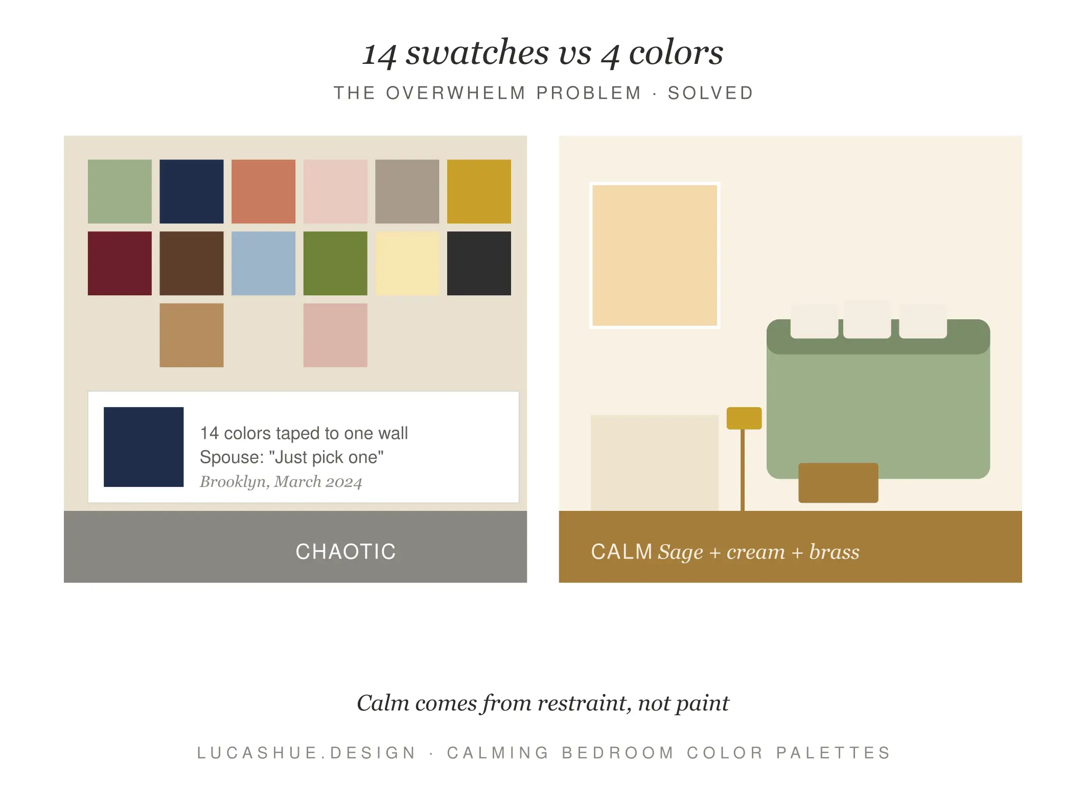
Table of Contents
What a Bedroom Color Palette Actually Is
A bedroom color palette is not a mood board. It's a ratio.
Most beginners think picking colors means picking colors. It doesn't. Picking colors means deciding how much of each color goes where — walls, bedding, rugs, art, hardware. A palette without proportions is just a list. And lists don't make rooms feel restful.
Across the projects I've consulted on since 2016, the bedrooms that fail the "do you actually want to be in here" test almost always share one trait: too many colors, all fighting for the same square footage.
What is the 60-30-10-1 bedroom color palette method?
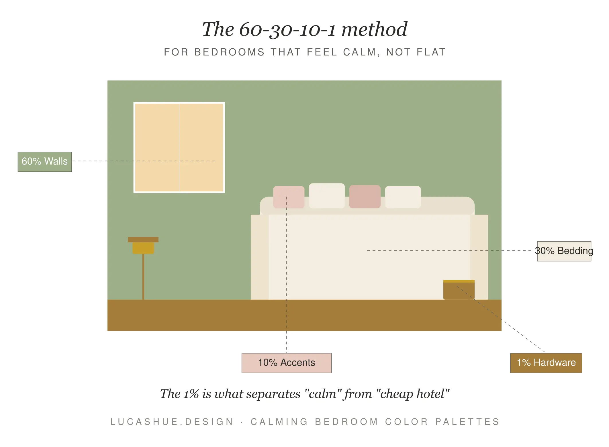
The 60-30-10-1 method splits your bedroom into four color zones by surface area: 60% dominant (walls, large rugs), 30% secondary (bedding, curtains, headboard), 10% accent (cushions, throws, lamp shades), and 1% jewel (hardware, a single art piece, picture frames). Picking colors in this ratio takes about 90 minutes and removes the indecision that wrecks most DIY bedroom palettes.
The 60-30-10-1 Method Explained
Here's why the ratio matters. The eye reads dominance before it reads color. A "blue bedroom" with blue walls feels blue. The same blue used only on cushions feels like a beige bedroom with blue cushions. Same color, completely different room.
The four zones:
60% — The Anchor
Walls, ceiling, large area rug. This is the temperature of the room.
30% — The Companion
Bedding, curtains, upholstered headboard. Supports the anchor without competing.
10% — The Lift
Decorative pillows, throw blanket, lamp shade, smaller art. This is where personality lives.
1% — The Jewel
Door handles, drawer pulls, a single sculptural object, picture frame edges. Brass. Black iron. Aged bronze. Tiny, but it tells your eye the room is finished.
How to Pick Your Anchor Color in 4 Steps
Skip Pinterest. Do this instead.
Step 1: Stand in your bedroom at 7am and 9pm
Note the light. North-facing rooms get cool blue light; south-facing rooms get warm yellow light. Your anchor needs to flatter both.
Step 2: Find one object you already love and won't replace
A quilt your grandmother made. A rug you spent too much on. A painting. This object is now your palette's North Star.
Step 3: Pull three colors from that object
Literally hold paint chips against it. The dominant color in the object is not automatically your anchor — usually it's the second-most-prominent tone that works best on walls.
Step 4: Test the anchor at 60% scale before you commit
Buy a sample pot. Paint a 1-meter square on the wall opposite your bed. Live with it for 72 hours. If you stop noticing it by day three, you've got your anchor. If it still nags you, it's wrong.
Five Tested Bedroom Color Palettes (With Hex Codes)
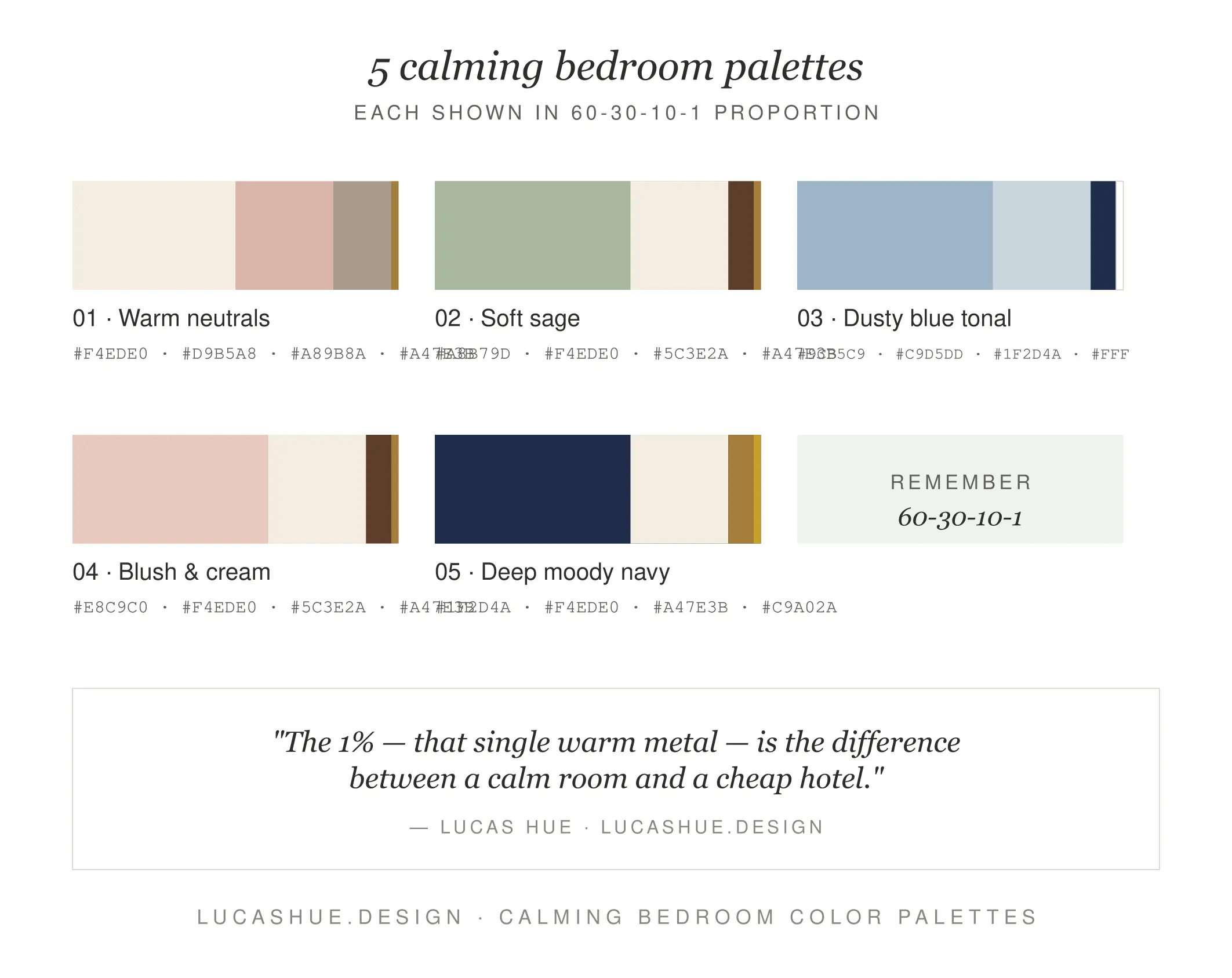
These are five palettes I've actually used on paid projects between 2022 and 2025. Hex codes match Dulux/Benjamin Moore equivalents in most cases — confirm at the store.
1. Coastal Quiet
Used on 9 of my Queensland projects.
- 60%: Soft chalk white #EFEAE0
- 30%: Driftwood linen #C9BFB1
- 10%: Deep ocean #2E4A5C
- 1%: Aged brass
2. Forest Floor
Best for north-facing rooms with poor light.
- 60%: Mushroom taupe #A89E91
- 30%: Mossy olive #6B6E4A
- 10%: Burnt clay #B05A3C
- 1%: Matte black
3. Hotel Suite
My most-requested master bedroom palette.
- 60%: Warm dove grey #C7C2BA
- 30%: Charcoal velvet #3A3A3D
- 10%: Soft camel #B6976B
- 1%: Polished nickel
4. Plaster Pink
The one clients hesitate on, then love.
- 60%: Tonal plaster #E5D4C7
- 30%: Caramel #A37857
- 10%: Forest green #3C5544
- 1%: Antique gold
5. Inkwell
For people who want a cave, not a cloud.
- 60%: Deep navy #1E2A38
- 30%: Cream linen #ECE4D2
- 10%: Rust #9C5230
- 1%: Brushed brass
Deep Dive: Why "Calming" Colors Often Aren't
Here's the contrarian part. Pale blue is not automatically calming. Sage green is not automatically restful. Beige is not automatically peaceful.
I learned this the hard way in 2019. A client requested "the most calming bedroom possible." I gave her textbook serenity — pale blue walls, white linen, soft grey curtains. She called me three weeks later. She hated it. Couldn't sleep. Felt like she was in a dental clinic.
What actually calms the nervous system in a bedroom is contrast control, not color choice. Two factors matter more than the hue itself:
1. Value range
The lightest and darkest things in your room shouldn't be more than about 60% apart on a black-to-white scale. White sheets on a black bed in a pale blue room? Your eye treats that like a strobe light.
2. Tonal warmth consistency
Mixing cool greys with warm beiges creates low-grade visual friction. Your brain notices. Pick a temperature lane — warm or cool — and stay in it.
The "calmest" bedroom I've ever designed was painted a deep, smoky terracotta. Not a soft color in sight. But every value was within range, and every undertone was warm. The client described it as "sleeping inside a hug."
Calming isn't a color. It's a relationship between colors.
Pro Tips From 47 Real Projects
- Skip pure white ceilings. Tint your ceiling paint 25% toward your wall color. Pure white ceilings make walls look dingy by contrast. This is the single cheapest upgrade you can make.
- The headboard wall is not automatically the feature wall. In small bedrooms, painting the wall behind your head a deeper color makes the room feel bigger, not smaller. You're not looking at it when you're in bed.
- Buy bedding before paint. Paint colors are infinite. Bedding you actually like is rare. Match paint to bedding, never the reverse.
- Avoid the "matchy" trap. If your curtains, bedding, and rug are all the same shade, the room reads flat. Vary the value within your 30% zone.
- Test paint on the wall opposite the window, not next to it. Light bouncing off the window-side wall lies to you about the actual color.
- One metal finish, full stop. Mixing brass, chrome, and black hardware in the same bedroom is the easiest way to make an expensive palette look cheap.
FAQ
What are the best calming bedroom colors for beginners?
Warm neutrals with low value contrast. Plaster pink, mushroom taupe, and warm dove grey are the most forgiving anchors I recommend to first-time DIYers because they hide application mistakes and pair with almost any bedding.
How many colors should a bedroom color palette have?
Four. One dominant, one companion, one accent, one metallic. More than four and the room loses focus. Fewer than four and it feels unfinished.
What's the best bedroom paint palette for small rooms?
A single tonal range — three values of the same color family — applied across walls, ceiling, and trim. This removes visual breaks and makes a small bedroom read as one continuous space rather than a chopped-up box.
Should master bedroom colors be different from guest bedroom colors?
Yes. Master bedrooms can carry deeper, more saturated anchors because you're in there long enough to settle into the color. Guest rooms should stay lighter and more neutral — your guests don't need to bond with the wall.
Can dark colors work in a bedroom with no natural light?
Absolutely. The mistake is fighting the darkness with pale paint, which just looks grey and depressing under artificial light. Lean into it. Deep navy, charcoal, or smoky green with warm lighting beats sad beige every time.
How long does it take to choose a bedroom color palette using this method?
About 90 minutes once you have your North Star object. The 72-hour wall test adds three days, but the actual decision-making is fast.
Final Thoughts
Your bedroom color palette is not a personality test. It's a system. Pick your anchor, hold the 60-30-10-1 ratio, control your value range, and stay in one temperature lane. That's the whole job.
If you've used the 60-30-10-1 method on your own bedroom, drop your palette in the comments — I read all of them and reply within a week. And if you're tackling the rest of the house next, my next read for you is below.
Sleep well.
Related read: How to Choose a Whole-Home Color Palette Without Losing Your Mind (coming soon)


Comments 2