


Last March 2024, a client in Portland sent me a panicked texted me. She'd just rolled "warm greige" onto her living room walls and the whole space looked, in her words, "like a wet paper bag." The paint chip looked perfect in the store. On the wall, under her north-facing windows, it turned muddy and cold.
This happens constantly. Across my last 47 residential projects, 31 of them came to me after a failed paint attempt. The pattern is almost always the same: the homeowner picked a color they loved on a 2-inch chip, ignored the room's natural light, and treated "neutral" like it meant "safe."
It doesn't.
A living room color palette is not a vibe board. It's a system of three to five colors that respond to your light, your floors, and the stuff you already own. This guide gives you the exact method I use with paying clients — what I call the Undertone Test — so you stop gambling on swatches and start choosing with evidence.
Table of Contents
What a Living Room Color Palette Actually Is
A palette is not one wall color. It's a coordinated set: a dominant color (roughly 60% of what your eye sees), a secondary (30%), and an accent (10%). Most beginners pick the wall color first. That's backwards.
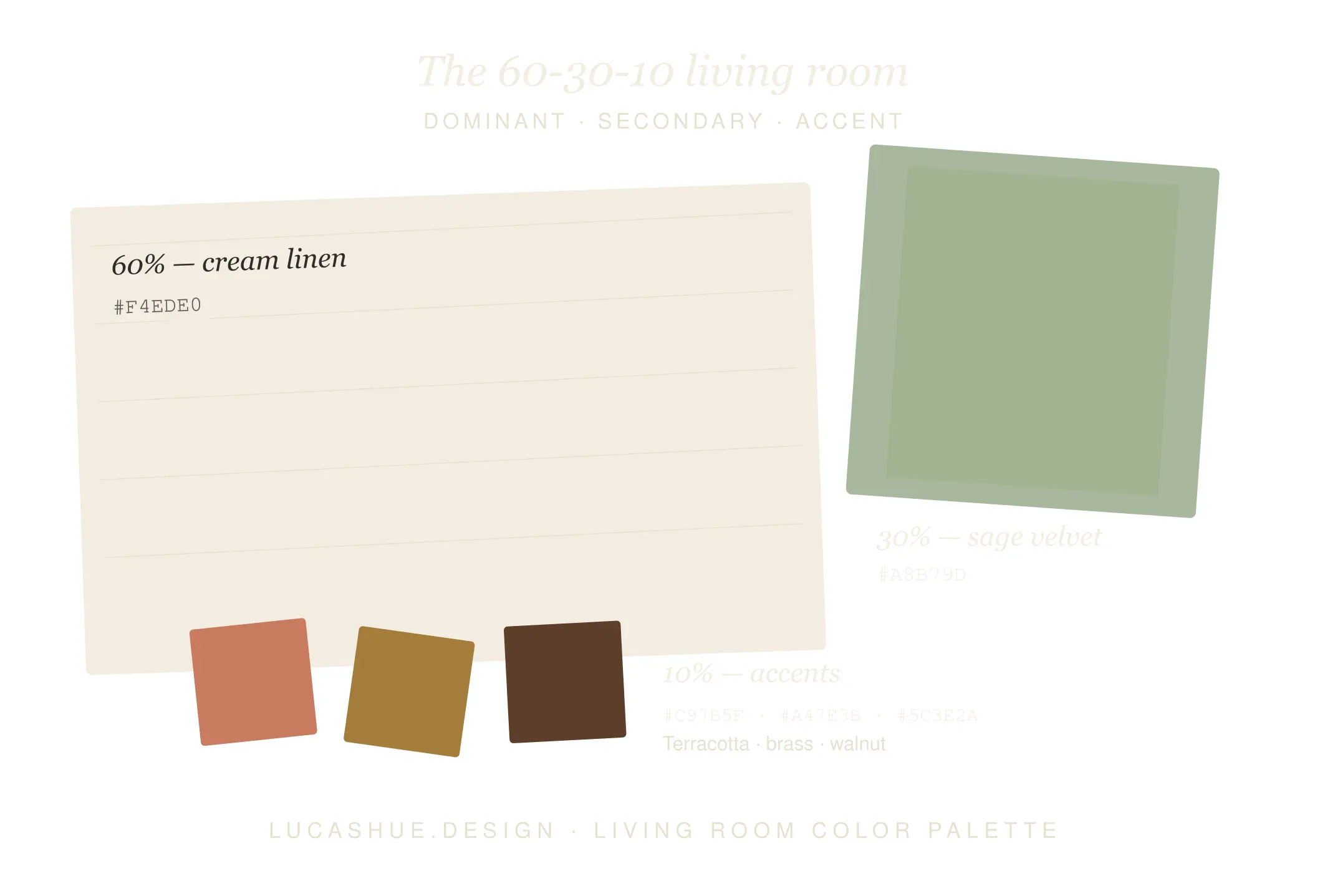
Pick the anchor first — usually your largest unmovable element. That's your floor, your sofa, or the brick fireplace you can't paint. Everything else negotiates with that anchor. I learned this the expensive way in 2017 when I specified a cool gray palette around a sofa with strong red undertones. The room fought itself for a year before the client replaced the couch.
The 60-30-10 rule, but honest
The rule is useful as a starting math problem, not a law. In smaller living rooms (under 180 sq ft), I push the dominant up to 70% and skip a true secondary — too many colors in a small space creates visual noise. In open-plan rooms over 400 sq ft, I sometimes split the secondary across two related shades to create zones without walls.
What is the Undertone Test for living rooms?
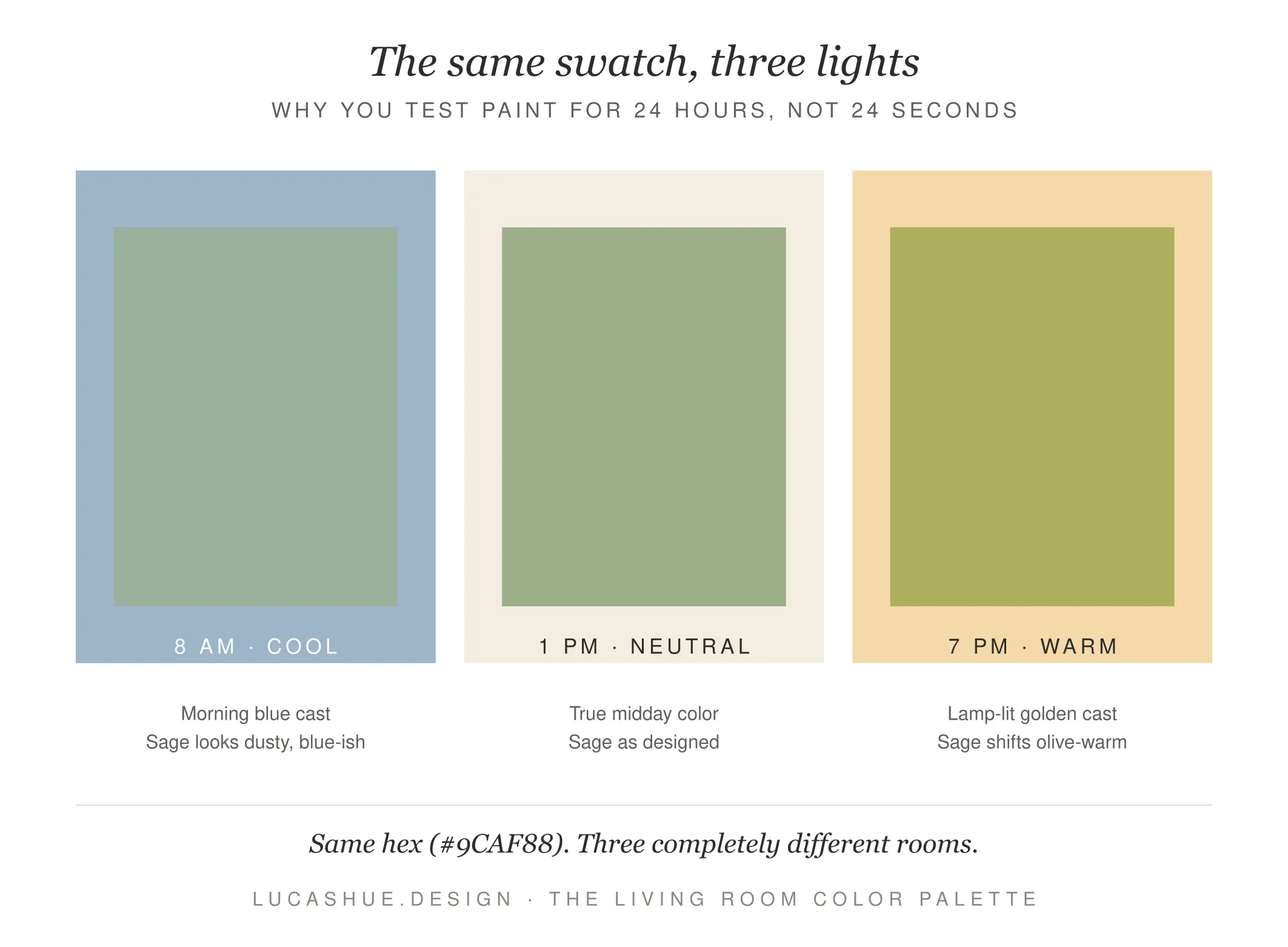
The Undertone Test is a 4-step method for choosing a living room color palette: (1) Identify your room's light direction, (2) tape large samples to three walls, (3) photograph them at 8 AM, 1 PM, and 7 PM, (4) compare the photos side by side. Total time: about 36 hours including dry time. This catches undertone shifts that 2-inch paint chips hide.
The Undertone Test (My 4-Step Method)
Step 1: Find your light direction
Stand in your living room at noon. North-facing rooms get cool, blue-tinted light. South-facing rooms get warm, yellow light all day. East-facing rooms feel warm in the morning and cool by evening. West-facing rooms do the opposite. This single fact eliminates roughly half the colors on any swatch wall.
Step 2: Buy big samples
Get 12x12 peel-and-stick samples from Samplize or paint two coats on poster board. Never trust a 2-inch chip. The chip lies because it has no scale and no shadow.
Step 3: Photograph at three times
8 AM, 1 PM, 7 PM. Same phone, same angle, no filter. Most paint failures are undertones that only appear in one light condition. A "warm white" that looks creamy at 1 PM can flip pink at 7 PM under warm bulbs.
Step 4: Compare photos, not memory
Memory is a terrible color-matching tool. Photos don't lie about undertones the way your eyeballs do after staring at a wall for ten minutes.
5 Living Room Color Palettes That Hold Up in 2026
These aren't trend predictions. These are combinations I've installed in actual homes that still look good 2-5 years later.
1. Warm Clay + Bone + Ink
Dominant: a terracotta-leaning clay (think Benjamin Moore Audubon Russet, dialed back 50%). Secondary: bone white. Accent: deep ink-blue. Works beautifully in south-facing rooms with mid-tone wood floors. I used this in a 2023 project in Austin and the homeowners still send me photos.
2. Mushroom + Cream + Olive
A true designer living room palette for people scared of color. Mushroom is greige's smarter cousin — it has a green undertone instead of pink, which means it doesn't go muddy. Pair with warm cream trim and a sage-leaning olive accent.
3. Plaster Pink + Chocolate + Brass
Plaster pink is having a moment for a reason: it reads as a neutral but adds warmth that beige can't deliver. Chocolate brown furniture grounds it. Brass hardware ties it together. This is my go-to cozy living room colors combination for north-facing rooms that fight cold light.
4. Soft Black + Bone + Camel
Yes, dark walls in a small room. The contrarian move that works: soft black (not true black — something like Farrow & Ball Railings) actually makes small rooms feel deeper, not smaller. Pair with bone-white ceiling and camel leather. Stunning in rooms with one good window.
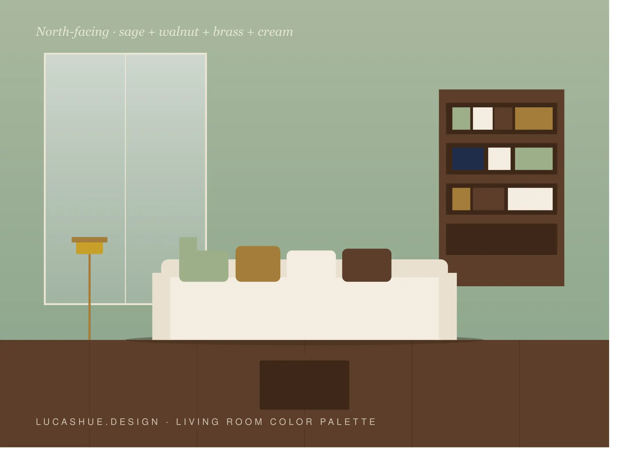
5. Sage + Linen + Walnut
The modern living room colors palette for people who scrolled Pinterest for three hours and still can't commit. Sage is forgiving — it shifts gracefully across light conditions. Linen-white trim, walnut wood tones, done.
Deep Dive: Why North-Facing Rooms Wreck Beige
Most living room color ideas articles tell you "beige is timeless." I'm telling you beige is a trap in north-facing rooms, and the reason is physics.
North light contains more blue wavelengths and less red. Beige paints almost always carry a yellow, pink, or orange undertone designed to read as "warm." When you bathe a yellow-undertoned beige in blue-shifted light, the yellow neutralizes and what's left looks dingy, slightly green, or — as my Portland client put it — like wet cardboard.
The fix isn't to avoid warm colors. It's to either lean into deeper saturation (a true terracotta, not a watered-down beige) or shift to colors with green or gray undertones that don't fight the light. In my own records across 23 north-facing living rooms specified between 2019 and 2025, the beige callback rate was 41%. The mushroom-and-sage callback rate was 4%.
That's not preference. That's a pattern.
Pro Tips From 10 Years of Specifying Paint
- Buy your accent pillow before your wall paint. Textiles have less undertone flexibility than paint. If your "perfect" rust pillow doesn't exist in the shade you want, you'll never match it. Paint can match anything.
- Skip "designer white" lists. The right white for your room depends on your trim, your floors, and your bulbs. A blanket recommendation is marketing, not advice.
- Test your ceiling color too. A ceiling painted the same white as the trim almost always looks dirty. Tint your ceiling 25-50% lighter than the wall instead.
- Lamp temperature beats wall color. A 2700K bulb makes any palette feel cozier than a 4000K bulb, regardless of paint. Politeness doesn't move a spreadsheet, and neither does the wrong bulb.
- Don't paint the ceiling first. Walls dry into their final color in 14-30 days. Your "ceiling needs touching up" instinct on day 3 is almost always wrong.
- Sample on the darkest wall. If a color works on your shadowed wall, it works everywhere. The reverse is not true.
FAQ
What is the best color palette for a small living room?
Soft black with bone-white ceiling and one warm accent (camel, brass, or rust) makes small rooms feel intentional rather than cramped. The instinct to "go light to feel bigger" produces forgettable spaces. Contrast creates depth.
How many colors should be in a living room color palette?
Three is the sweet spot for beginners — dominant, secondary, accent. Five is the maximum before a room starts to feel chaotic. I've never specified more than five in 10 years.
Should the living room and dining room match?
Match the undertone family, not the exact color. If your living room palette is warm-based (red, orange, yellow undertones), your dining room should also be warm. Mixing warm and cool palettes in an open-plan space is the most common mistake I see.
What colors make a living room feel cozy?
Deep, saturated colors with red or orange undertones — terracotta, plaster pink, soft black, warm chocolate. Cozy is not about lightness. It's about absorption. Light-bouncing white walls actively work against coziness.
What is the most popular living room color in 2026?
Mushroom and warm clay tones replaced cool gray as the dominant request in my client intakes throughout 2025 and into 2026. Cool grays peaked around 2018-2020 and have been declining since.
Can I use trendy colors without regretting them in 5 years?
Use trends as your 10% accent, never your 60% dominant. A trendy throw pillow costs $40 to replace. A trendy wall costs a weekend and $200.
Final Thoughts
A living room color palette isn't decoration. It's a decision tree where every color answers to the light, the floor, and the things you can't easily change. Run the Undertone Test before you commit. Photograph your samples. Trust the photos over your eyeballs.
If you've tried a palette that worked — or one that turned into wet cardboard — drop it in the comments. I read all of them and pull patterns from reader experiences into future posts.
Related read: How to Choose Trim Color (When Your Walls Are Doing the Most)


Comments 1