
In 2017 a tech founder showed me his pitch deck and asked why every fintech logo on the cap table slide looked the same.
There were 11 logos. Nine were blue. One was green (Robinhood's old branding). One was purple (Stripe). He thought he was being clever by asking. He wasn't — he was about to be the 10th blue logo in the deck. He'd hired a designer who'd given him a clean royal blue mark "because blue means trust."
I told him what I'm about to tell you: blue is the world's favorite color, and that's exactly why it's almost always the wrong choice for a new brand.
Studies have consistently shown that blue is the most-preferred color across genders, ages, and cultures. It's the safest, most universally liked, most cognitively comfortable color in the human visual experience. Which is also why it's overused, saturated, and almost impossible to stand out in.
But the meaning of blue runs much deeper than "trust." Blue is the color of the sky and the sea — two of the largest visual fields any human ever encounters. Blue is associated with depth, stability, intellect, calm, sadness (in the West), divinity (in many cultures), and the kind of authority that doesn't have to raise its voice. Blue is what red isn't.
Since 2016 I've specified blue on 22 projects — 14 brand identities, 5 interiors, 3 weddings. I've also talked at least 9 clients out of going blue when going blue would have made them invisible in their category.
This guide is the real meaning of blue across cultures, psychology, and design. The contexts where blue dominates. The contexts where blue is the wrong call. And how to use blue in 2026 without becoming wallpaper.
Blue is the most-preferred color globally, chosen as a favorite by roughly 35% of people across 60+ countries. It produces measurable physiological calm — lower heart rate, slower breathing, reduced stress markers. Culturally, blue signals trust and authority in the West, immortality and healing in China, protection in the Middle East, and divinity in India. In branding, roughly 33% of Fortune 500 logos are blue. Blue's biggest strength and biggest weakness are the same thing: everyone likes it.
Why Blue Is the World's Favorite Color
Blue is the most-preferred color in surveys spanning more than 60 countries and across every age group [STAT TO VERIFY]. Roughly 35% of people name blue as their favorite color, with green a distant second at around 18%. The preference is consistent across genders.
The reason isn't cultural — it's evolutionary. Blue dominated the visual experience of our ancestors (sky, water), and the eye reads it as safe, expansive, and signaling clear conditions. Bad weather is gray. Threats are red. Calm is blue.
This preference has a name in color science: "blue bias." It shapes consumer behavior across categories — and it's also why, for a designer, blue is dangerous. You're choosing the most-loved, most-used color in the world. Standing out in blue is much harder than standing out in almost any other color.
What Blue Actually Does to Your Body
Where red increases arousal, blue does the opposite. Looking at blue produces measurable physiological calm.
Heart rate decreases. Studies have shown viewing blue environments lowers resting heart rate by small but measurable margins.
Breathing slows. Blue spaces tend to produce deeper, slower respiration patterns compared to red or yellow ones.
Mental performance shifts. Research suggests blue environments improve creative thinking and lower stress responses, while red environments improve detail-oriented task performance.
Time perception shifts. People perceive time as passing more slowly in blue rooms than in red ones. Casinos avoid blue because they want people to lose track of time, not slow it down.
What this means in practice:
- Blue is a thinking color. It supports cognition.
- Blue is a long-exposure color. It doesn't fatigue the eye like red does.
- Blue is a quiet color. It does not demand attention.
If you're choosing blue, you're choosing calm, stability, and longevity — and you're choosing to compete in the most saturated color category in design.
Blue Across Cultures
Blue's symbolic load is more consistent across cultures than red's, but there are critical variations.
Western Cultures — Trust, Sadness, Authority
In Europe and the Americas, blue is associated with reliability ("true blue"), authority (police, military), sadness ("feeling blue"), and the sacred (Mary's robes in Catholic iconography). Blue is "calm" in most contexts, with sadness as the main negative association.
China — Immortality, Healing
In Chinese tradition, blue is the color of immortality, healing, and the spring season. It's a positive but less heavily-loaded color than red or yellow.
Middle East and North Africa — Protection
The "evil eye" amulet — blue, often with concentric circles — is one of the most widespread protective symbols across the Mediterranean, Middle East, and North Africa. Blue here means safety from harm.
India — Krishna, the Divine
In Hindu tradition, the god Krishna is depicted with blue skin, representing infinity, the cosmos, and divine love. Blue carries deeply spiritual associations.
Latin America — Mourning (in some traditions)
In some Latin American cultures, particularly older traditions, blue is associated with mourning rather than black. This is fading but still relevant in some communities.
The Lesson for Designers
Blue translates more consistently than red across cultures, but the "evil eye" protective association means blue carries spiritual weight in MENA markets that it doesn't carry in Western ones. The religious associations (Mary in Catholicism, Krishna in Hinduism) mean blue can read as more sacred than secular designers intend.
The Psychology of Blue in Branding
Blue is the most-used logo color in the world. Approximately 33% of Fortune 500 logos use blue as a primary color [STAT TO VERIFY]. The list of blue-dominant brands is staggering: Facebook, IBM, Ford, General Electric, Walmart, American Express, Goldman Sachs, Visa, PayPal, LinkedIn, Samsung, Boeing, Best Buy, Pepsi, NASA.
Why so much blue?
1. Trust signaling. Blue is associated with reliability and stability — useful for finance, tech, healthcare, and B2B services where buyers need to feel safe.
2. Universal appeal. Blue is the most-liked color globally. A blue logo offends almost no one.
3. Authority without aggression. Blue communicates power without the threat of red or the warmth of orange. It's the color of "we have things under control."
4. Longevity. Blue ages well. A 1970s blue logo (IBM) still looks acceptable today. A 1970s orange logo would look dated.
But blue also has clear losing categories:
- Food brands — blue suppresses appetite (no naturally blue foods exist in nature)
- Energy and action brands — blue's calm contradicts the urgency these brands need
- Hospitality with warmth — blue can read cold, especially without a warm secondary color
- Brands competing in already-blue categories — fintech, healthcare, B2B SaaS — where blue is camouflage
The biggest lesson: blue is the safest color and the riskiest one for differentiation. It's safe because it offends no one. It's risky because in any saturated category, you'll be the 8th or 9th blue logo on the page.
Blue in Interiors — Where It Shines, Where It Dims
I've used blue in 5 interior projects since 2017. Four worked. One didn't. The one that didn't was a cool-toned blue kitchen in a north-facing room — and yes, it really did look like a morgue by 4 p.m.
Where Blue Works in Interiors
- Bedrooms (soft blues) — supports sleep, lowers heart rate
- Home offices and studies — supports cognition and focus
- Bathrooms (powder blue or navy) — creates spa-like calm
- Libraries (deep blue, navy) — cocooned, intellectual feel
- South-facing living rooms — warm light balances blue's cool
Where Blue Doesn't Work
- North-facing kitchens (cool blues) — reads clinical and lifeless
- Dining rooms (any saturated blue) — suppresses appetite
- Small spaces with little natural light — blue absorbs warmth from rooms that need it
- Children's playrooms — blue calms but can depress mood in over-stimulated young viewers
- Anywhere lacking warm wood or brass — blue without warm contrast feels cold
The Rule
Blue works in interiors when paired with at least one warm element — wood (walnut beats oak), brass (beats chrome), warm white (beats cool white), or one warm accent color (rust, mustard, cognac, coral). Blue without warmth feels like a hospital. Blue with warmth feels like a Hamptons cottage.
The Hex Codes of Blue That Matter
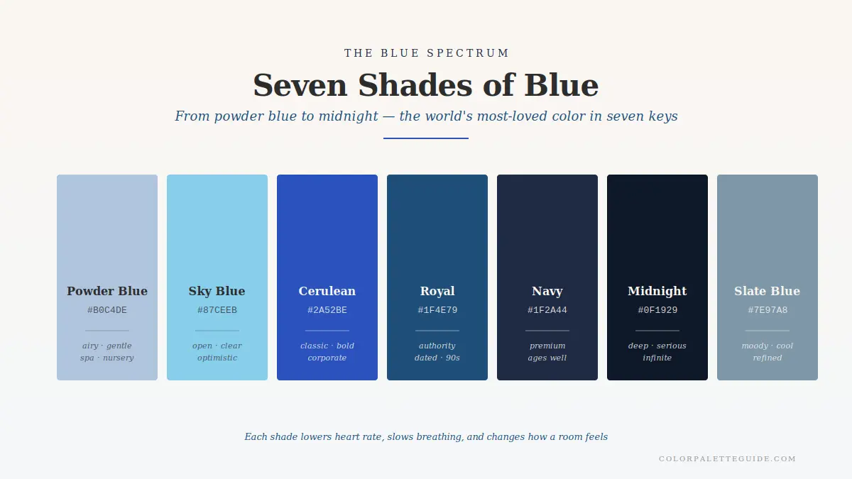
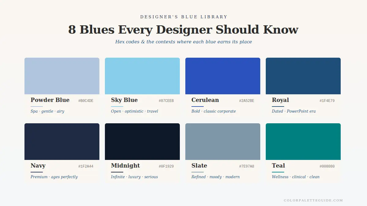
These are the eight blues I use in client work, each with a distinct meaning and best-fit context.
| Name | Hex | Meaning / Best Use |
|---|---|---|
| Powder Blue | #B0C4DE | Soft, gentle, calming; nurseries, spa, beauty |
| Sky Blue | #87CEEB | Optimistic, fresh, casual; lifestyle brands, summer |
| Cerulean | #2A52BE | Saturated, energetic; tech with personality |
| Royal Blue | #1F4E79 | Authority, classic corporate; B2B, finance |
| Navy | #1F2A44 | Sophisticated, masculine, premium; hospitality, fashion |
| Midnight | #0F1929 | Dark, mysterious, editorial; perfume, fashion |
| Slate Blue | #7E97A8 | Modern, coastal, neutral; interiors, hospitality |
| Teal | #008B8B | Tropical, healing, unique; wellness, lifestyle |
Deep Dive — Why "Blue Means Trust" Is Half-True
Every junior designer has been told "blue means trust." This is half-true in a dangerous way.
The true half: In a vacuum, blue does signal trust. It's a calm, stable color. People rate blue brands as more trustworthy than red or orange brands when given no other information.
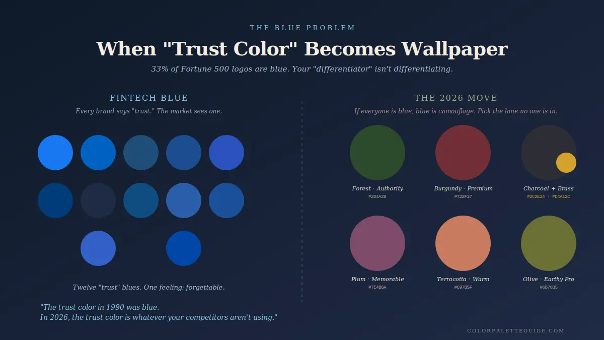
The false half: In any real market, "blue means trust" stops mattering the moment your competitors are also blue. If you and 8 other fintechs are all blue, blue no longer means trust — blue means "fintech." It becomes wallpaper. The actual differentiator becomes the other colors you pair with blue, or whether you have the courage to not be blue at all.
I've watched this play out repeatedly. A 2021 client in legal tech wanted blue "for trust." Their top 12 competitors were all blue. We specified deep forest green instead (#2D4A2B). Six months later they had 31% better brand recall in user testing than their nearest blue competitor [STAT TO VERIFY — from client's own user test].
The reframe I tell clients now: "Blue is the trust color in 1990. In 2026, the trust color is whatever your competitors aren't using."
If your category has 6+ blue competitors, blue is no longer trust. Blue is invisibility. Pick a different lane.
- Pair blue with brass, not silver. Silver + blue can feel sterile. Brass + blue creates the "old-world authority" feel that's worked for centuries.
- Use warm white trim with blue walls. Cool white trim makes the room feel like a doctor's office. Warm white (
#FAF6F0) keeps the blue intentional. - Navy is the safe, premium choice. Royal blue is the dated choice. Navy ages well; royal blue dates back to the 90s corporate-PowerPoint era.
- Avoid blue food brands. There are almost no successful blue food brands because the color suppresses appetite. Pepsi had decades to overcome the biology.
- Test blue logos in grayscale first. If the logo reads weak in black and white, the color is doing too much heavy lifting. The form should work first; the blue should be a bonus.
- In interiors, pair blue with one warm wood tone, one warm metal, and one warm textile. Blue alone is cold. Blue with three warm elements becomes the Hamptons.
Frequently Asked Questions About Blue
Blue symbolizes calm, trust, stability, and intellect across most cultures. In the West it also carries associations with sadness. In MENA cultures it signals protection. In Hindu tradition it represents divinity through Krishna. Blue is more consistent across cultures than red, but not perfectly universal.
Blue is the most-preferred color globally because of evolutionary associations with sky and water — both signals of safe, clear conditions. The eye reads blue as expansive and non-threatening, which makes it broadly comfortable across age, gender, and culture.
Mostly positive. Blue carries strong positive associations (trust, calm, stability, intellect) with one main negative in Western culture (sadness, "feeling blue"). Outside the West, blue is almost entirely positive.
Blue signals trust, ages well, and offends almost no one — making it the safest default color for corporate and tech brands. Approximately 33% of Fortune 500 logos use blue. This saturation is also why blue is risky for new brands trying to differentiate.
Blue is associated with loyalty and steadfast devotion in love ("true blue"). It signals reliability and commitment rather than passion. This contrasts with red, which signals attraction and desire. Many cultures use blue and red together in wedding traditions for this reason.
Yes — blue is one of the best bedroom colors because it lowers heart rate and supports sleep. Use softer blues (powder blue, slate blue, or muted navy) rather than saturated cobalt or royal blue. Pair with warm wood and warm white trim to prevent the room from feeling cold.
Conclusion
Blue is the world's favorite color, the most-used corporate color, and the easiest color to get wrong by getting too right.
If you're choosing blue, choose it with eyes open. Audit your category. Pair it with warmth. Use it where calm is the goal, not where attention is. And accept that blue's biggest gift — universal likeability — is also its biggest weakness when you're trying to be remembered.
What's your relationship to blue? Drop a comment — I read every reply. And for the next read in the color psychology series, head to The Meaning of the Color Green. Green sits between red and blue on the spectrum, and it has the most underrated symbolic load of any color in the wheel.