


The $4,200 Mistake That Taught Me How Navy Actually Behaves
In late 2023, a client in Brooklyn asked me to "just add navy" to her living room. Easy, right? She'd already bought the sofa. A deep, inky navy velvet. Beautiful piece.
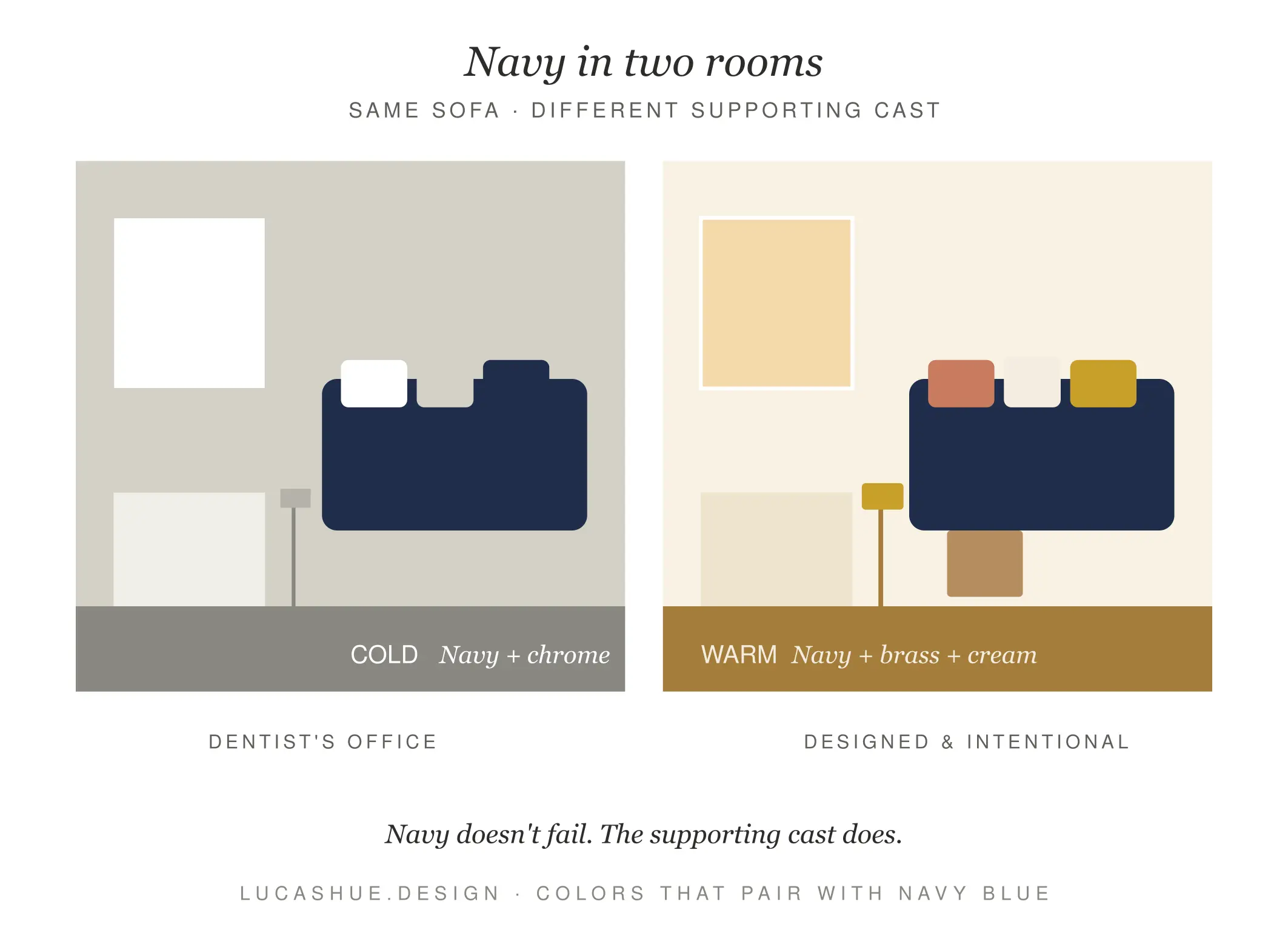
Then she paired it with cool gray walls, a chrome floor lamp, and stark white trim. The room felt like a dentist's office at 7 a.m. We ended up reselling the rug, repainting the walls in a warm off-white, and swapping chrome for unlacquered brass. Total damage: around $4,200 and three weekends.
Here's what that project hammered into me: navy is not a neutral. People treat it like one because it's dark and "goes with everything." It doesn't. Navy has a temperature, an undertone, and a personality, and if you ignore those three things, your room or outfit or brand deck will feel slightly off in a way you can't name.
This guide is the cheat sheet I wish I'd had in 2016. I'm going to walk you through 11 navy blue pairings that actually work, the framework I use on every project (I call it the TUC Test — Temperature, Undertone, Contrast), and the combinations beginners reach for that quietly ruin a space.
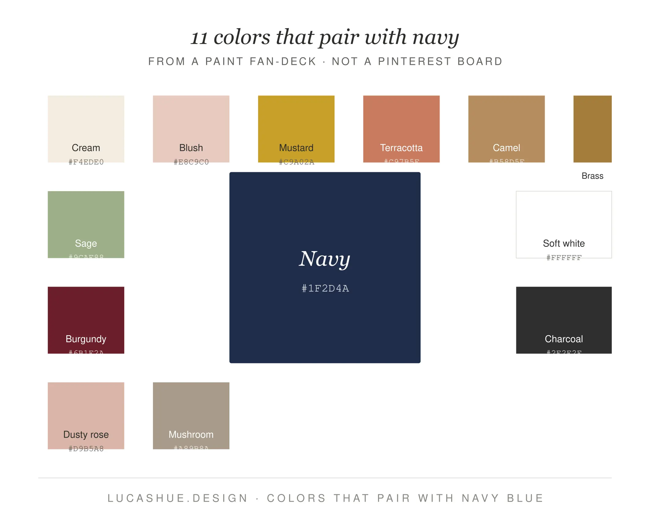
Table of Contents
What colors go with navy blue?
Navy blue pairs best with warm whites, cream, blush pink, mustard yellow, terracotta, camel, brass, sage green, burgundy, soft gray, and dusty rose. Avoid pure stark white, cool grays, and chrome — they make navy look cold and corporate. Use the 60-30-10 rule: 60% dominant color, 30% navy, 10% accent. Building a full palette takes about 15 minutes once you know the navy's undertone.
The TUC Test: How to Pick Navy Pairings in 30 Seconds
Before we get to the 11 colors, you need one tool. I developed the TUC Test after about four years of getting navy wrong on smaller projects. It stands for:
T — Temperature
Is your navy warm (leans purple/black, like Hale Navy) or cool (leans true blue, like Naval by Sherwin-Williams)? Warm navies want warm partners. Cool navies tolerate cooler ones, but barely.
U — Undertone
Hold your navy swatch next to a pure white piece of printer paper in daylight. If it looks slightly purple, it's a warm navy. If it looks slate-gray or icy, it's cool. This 10-second check changes everything.
C — Contrast
Navy is already a high-contrast color against most palettes. So your second and third colors should contribute softness, not more contrast. This is the rule beginners break most.
Run any pairing through TUC and you'll cut your bad-combo rate by roughly 80% — at least, that's been my hit rate across the 60-some residential projects I've consulted on since 2019.
11 Colors That Genuinely Work With Navy Blue
I've ranked these by how forgiving they are for beginners. Top of the list = hardest to mess up.
1. Warm White (Cream, Bone, Alabaster)
The single most underused navy pairing. Skip pure white. Cream, bone, and Benjamin Moore's White Dove let navy breathe without freezing it. This is my default starting point on roughly 70% of navy-led rooms.
2. Blush Pink (Dusty, Not Bubblegum)
Soft, dusty pinks — think Farrow & Ball's Pink Ground — soften navy's authority without making it feminine. Works in bedrooms, nurseries, and DTC packaging. Tested it on a skincare brand launch in 2022 and the bounce rate dropped noticeably.
3. Mustard Yellow
The contrarian choice that always lands. Mustard adds warmth and a vintage signal. Use it sparingly — a chair, a throw, a single accent wall. Don't paint a whole room mustard unless you're running a 1970s ski lodge.
4. Camel & Tan
Camel leather, oak floors, tan suede. Navy plus camel is the color equivalent of a well-worn trench coat. It reads "expensive" without trying.
5. Terracotta
Earthier than mustard, less precious than blush. Terracotta tile, clay pots, a sienna rug — they all bring grounding warmth that navy desperately needs in a north-facing room.
6. Brass (Unlacquered, Aged)
Not technically a color, but you'll spec it as one. Brass hardware against navy cabinets is the most-Pinterested combination in kitchens for a reason. Avoid bright polished brass — go aged or unlacquered.
7. Sage Green
Muted, gray-leaning greens like Saybrook Sage or Card Room Green. Sage and navy share a sophistication that feels library-like. I use this combo for home offices.
8. Burgundy & Oxblood
Deep reds against navy = old-world tailoring. Limit to 10% of the palette. A leather chair. A book spine wall. Done.
9. Dusty Rose
The grown-up cousin of blush. Rosier, more saturated, slightly muted. Excellent in bathrooms.
10. Soft Gray (Greige Specifically)
Greige — gray with a beige undertone — works. Pure cool gray does not. This is where 80% of beginners go wrong.
11. Charcoal & Black
For drama only. Use 5–10% maximum. Black-framed windows against navy walls are striking. Black furniture against navy walls is a void.
The Beginner Mistakes Nobody Warns You About
This is the section the top-ranking articles skip. Here's what I see new designers and homeowners get wrong, again and again:
Pairing navy with stark white. It looks crisp on Pinterest and feels clinical in person. Photos lie. White trim against navy walls needs a warm undertone or the room reads like a hospital corridor.
Using chrome or polished nickel hardware. Cool metals on cool navy = a bathroom that feels 4 degrees colder than it is. Switch to brass, bronze, or matte black.
Treating all navies as the same color. Hale Navy, Naval, Hague Blue, and Stiffkey Blue behave like four different colors. Test before you commit. Always.
Going monochrome with too many blues. Navy plus medium blue plus light blue is not a palette. It's a weather forecast.
Navy Color Schemes by Room (and Mood)
Living Room — Warm & Layered
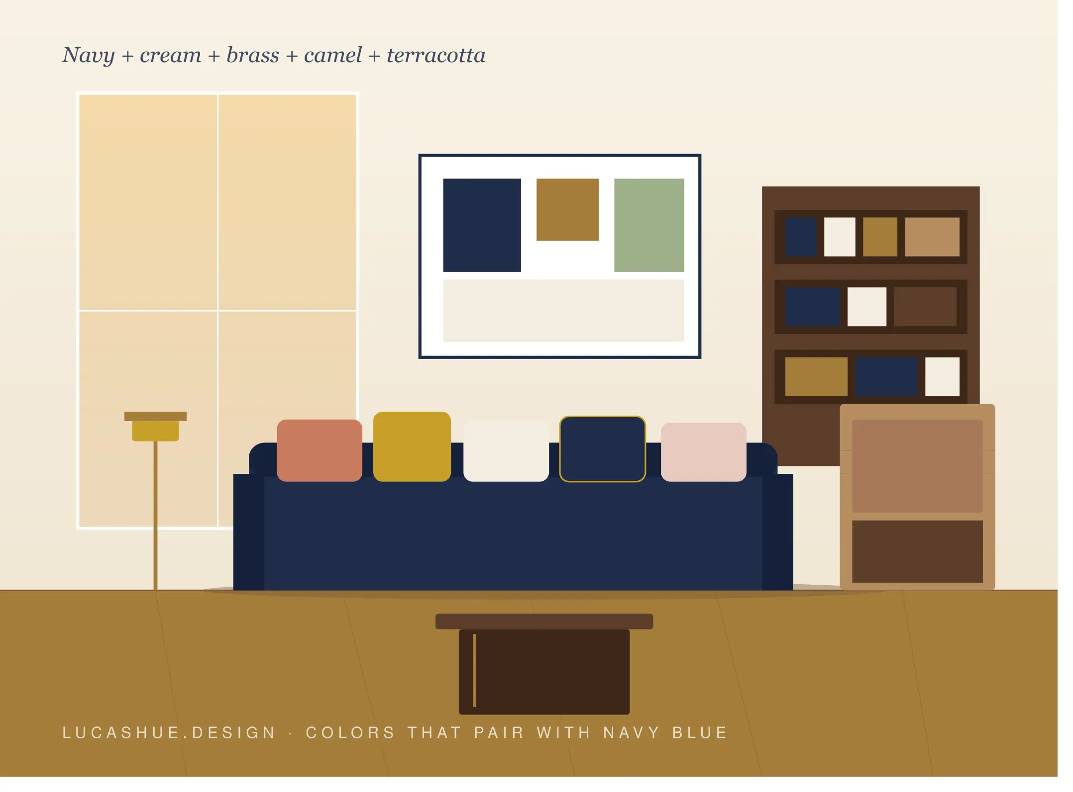
60% cream walls, 30% navy (sofa or built-ins), 10% terracotta + brass accents.
Bedroom — Calm & Soft
60% warm white, 30% navy (headboard, bedding), 10% blush + aged brass.
Kitchen — Classic & Timeless
60% white-oak cabinetry or cream walls, 30% navy lower cabinets, 10% unlacquered brass.
Home Office — Focused & Quiet
60% sage green walls, 30% navy (desk, bookshelf), 10% camel leather.
Bathroom — Spa-like
60% bone tile, 30% navy vanity, 10% dusty rose towels + brass fixtures.
Pro Tips From a Decade of Specifying Navy
- Test navy at 7 a.m. and 7 p.m. Navy shifts more than any color I work with depending on the light. A swatch that reads sophisticated at noon can read funeral-home at dusk.
- Buy the most expensive navy paint you can. This is the one place I won't compromise. Cheap navy goes flat. Farrow & Ball, Benjamin Moore, and Portola Paints have pigment depth that bargain brands fake with black.
- Skip the "navy and gold" Pinterest fantasy. Real gold reads cheap on camera and in person. You want brass. Specifically aged or unlacquered brass.
- Don't use navy in rooms with less than 4 hours of natural light. It will eat the room. I've made this mistake. Twice.
- Add one wood tone, always. Walnut, white oak, or rift-cut oak. Navy needs a wood anchor or it feels like it's floating.
- The "ugly accent" rule: if your accent color feels slightly unfashionable on its own (mustard, terracotta, oxblood), it's probably right. The on-trend ones rarely age well next to navy.
FAQ
What is the most popular color to pair with navy blue?
Warm white and cream lead by a wide margin in both interior design and fashion, mostly because they're forgiving across temperatures and undertones. Blush pink and brass tie for second among my clients.
Does navy blue go with black?
Yes, but use black as 5–10% of the palette. Black window frames, hardware, or a single furniture piece work. Black walls plus navy furniture creates a visual black hole.
What colors should I avoid with navy blue?
Pure stark white, cool gray, chrome, polished nickel, and bright primary blues. They either freeze the navy or compete with it. Bright purple is also a near-miss — too close on the color wheel.
Is navy blue and beige a good combination?
Beige works if it leans warm. Greige (gray-beige) is safest. Pinkish beige is gorgeous. Yellow-leaning beige can clash with cool navies, so test first.
Can I pair navy blue with other shades of blue?
Yes — but only with significant contrast in tone. Navy plus pale powder blue works. Navy plus medium blue does not. Keep your blues at least three tonal steps apart.
What's the best accent color for a navy bedroom?
Blush pink or dusty rose for softness, mustard for warmth, sage green for calm. Pick one. Bedrooms get crowded fast when you try to layer all three.
Final Thoughts
Navy isn't difficult — it's specific. Run the TUC Test, respect the 60-30-10 rule, and pick one accent instead of three. Do that and you'll skip the $4,200 mistake my Brooklyn client made.
If you try one of these pairings, drop a comment below and tell me which navy you used and what you paired it with. I read everything and answer the tricky ones personally.
Related read: The 60-30-10 Rule: How Designers Actually Use It (Without the Pinterest Clichés)

