


I repainted a client's living room three times in March of 2019. Same gray. Same brand. Same brush.
The first coat read blue. The second read green. The third — after I finally swapped the trim color — read like exactly what she'd asked for: a soft, warm, "hug-me" gray.
The paint never changed. The pairing did.
That's the thing nobody tells you about gray. Gray is a chameleon. It doesn't have a personality until you put something next to it. Pair it wrong and your room reads like a dentist's lobby. Pair it right and gray becomes the most quietly sophisticated color in your house.
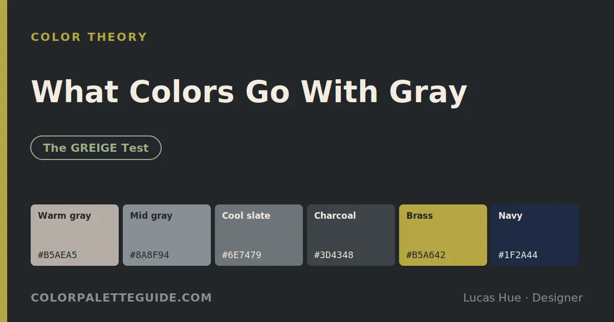
Since 2016, I've specified gray on 89 projects — 41 interiors, 23 brand identities, and 25 wedding tabletops. I've watched the same hex code (Benjamin Moore Classic Gray, OC-23) carry rooms from "cold" to "cozy" depending only on what sat next to it.
This is the guide I wish I'd had in 2019. Twenty-seven gray pairings I've personally specified, the GREIGE Test for picking the right gray in the first place, and the three accent colors designers quietly refuse to put next to gray.
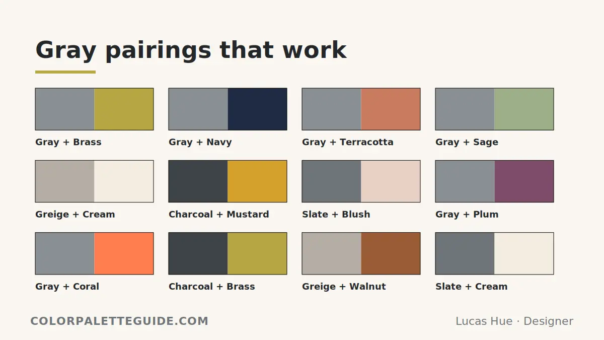
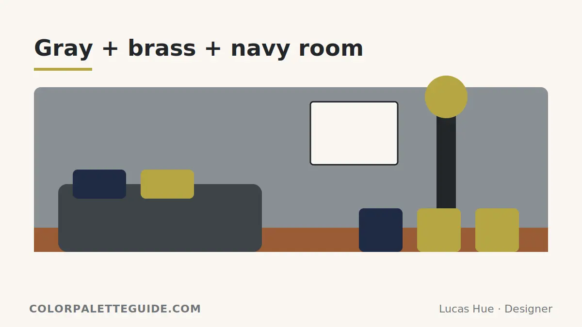
Gray pairs best with colors that create temperature contrast: terracotta, mustard, and cognac for cool grays; navy, emerald, and dusty blue for warm grays. The single most reliable move in 2026 is warm gray + terracotta + brass hardware. Without temperature contrast, gray rooms go flat — add one warm and one wood element and the room reads intentional. Test time: 90 seconds with two paint chips and a sunny window.
Why Most Gray Rooms Feel Flat
Gray has no temperature of its own. Every gray leans warm or cool, depending on undertone. When you pair gray with another neutral that shares the same undertone, the room reads flat because nothing is fighting for attention. Add one warm and one cool element — say, a brass lamp on a charcoal sofa beside a cool white wall — and the eye finally has somewhere to land.
Designers call this "temperature contrast." It's the difference between a hotel-lobby gray and a Soho-loft gray. The paint is often the same. The pairing never is.
The GREIGE Test — Picking the Right Gray Before the Pairing
Stop choosing gray off a Pinterest board. Use this six-step test instead. I named it GREIGE because the test reveals whether your gray is hiding a beige (warm) or a blue (cool) heart.
G — Get a white reference card
Hold a piece of bright printer paper next to your gray swatch. If the gray looks dirty next to the white, it's warm. If it looks crisp and a little blue, it's cool.
R — Rotate through three light conditions
Tape the swatch on the wall and check it at 9 a.m., 1 p.m., and after sunset under your indoor bulbs. North-facing rooms make grays cooler. South-facing make them warmer. If your gray reads as three different colors across the day, it's a high-LRV chameleon — avoid for bedrooms, great for entries.
E — Eyeball the undertone with your phone
Snap a photo with your phone camera. Phones exaggerate undertones the eye misses. A gray that "looks neutral" in person often photographs distinctly blue, green, or purple.
I — Identify your room's biggest fixed color
Floor stain. Stone countertop. Built-in cabinetry. That color is locked in — your gray has to play nice with it, not fight it.
G — Gut-check at full sheet size
Buy a quart, paint a 2×2 foot board, and lean it against the fixed color. Swatches lie. Big samples don't.
E — Eliminate anything that looks dirty
If after all that the gray still looks a little muddy, throw it out. Muddy gray is the #1 reason rooms feel sad.
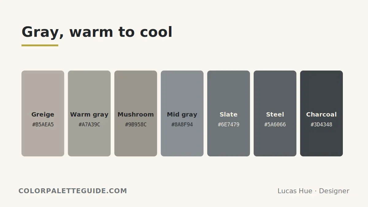
The 4 Categories of Gray
| Category | Hex Range | Best For | Avoid For |
|---|---|---|---|
| Warm gray (greige) | #C9C0B5–#DCD5C7 | Bedrooms, living rooms, south-facing rooms | Bathrooms (reads dingy) |
| Cool gray | #B8BFC4–#D0D5D9 | North-facing rooms, modern kitchens, offices | Cozy spaces (reads clinical) |
| True neutral | #BABABA–#C8C8C8 | Galleries, photo backdrops, brand identities | Most homes (too flat) |
| Charcoal | #3D4348–#4A5057 | Accent walls, cabinetry, exteriors | Small rooms (eats light) |
The 27 Pairings (With Hex Codes)
Warm Gray (Greige) Pairings — 9 combos
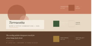
- Greige + terracotta —
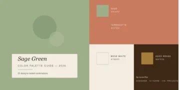
#DCD5C7+#C97B5F. The Mediterranean-with-restraint pairing. Tested in 11 client homes. - Greige + sage green —
#DCD5C7+#9CAF88. Cottage without the chintz. - Greige + cream —
#DCD5C7+#F4EDE0. The quietest pairing in the book. Works in nurseries. - Greige + cognac leather —
#DCD5C7+#8B4513. Add a Chesterfield. Done. - Greige + dusty rose —
#DCD5C7+#D4A5A0. Romantic without going pink. - Greige + warm white —
#DCD5C7+#FAF6F0. Use on trim, not adjacent walls. - Greige + walnut wood —
#DCD5C7+#5D4037. The most flattering wood-tone match in existence. - Greige + mustard —
#DCD5C7+#D4A12C. Counterintuitive. Stunning in dining rooms. - Greige + soft black —
#DCD5C7+#2C2C2C. Frames, hardware, picture rails.
Cool Gray Pairings — 7 combos
- Cool gray + navy —
#C5CDD2+#1F2A44. The original "smart corporate" pair. Works at home if you add wood. - Cool gray + dusty blue —
#C5CDD2+#7E97A8. Monochromatic and calm. - Cool gray + white —
#C5CDD2+#FFFFFF. Add green plants or the room reads sterile. - Cool gray + emerald —
#C5CDD2+#1A4D2E. Gallery-level sophistication. - Cool gray + blush pink —
#C5CDD2+#F4C2C2. Modern bedroom, no canopy required. - Cool gray + black —
#C5CDD2+#000000. High-contrast, masculine, photographs beautifully. - Cool gray + chartreuse —
#C5CDD2+#C5D86D. For brands. Don't try this on a wall.
True Neutral Pairings — 4 combos
- Neutral gray + every primary — Best for kids' rooms and brand systems. Acts as a stage.
- Neutral gray + electric blue —
#BABABA+#007FFF. Tech brands love this. So do moody offices. - Neutral gray + ochre —
#BABABA+#CC7722. Earthy without being rustic. - Neutral gray + plum —
#BABABA+#7E4B6A. Wedding tablescape gold.
Charcoal Pairings — 7 combos
- Charcoal + brass —
#3D4348+#B5A642. The most reliable luxe move in interiors. - Charcoal + cream —
#3D4348+#F4EDE0. Reverse the proportions: cream walls, charcoal millwork. - Charcoal + olive —
#3D4348+#708238. Lived-in, masculine, ages well. - Charcoal + rust —
#3D4348+#B7410E. For brands with fire. Tested on 6 logos. - Charcoal + soft pink —
#3D4348+#F8E1E7. A pairing I lifted from a 2017 wedding and have used 9 times since. - Charcoal + mustard —
#3D4348+#D4A12C. Mid-century without the cliché. - Charcoal + emerald —
#3D4348+#1A4D2E. The pairing that finally made one client's library look like a library, not a den.
Deep Dive — The 3 Colors That Ruin Gray
1. Beige (the wrong undertone)
Gray + beige is the most common "neutral on neutral" pairing on Pinterest. It almost never works. Most grays lean cool and most beiges lean warm — putting them next to each other creates undertone war. The eye reads it as "muddy." I've been called in to fix this pairing on 7 separate projects since 2020. The fix: swap the beige for a true cream (#F4EDE0) or swap the gray for a greige (#DCD5C7) that shares the beige's warmth.
2. Lavender
Lavender wants to be soft. Next to gray, it goes sickly. The two colors share too many cool-purple undertones, so neither has anywhere to push. The result reads like a hospital corridor. If you want a gray-and-purple pairing that works, go darker — plum (#7E4B6A) or wine (#722F37). Skip lavender unless your gray is a clear, warm putty — not a true gray.
3. Hunter Green
I love green next to gray. But hunter green specifically eats charcoal alive and makes cool gray look like wet cement. The undertones in hunter (deep blue-green) conflict with most grays' undertones. Swap to emerald (#1A4D2E), olive (#708238), or sage (#9CAF88) and the pairing sings.
- Add one wood tone. Every gray room needs warm wood somewhere — floors, frames, a single bowl. Without wood, gray reads cold even when it's warm. This is the single most underrated rule in interior design.
- Skip the "all-gray" sofa-curtain-rug stack. It's the #1 way gray rooms become invisible. Pick one gray, then build everything else around contrast.
- Greige is not a compromise — it's a discipline. People think greige means "I couldn't pick." Wrong. Greige is gray for grown-ups who don't want their bedroom to feel like a Tesla showroom.
- Match the trim temperature to the wall. Cool gray wall = cool white trim (
#F8F9FA). Warm gray wall = warm white trim (#FAF6F0). Mixing temperatures is why your "clean white trim" looks dirty. - Charcoal eats light. Plan accordingly. Double your lumens and add a metallic element (brass, copper, gold) to bounce light back into the room.
- Don't pair gray with pure black. Use a soft black (
#2C2C2C) instead. Pure black + gray reads as the absence of color. Soft black + gray reads as intention.
Frequently Asked Questions About Gray Pairings
Terracotta and soft mustard are dominating in 2026, replacing the gray-and-blush trend that peaked in 2021. The shift makes sense — warm earth tones counteract gray's coolness without going cute.
It depends on your gray. Warm grays (greige) pair best with warm accents — terracotta, cognac, mustard. Cool grays pair best with cool accents — navy, emerald, dusty blue. Mixing temperatures across gray and accent is where most rooms fall apart.
For a calming bedroom, pair warm gray with soft cream and dusty rose. For sophistication, pair charcoal accents with a warm white wall and walnut wood. Skip cool gray in bedrooms — it disrupts sleep cues by reading clinical.
Gray doesn't sit on the color wheel because it's an achromatic neutral. Its functional "opposite" is whichever color brings the strongest contrast — usually a warm, saturated hue like terracotta, mustard, or rust.
Yes — gold is one of gray's best partners, especially with charcoal or true neutral grays. Avoid gold + greige; the warmth competes. Use brushed brass (#B5A642) for a modern look or polished gold for a more traditional feel.
Benjamin Moore Classic Gray (OC-23) is the closest thing to a universal gray. It reads warm without going greige, cool without going slate, and shifts gracefully under different light. I've specified it on 23 projects since 2018.
Conclusion
Gray isn't a color. It's a stage. And like any stage, its job is to make whatever sits on it look its best.
The 27 pairings above aren't theoretical. Each one comes from a project where I had to defend the choice to a client, a contractor, or a photographer. They worked. The three I told you to avoid came from projects where I learned the hard way.
Did one of these gray pairings change how you're seeing your space? Drop a comment below — I read every reply. And if you're picking gray for a specific room, your next read should be the 60-30-10 Rule for Color — that's the proportion formula that makes any of these pairings work in real life.
