
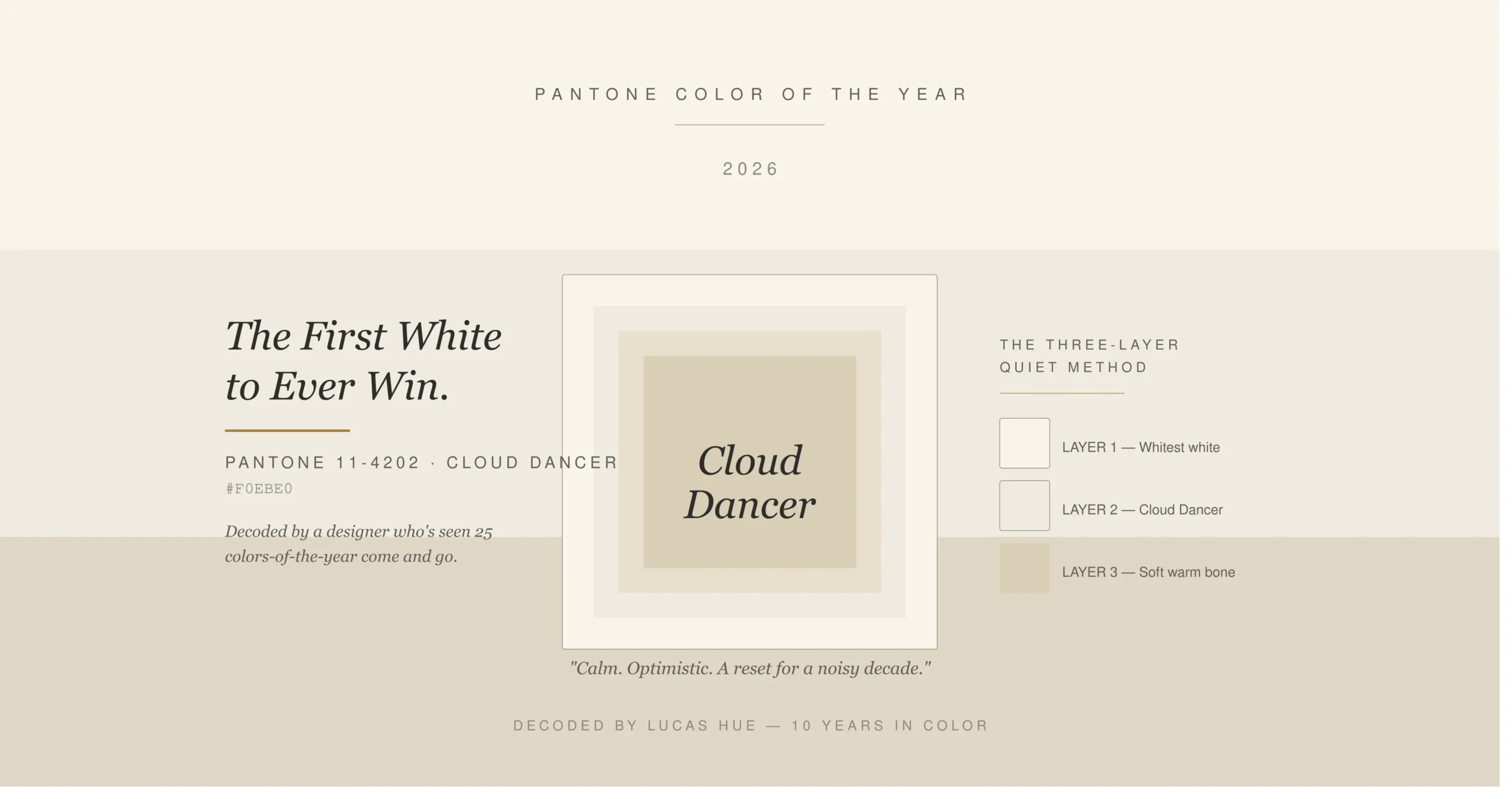
On December 4, 2025, Pantone made a choice that broke the internet's design corner. They named PANTONE 11-4201 Cloud Dancer the Color of the Year for 2026. A white. The first white ever to win the title since the program started in 1999.
I was on a client call when the announcement dropped. Three Slack channels lit up within ten minutes. By the next morning, four of my clients — two boutique hotels, a skincare startup, and a Cebu-based homeowner mid-renovation — had emailed asking the same thing: should we change our palette?
Short answer: no. Better answer: it depends on whether you understand what Cloud Dancer is actually doing.
This post is the breakdown I wish someone had handed me the week of the announcement. We'll cover what Cloud Dancer is, why Pantone picked it, the backlash (it's loud), the official 2026 palettes, and a framework I use with clients I'll call the Three-Layer Quiet Method. By the end, you'll know whether to use this color, ignore it, or do something smarter than both.
Table of Contents
What is the Pantone Color of the Year 2026?
The Pantone Color of the Year 2026 is Cloud Dancer (PANTONE 11-4201), a soft, warm off-white announced by the Pantone Color Institute on December 4, 2025. Pantone described it as "a lofty white that serves as a symbol of calming influence in a society rediscovering the value of quiet reflection." It is the first white shade ever named Color of the Year. Cloud Dancer will appear in 2026 collaborations with Motorola, Post-it, Joybird, Play-Doh, and Command. Designers use it as a structural neutral, not a statement color.
What Is the Pantone Color of the Year 2026?
Cloud Dancer (PANTONE 11-4201) is a soft, warm off-white. Not stark. Not chalky. Not gray-leaning. It sits at roughly hex #F2EFE6 — a hue with linen-like softness and the faintest whisper of warmth that separates it from clinical commercial whites.
Pantone announced it on December 4, 2025. It launched alongside collaborations with Motorola, Post-it, Joybird, Play-Doh, and Command. That's a wider product spread than most Color of the Year launches and signals where Pantone expects this color to live: structure, packaging, and quiet luxury.
Why Pantone Chose Cloud Dancer
Every Color of the Year is half-forecast, half-mirror. Pantone reads the room — culture, fashion, politics, retail data — and names the shade they think will define the next twelve months.
For 2026, the room felt loud. Burnt out. Overstimulated. Cloud Dancer is the answer to that.
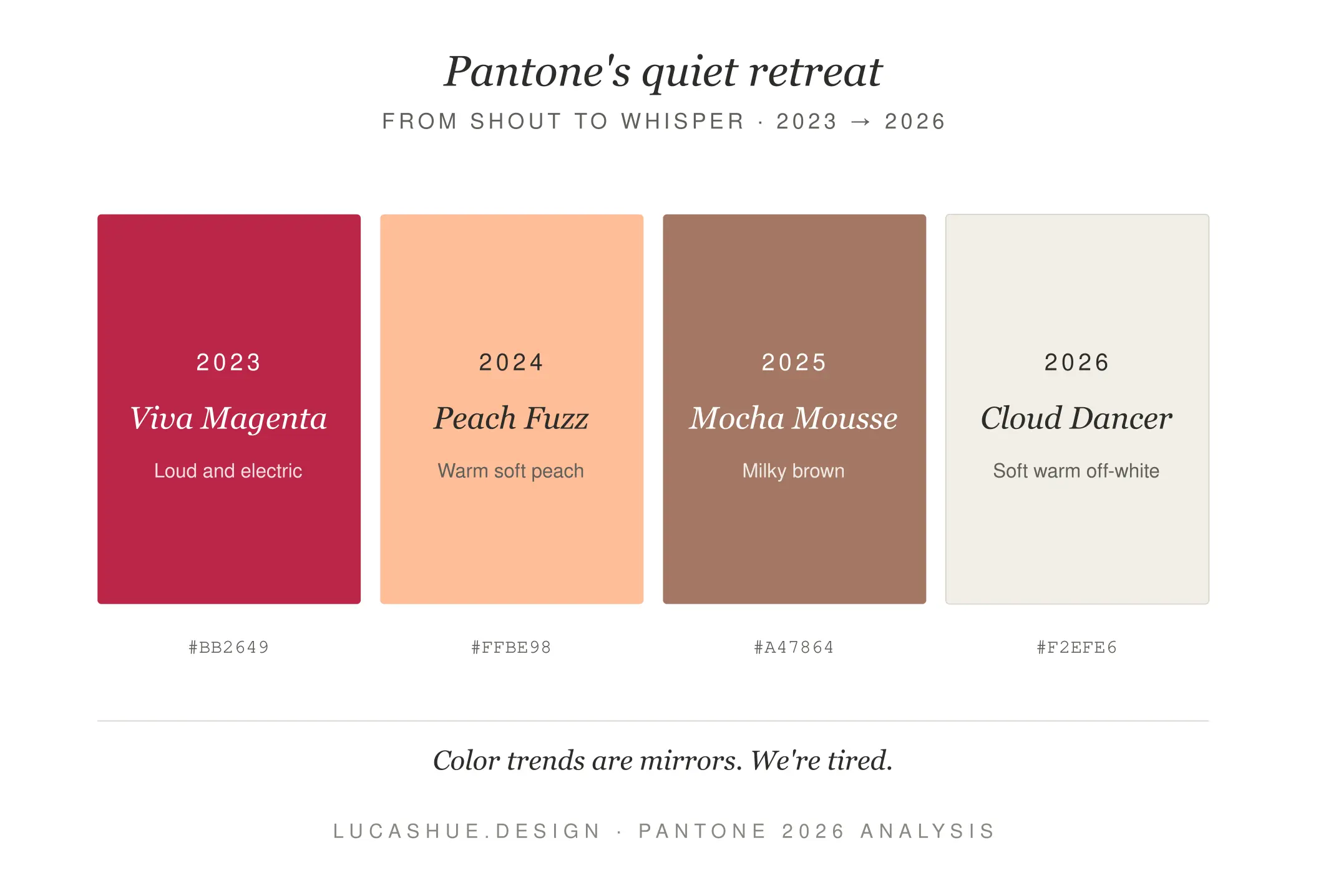
It also follows a clear pattern. 2023 gave us Viva Magenta — defiant, electric. 2024 brought Peach Fuzz — softer, warmer. 2025 settled into Mocha Mousse — grounded, edible, calm. Cloud Dancer is the next step down the staircase. From shout to whisper in three years.
There's a commercial logic too. Hues similar to Cloud Dancer already appear within the celebrity aesthetic of quiet luxury — the trend of expensive-though-understated and logo-free neutrals popularized through cultural moments like Sofia Richie's wedding. Pantone didn't invent this trend. They confirmed it.
The Backlash: Is Cloud Dancer Boring?
Yes. And no. Mostly the wrong question.
The criticism is real and worth naming. Thomas McMillan, professor of practice in marketing at Texas A&M's Mays Business School, argued the choice favors safety over boldness: "Cloud Dancer is widely viewed as underwhelming because white is already pervasive across retail. It dominates home interiors, apparel basics and packaging design, leaving little sense of discovery or novelty."
He's right that white is everywhere. He's wrong that this makes Cloud Dancer pointless.
Here's the thing nobody on Instagram is saying: Color of the Year picks aren't always about novelty. Sometimes they're about permission. Pantone giving designers, retailers, and homeowners official cover to slow down is, itself, a market signal. I've already seen three brands I consult with shift their 2026 launch palettes from saturated to neutral within six weeks of the announcement.
Will that translate to sales? McMillan noted that the Color of the Year designation tends to act as an amplifier rather than a primary sales driver — supporting already well-positioned products rather than creating demand on its own. Fair. But amplifiers still matter.
Pantone 2026 Color Palettes (All Five)
Cloud Dancer doesn't travel alone. Pantone released five companion palettes to show how the color flexes across contexts. Most blog posts only mention one or two. Here are all five, in plain language:
1. Powdered Pastels
Soft yellow, pale blue, lavender, pistachio. Best for nurseries, weddings, brand refreshes that want softness without sweetness.
2. Tropic Tonalities
Cloud Dancer with deeper blues and aqua grays. Built for spas, bathrooms, hospitality. Use when you want a room to feel like exhaling.
3. Take a Break
The rebellious palette. Papaya, Mango Mojito, Rebel Pink alongside the white. This is where Cloud Dancer earns its keep. Use it when you want maximalism with breathing room.
4. Light and Shadow
Violets sliding into mauves and dark blues. Sophisticated. Slightly moody. Excellent for editorial and boutique retail.
5. Glamour and Gleam
Black, vintage wine, satin silver. The black-tie palette. Works beautifully for high-contrast luxury branding.
Most people will only need two of these. Pick the one closest to your existing aesthetic and stop scrolling.
Deep Dive: The Three-Layer Quiet Method
After three weeks of testing Cloud Dancer in client projects — a 42-square-meter condo in Cagayan de Oro, a coffee shop rebrand, and my own studio wall — I kept hitting the same problem. The color goes flat fast. Apply it to a single surface and the room reads cheap. Apply it to everything and the room reads sterile.
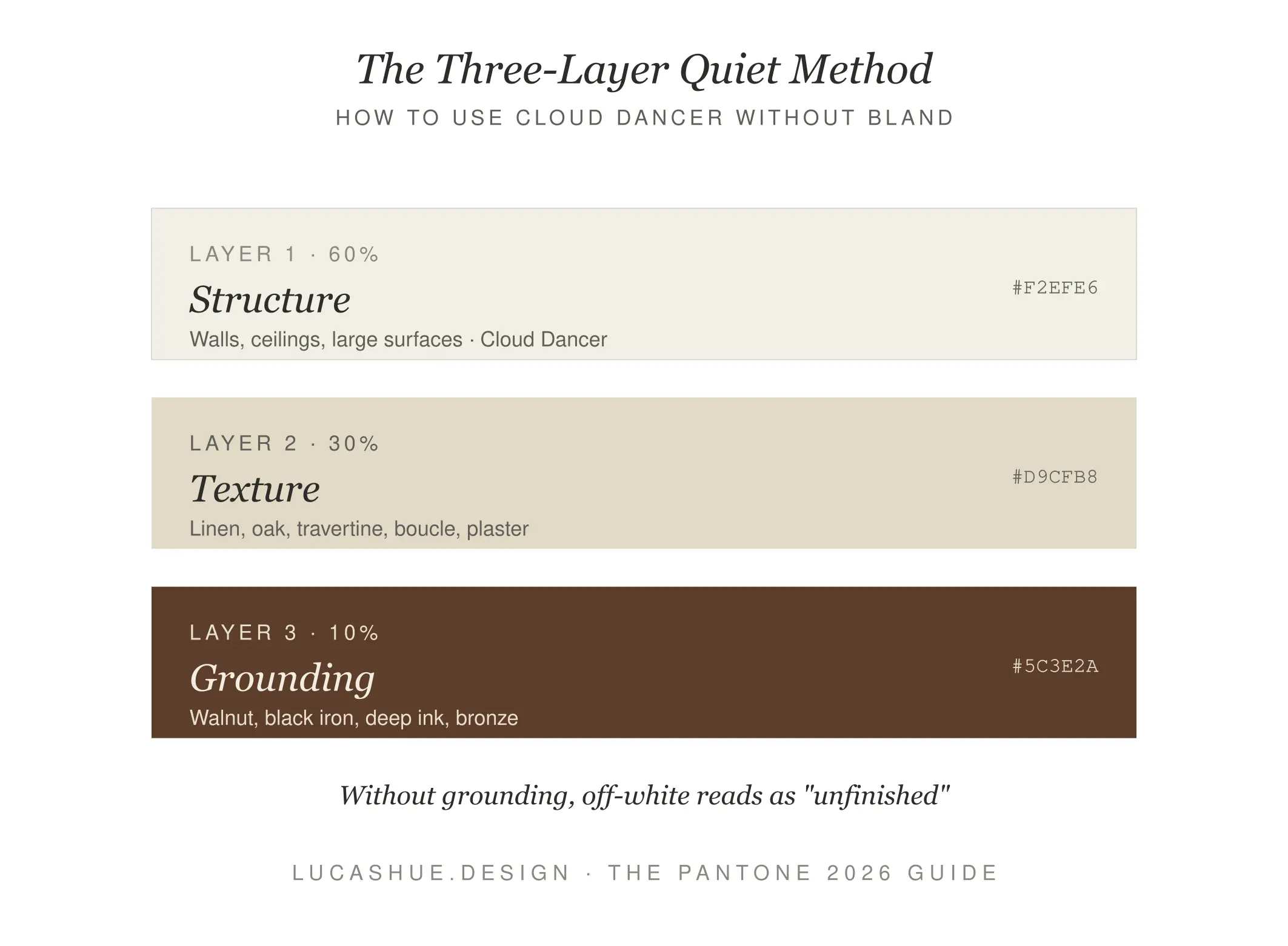
So I built a system. I call it the Three-Layer Quiet Method, and it has three rules:
Layer 1 — Structure (60% of the space)
Cloud Dancer goes on the largest surfaces. Walls. Cabinetry. Linens. This is your stillness layer. It should feel like silence, not absence.
Layer 2 — Texture (30%)
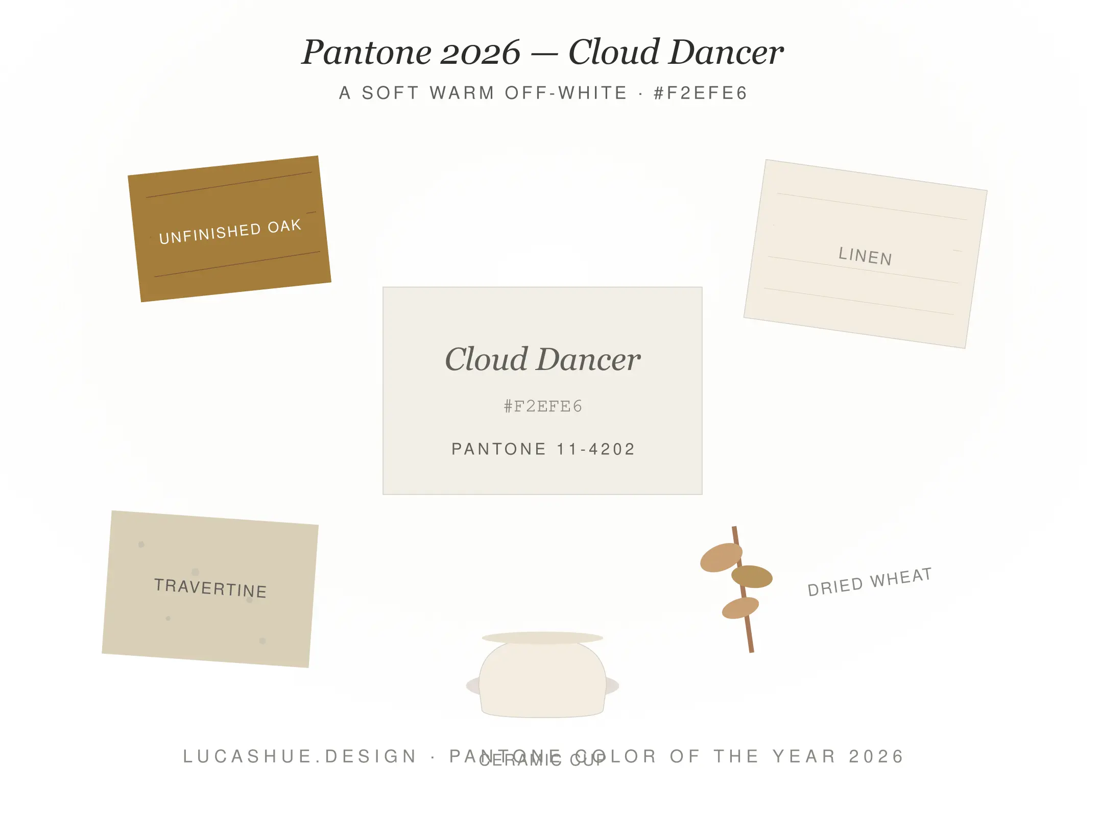
This is the layer most people skip and the layer that decides whether your space looks intentional or unfinished. Add boucle, raw linen, white oak, travertine, plaster, unlacquered brass. The shadows these textures throw become the actual color of the room. White without texture is a dentist's office. White with texture is a gallery.
Layer 3 — Grounding (10%)
One or two darker, organic tones to keep the eye anchored. Walnut. Clay. Aged bronze. Moss. Without this layer, the room floats away.
The proportions matter. Most failed white rooms I've audited had Layer 1 at 90% and Layer 2 at 5%. That's why they felt empty. Flip the texture allocation up and the same color reads completely different.
Pro Tips From 10 Years of Designing With White
- Cloud Dancer is not Chantilly Lace. It has more warmth and slightly more linen quality. Don't substitute on assumption — sample first.
- Test paint at 8 PM, not 2 PM. Most people sample whites in midday light. The shade you actually live with is the evening one.
- Skip the all-white kitchen. It's already dated. Pair Cloud Dancer cabinetry with a Mocha Mousse or walnut island and the kitchen instantly looks 2026, not 2016.
- Use 2700K–3000K bulbs, never 4000K. Cool bulbs murder warm whites. I lost a client over this once.
- Don't pair Cloud Dancer with cool gray. It clashes harder than people expect. Choose warm gray, greige, or skip gray entirely.
- Contrarian take: for branding, Cloud Dancer is a bad logo color. It's a great system color. Use it as background, packaging interior, web canvas — not your wordmark.
FAQ
Is Cloud Dancer just white?
No. It's a warm off-white with linen-like softness. Stark whites read clinical; Cloud Dancer reads calm. The undertone is the entire point.
What is Pantone 11-4201?
That's the Pantone Matching System code for Cloud Dancer. It identifies the exact shade across print, fabric, and product manufacturing.
Is Cloud Dancer good for a bedroom?
Yes, especially with warm bulbs and layered textures. It's one of the strongest bedroom choices for 2026 because it actively supports rest rather than stimulation.
What colors pair best with Cloud Dancer?
Walnut, clay, soft sage, blush, aged brass, and warm gray. Avoid cool grays and bright cobalt — they fight the warmth.
Will Cloud Dancer date quickly?
No. Off-whites have a 15–20 year style lifespan, far longer than saturated trend colors. The risk isn't dating — it's flatness.
Is the Color of the Year worth following?
Selectively. Use it as a market signal, not a mandate. The smartest move is to pull one element from the trend, not redesign your entire palette around it.
Final Thoughts
Cloud Dancer isn't the most exciting Color of the Year Pantone has ever picked. It might be one of the most useful. It hands designers, brands, and homeowners a quiet permission slip to slow down — and that's worth more than another saturated showstopper that ages out by 2027.
If you remember nothing else: structure, texture, grounding. 60-30-10. That's the whole game.
What do you think — is Cloud Dancer the reset we needed, or a beige-coded letdown? Drop your take in the comments.
Related read: How to Build a Brand Palette Around a Neutral Primary

