


The Bouquet That Looked Brown in Every Photo
In March 2024, a bride showed me her Pinterest board on a Tuesday afternoon. Sage green. Dusty rose. Terracotta. Champagne. Ivory. Mauve. Burnt orange. Eucalyptus. Nine colors total, all "muted" and "earthy," all gorgeous on her phone.
Three weeks later she texted me her engagement-shoot preview. Everything looked brown. Not warm-brown or rich-brown. Muddy.
That's when I built what I now call the 2-3-1 Method, and it's the framework I'm going to walk you through today. Nine out of ten wedding color palette mistakes I see come from the same root cause: brides treating color like a mood board instead of a system. A mood board is a feeling. A palette is a working tool. Those are different jobs.
This guide will show you how to pick colors that actually hold up — in daylight, candlelight, on linen, in a bouquet, on your mother-in-law's dress, and in every photo you'll look at for the next forty years.
Table of Contents
What a Wedding Color Palette Actually Is (and Isn't)
A wedding color palette is a fixed set of 4–6 colors, assigned specific roles, that govern every visual decision from invitations to napkins. That last part — assigned specific roles — is where most beginners go wrong.
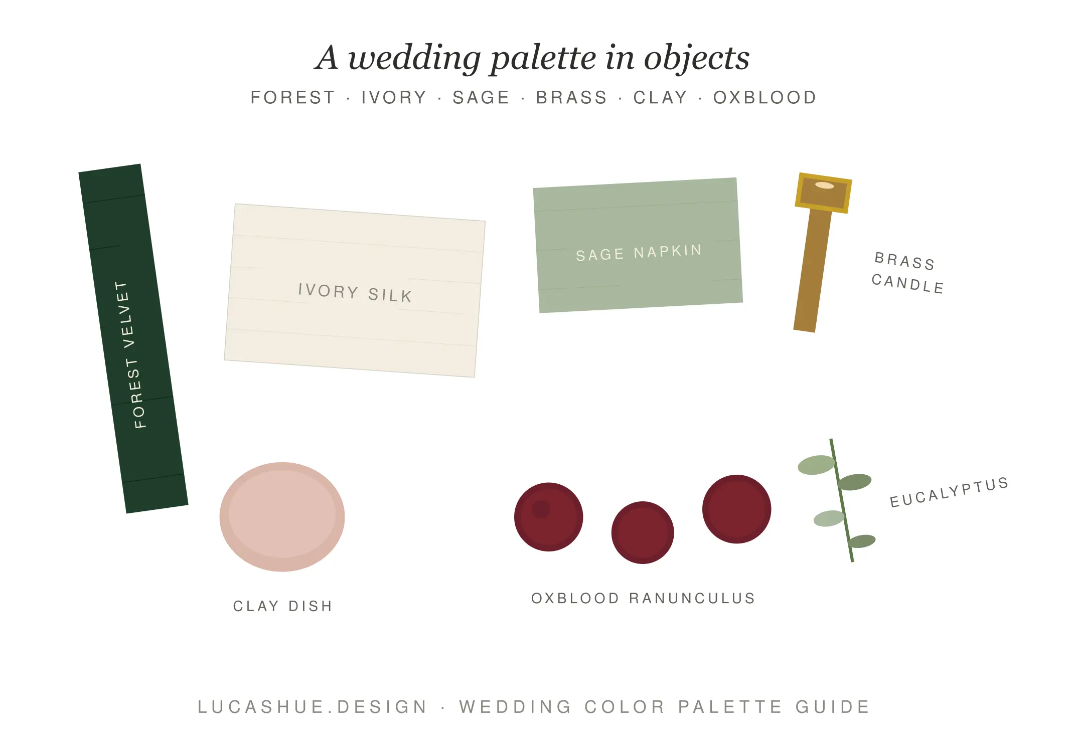
Pinterest gives you nine pretty colors. A palette gives you four working ones, plus rules. Without rules, your florist, stationer, and venue coordinator are each guessing. Guessing is how you end up with mismatched tones in your wedding photos.
How do you choose a wedding color palette?
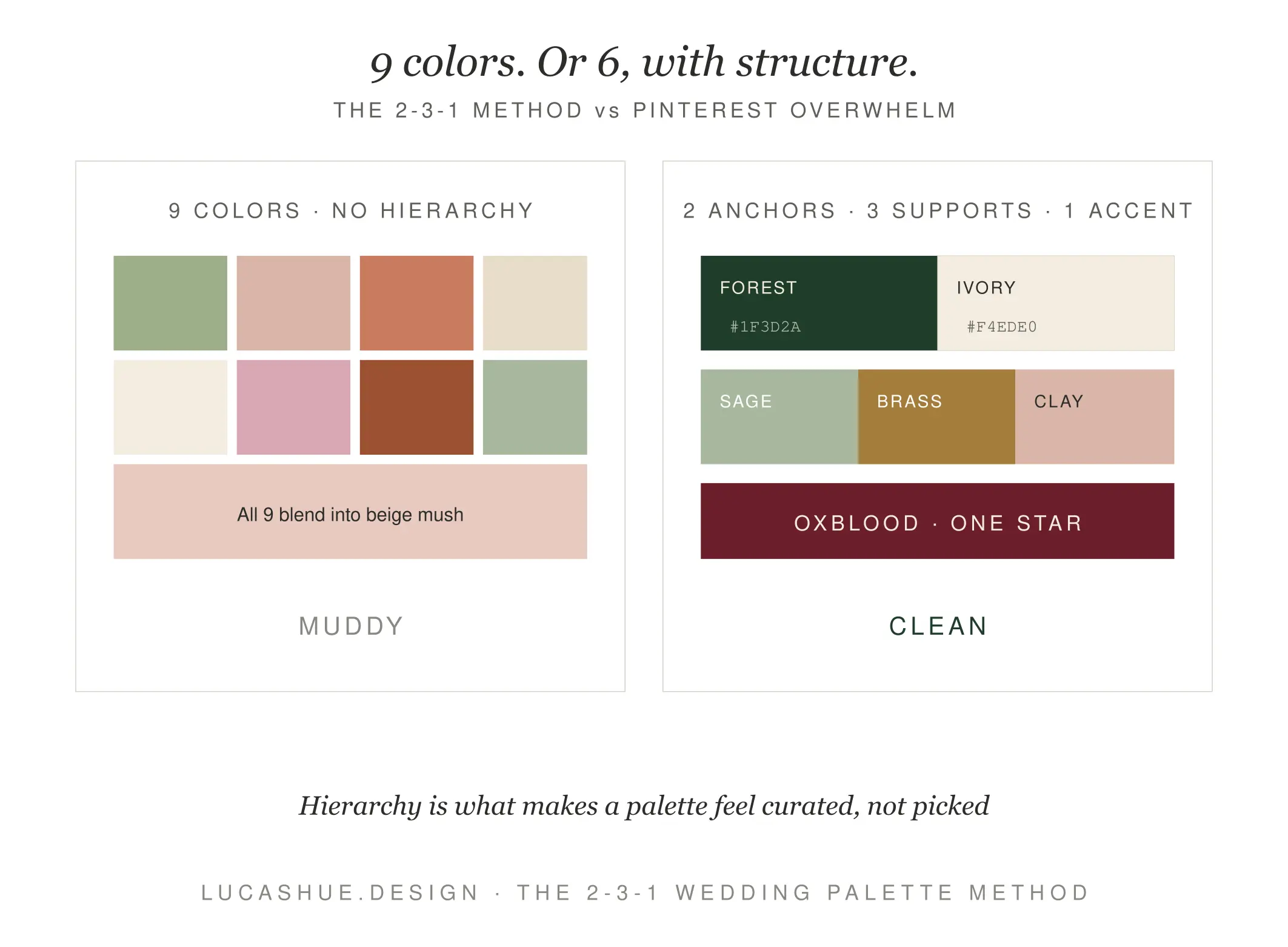
Pick 4–6 colors total: 2 anchor colors (the dominant tones guests will notice first), 3 supporting colors (the connectors that link your anchors), and 1 accent color (the small punch used in details like ribbon or candles). Test the palette in three lighting conditions — daylight, sunset, candlelight — before finalizing. The full process takes about 2–3 hours.
The 2-3-1 Method Explained
Here's the framework. It's simple. It works.
2 Anchor Colors
These are your dominant tones — the two colors that will appear in 60% of your visual decisions. Bridesmaid dresses, table linens, the largest floral masses. Anchors should have meaningfully different values (one lighter, one darker) so photos have contrast. A palette of "sage and dusty blue" fails this test. They're both medium-value muted tones and the camera flattens them into one shape.
Good anchor pair: deep forest green + warm ivory. Bad anchor pair: dusty mauve + dusty rose.
3 Supporting Colors
These are connectors. They bridge your two anchors so the palette feels cohesive instead of stark. If your anchors are forest green and ivory, your supports might be soft sage, antique brass, and clay pink. Each support color should share at least one quality (warmth, saturation, or undertone) with both anchors.
1 Accent Color
This is your contrarian punch. One small, bold, slightly unexpected color used sparingly — in candle wax, ribbon trails, the inside of a menu fold, or a single boutonnière. The accent does the heavy lifting in close-up photography. Without it, every detail shot looks the same.
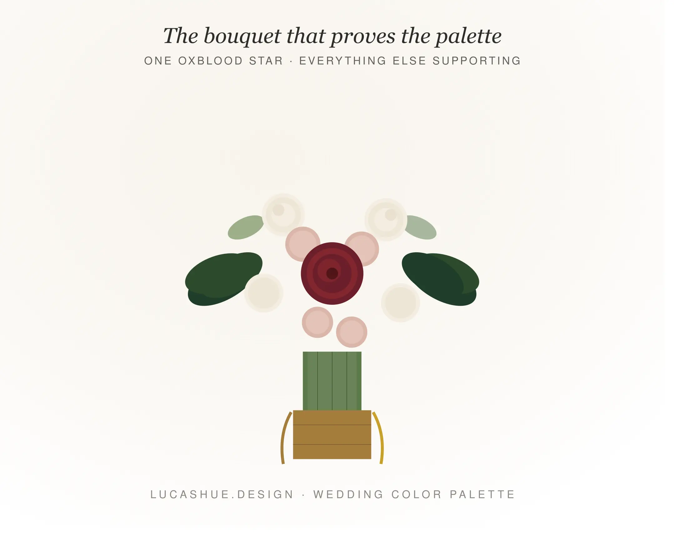
For that forest-and-ivory palette? A single drop of oxblood. Used in maybe 5% of decisions. Enormous impact.
Wedding Color Palette by Season
Season is the single biggest constraint people ignore. Your venue's natural light has a color temperature, and fighting it loses every time.
Spring (March–May)
Spring light is cool and clean. Lean into it. Soft butter yellow + cream as anchors. Pale blush, wisteria purple, and sage as supports. A whisper of cobalt as accent. Avoid heavy jewel tones in spring — they look out of season in photos and clash with the green you can't control (every tree leafing out behind your ceremony).
Summer (June–August)
Summer wants saturation. The sun is high and bleaches pale colors. Pick anchors with real pigment: terracotta + ivory, or marigold + sage. Whites read as gray on camera at midday, so a true cream or buttermilk performs better than chalk-white linens. This is the season for warm metallics — antique brass over polished gold.
Fall (September–November)
The most overdone season, and the one where the 2-3-1 method matters most. Burgundy, mustard, rust, and burnt orange are everyone's instinct, and combined they read as Thanksgiving table runner. Pick two fall colors as anchors and let your supports come from a quieter family. Try: deep burgundy + dove gray as anchors, with rust, blush, and warm white as supports. Accent: black. Yes, black.
Winter (December–February)
Winter weddings can either go moody-rich or icy-clean. Don't try to do both. Moody-rich: emerald + deep plum, with champagne, pewter, and ivory as supports. Icy-clean: pale blue + winter white, with silver, dove, and pearl as supports. The accent on a winter palette earns its keep — gold ribbon on emerald, or a single sprig of holly red on icy blue.
Romantic Wedding Colors That Don't Read as Beige
When clients ask me for "romantic wedding colors," I hear a translation problem. They mean soft, dreamy, intimate. They reach for blush, champagne, and ivory. The result on camera: beige soup.
Romance on film comes from contrast, not softness. Real romantic palettes use a deep, saturated anchor to make the soft tones glow. Burgundy makes blush look luminous. Forest green makes champagne look like candlelight. Navy makes ivory look like silk.
Here's the contrarian take most beginner guides won't tell you: the most romantic wedding palettes always include one color that feels slightly wrong on the mood board. A whisper of black, a streak of oxblood, a dusty cocoa. That one "wrong" note is what makes the rest sing.
The 60-30-10 Distribution Rule
Borrowed from interior design and adjusted for weddings:
- 60% of visual real estate goes to your two anchors combined
- 30% goes to your three supporting colors
- 10% goes to your accent and metallics
Apply this when ordering florals, linens, and stationery. If your florist shows you a centerpiece mockup that's 40% accent color, push back. The math is doing real work.
Pro Tips From 10 Years of Color Work
- Photograph every swatch under your venue's actual lighting before booking. Phone cameras lie less than your eyes. Take the photo at the exact ceremony hour, two weeks out.
- Skip "dusty" everything. Dusty rose, dusty blue, dusty sage — when stacked together they desaturate each other into mud. Pick one dusty tone, max, and surround it with cleaner colors.
- Metallics count as colors, not neutrals. Brass is warm yellow. Silver is cool blue. Rose gold is pink. Choose your metal first, then build the palette around it.
- Your wedding party's skin tones are part of the palette. A color that flatters everyone in the bridal party will photograph better than a color that's "on trend." Test fabric against actual arms in actual sunlight.
- The reception room's existing wall color is an uninvited guest in your palette. A cream-walled venue adds yellow to everything. A gray-walled industrial space adds blue. Account for it or choose a venue that doesn't fight you.
- Print your palette on physical paper before signing any vendor contracts. Screen colors and print colors diverge significantly. What looks dusty pink on Pinterest can print as salmon on your save-the-dates.
FAQ
How many colors should a wedding palette have?
Four to six total, organized as 2 anchors, 3 supports, and 1 accent. Fewer than four feels under-designed; more than six creates visual chaos in photos.
Can I use black in a wedding color palette?
Yes. Black functions as a powerful accent color in 2026, especially in fall and winter palettes. Used in 5–10% of details — ribbon, candles, menu type — it sharpens every other color in the palette.
What wedding colors photograph the best?
Colors with real pigment and clear value contrast. Deep greens, true blues, warm creams, saturated reds, and rich neutrals all hold up across lighting conditions. Pale, muted, "dusty" palettes require professional color grading to look right.
How early should I lock in my wedding color palette?
Lock anchors and supports 9–12 months before the wedding, since they affect attire and stationery. Your accent color can stay flexible until 3 months out.
Are seasonal wedding colors actually necessary?
You don't have to match the season, but you do have to work with the natural light it gives you. A summer palette of icy pastels will look washed out at noon in July. Fight the season, lose every photo.
What's the most overused wedding color combination right now?
Sage green and terracotta. It's a beautiful pairing that became visual wallpaper between 2022 and 2025. If you love it, add an unexpected accent — cobalt, oxblood, or black — to make it yours again.
Final Thoughts
A wedding color palette isn't about picking what's pretty. It's about picking what works — in real light, on real fabric, in real photos you'll keep forever. The 2-3-1 Method gives you a working system. Anchors, supports, accent. Test it under your venue's light. Distribute it 60-30-10. Add one color that feels slightly wrong.
That's the whole game.
What palette are you considering for your wedding? Drop your color list in the comments and I'll tell you whether it'll photograph well.
Related read: How to Brief Your Wedding Florist Like a Designer (coming soon)

