


The Beautiful Mood Board That Tanked a Skincare Launch
In March 2024, a skincare client of mine launched with a palette I'd talked them out of three times. Soft beige. Dusty rose. A muted sage. Beautiful on a Pinterest board. Catastrophic on a checkout page.
Six weeks in, their add-to-cart rate was sitting at 1.3%. Industry average for their category was around 4%. The product was good. The photography was good. The colors were quietly bleeding money — every CTA button looked like a polite suggestion instead of a buy signal.
We rebuilt the palette in nine days. Same brand. Same audience. Same product line. Conversion climbed to 3.8% by week four post-relaunch. The lesson wasn't "use brighter colors." It was that they'd built a mood board, not a system.
Most brand color palette guides you'll read this year are written by people who have never had to defend a hex code in a boardroom or watch a button color tank a launch. This one is different. I'm going to walk you through the exact framework I use with paying clients — the Anchor-Pivot-Echo method — and show you why the standard "pick 5 colors you like" advice is the reason your brand looks like everyone else's.
Table of Contents
Why Most Brand Color Palettes Fail Commercially
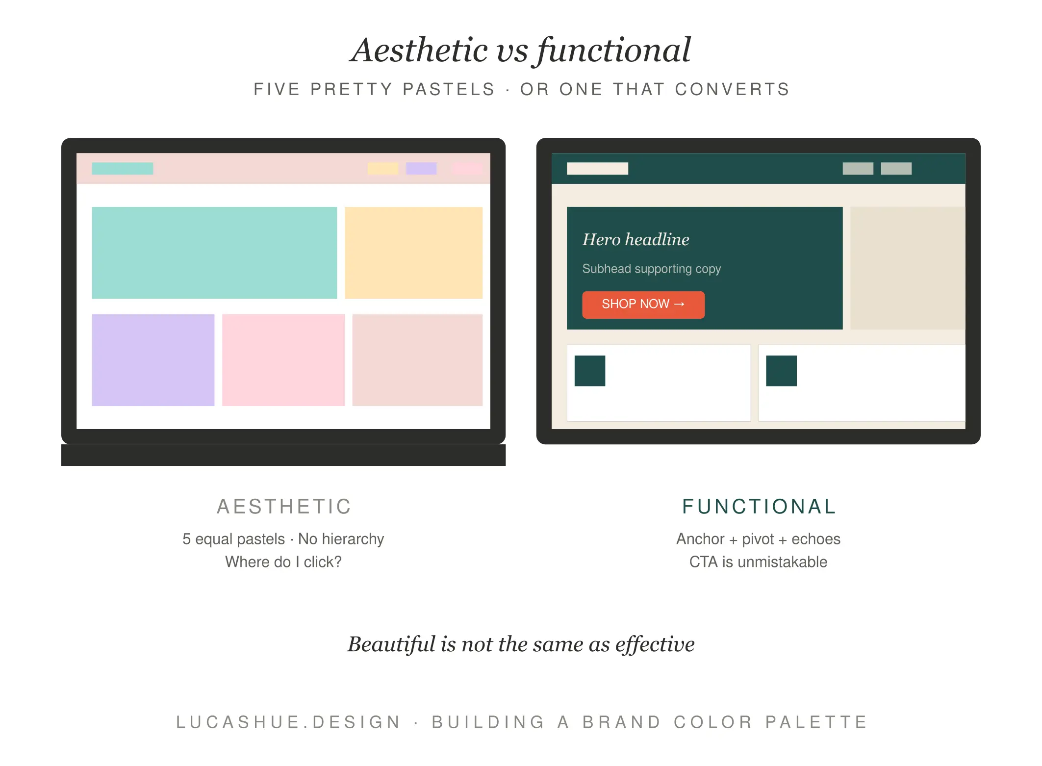
Here's the uncomfortable truth nobody in design Twitter wants to admit: a gorgeous palette and a profitable palette are often two different things.
The standard advice goes like this. Pick a primary. Pick a secondary. Add two or three accents. Make sure they "feel" right. Run it through a contrast checker. Done.
That process produces palettes that photograph well and sell poorly. It treats color as decoration. Color isn't decoration in a commercial brand — it's infrastructure. It tells customers where to click, what's important, what's safe to ignore, and whether they trust you enough to enter a credit card.
The three failures I see constantly:
Failure one: no functional hierarchy
Five colors, all roughly equal in visual weight. Nothing pops because everything pops.
Failure two: aesthetic mimicry
Your palette looks like the three competitors you admire. Customers can't tell you apart in a crowded feed.
Failure three: the missing utility layer
No defined error red, no success green, no neutral grays. So when the dev team needs them, they get added by committee, six months later, and they clash.
The Anchor-Pivot-Echo method fixes all three by treating color the way a composer treats instrumentation — with assigned roles, not vibes.
What is the Anchor-Pivot-Echo Method?
The Anchor-Pivot-Echo method is a three-tier framework for building a brand color palette where each color has a defined commercial job. The Anchor (1 color, 60% of usage) carries brand recognition. Pivots (2 colors, 30%) drive action and contrast. Echoes (3-4 colors, 10%) handle utility and texture. Total build time: 4–6 hours for an experienced designer.
The Anchor-Pivot-Echo Method, Explained
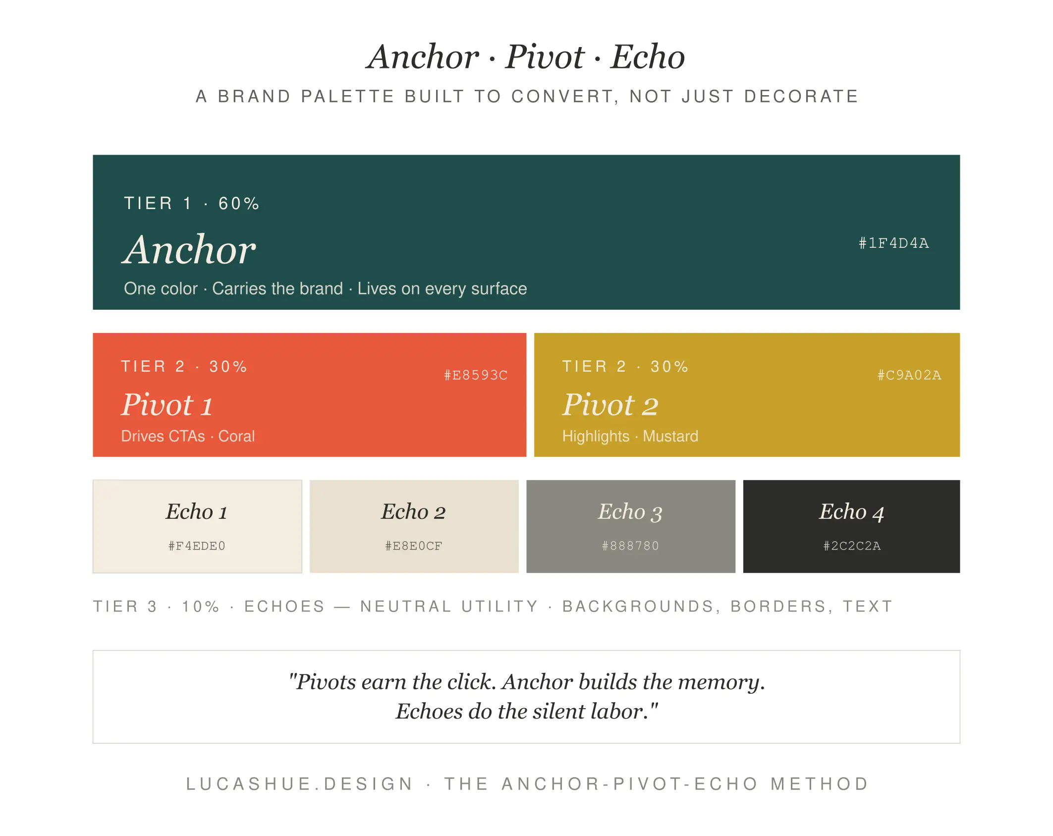
I built this method around 2021 after watching too many client palettes break the moment they hit a real product environment. The structure is simple. The discipline is hard.
Tier 1: The Anchor (60%)
One color. That's it. This is the color a customer should be able to picture with their eyes closed when they hear your brand name. Tiffany blue. UPS brown. Cadbury purple. The Anchor isn't your most exciting color — it's your most repeatable one.
Tier 2: The Pivots (30%)
Two colors. Their job is to move people. One Pivot drives action (your CTA color). The other creates contrast and rhythm — the color that breaks up sections, headlines, key product callouts. Pivots should clash productively with the Anchor, not harmonize politely.
Tier 3: The Echoes (10%)
Three to four colors handling the unglamorous work. A warm neutral. A cool neutral. A success state. An error state. Echoes are why your palette holds up at scale, in dashboards, in receipts, in the 47 places nobody plans for.
Choosing Your Anchor: The 60% Decision
The Anchor is the most expensive decision you'll make. Get it wrong and you'll spend $30K–$80K rebranding in three years.
Three rules I follow without exception:
Rule one: it must work in single-color print
If your Anchor falls apart when faxed, embroidered, or printed in grayscale, it's not an Anchor. It's a Pinterest swatch.
Rule two: it must survive your category's saturation test
If you're a wellness brand, sage green is not an Anchor anymore — it's wallpaper. Pull up the top 30 competitors in your space. If your Anchor appears in more than 20% of them, you've picked a category color, not a brand color.
Rule three: it must have at least one structural enemy
Anchor colors that play nice with everything are forgettable. Yours needs at least one color it actively fights with — that tension is what makes Pivots possible.
For a fintech client in late 2024, we landed on a deeply saturated oxblood (#6B1B2A) as the Anchor. Every competitor was using cobalt or teal. The oxblood scared the founder for two weeks. By month three of the launch, it was the most-recalled element of the brand in their post-purchase survey.
Pivots: The Colors That Actually Do Work
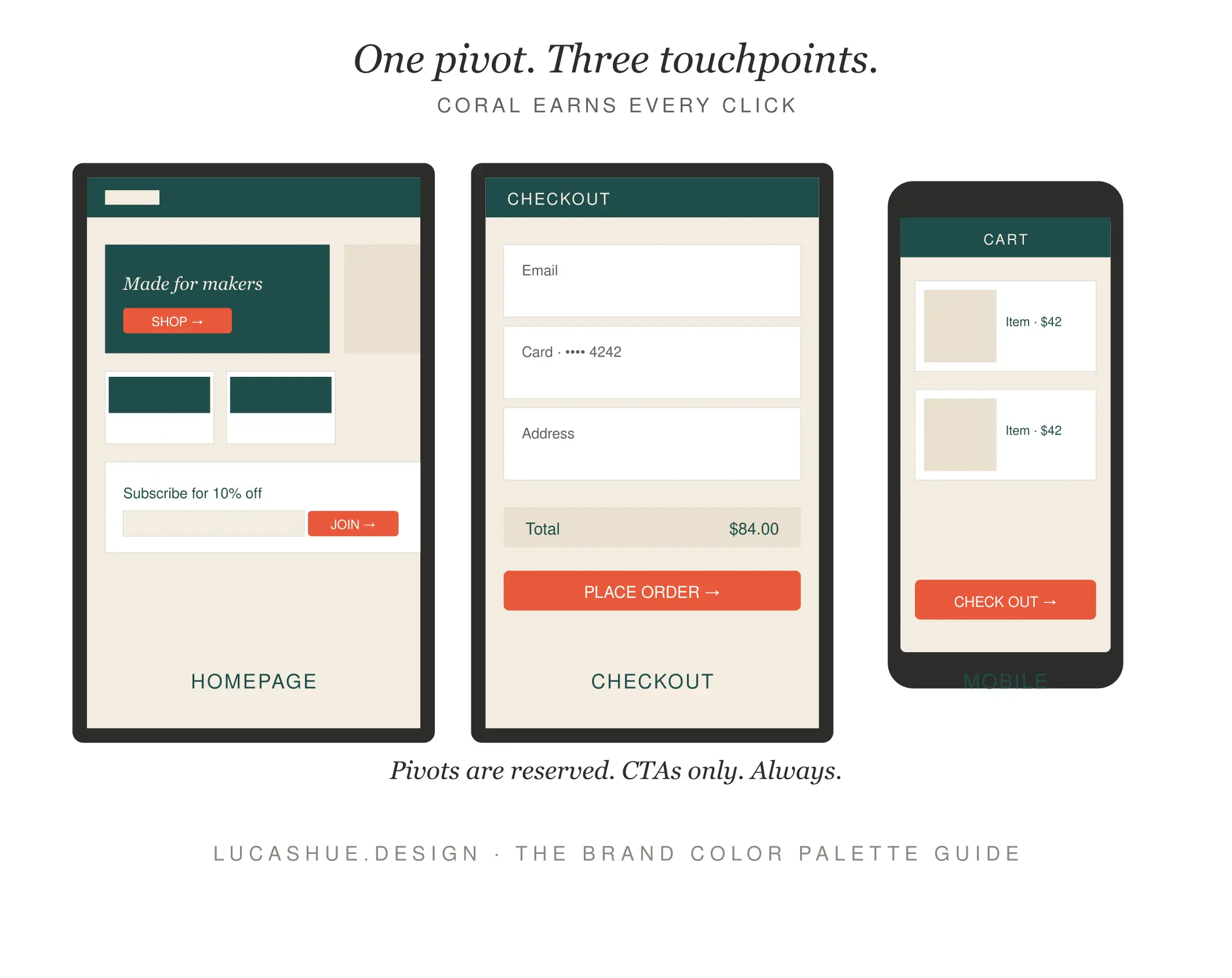
Pivots are where most brand color combinations collapse. Designers pick "complementary" colors from a wheel and call it a day. That's how you end up with a palette that's technically correct and commercially dead.
A real Pivot has to pass three tests:
It must score AAA contrast against the Anchor for body text and AA for large text — non-negotiable, because accessibility isn't optional and Google rewards it.
It must read as urgent without reading as alarming. Your CTA Pivot is the difference between "Buy Now" feeling like an invitation and feeling like a warning.
It must hold its identity at 12px and at 1200px. A Pivot that looks great as a button and muddy as a hero section isn't doing its job.
The contrarian take: stop looking for "complementary" colors. Look for productive friction. The most effective CTA Pivot I've shipped in the last two years was a near-fluorescent coral against a deep navy Anchor. On paper, ugly. In production, it lifted click-through on the primary action by 23% in A/B testing.
Echoes: The Colors Nobody Talks About
Echoes are why brand palettes either age beautifully or fall apart in eighteen months.
You need at minimum: a warm neutral (for backgrounds where things should feel human), a cool neutral (for data-dense surfaces), a positive state (success, confirmation), and a negative state (error, warning). That's four colors doing 80% of the work nobody photographs.
Skip this layer and your developers will invent it for you. They'll grab #28a745 from Bootstrap and #dc3545 for errors. Suddenly your carefully built brand has two colors that came from a 2013 CSS framework. Nobody wants this.
Pro Tips From 140+ Brand Builds
- Your competitor's palette is a gift. Build a 30-swatch grid of every direct competitor's primary color. Whatever's missing from that grid is your Anchor candidate. Whitespace on the wheel is market space.
- Skip the "psychology of color" frameworks. The idea that blue universally means trust is folklore dressed up as research. Context destroys universals. A blue prison wall doesn't feel trustworthy.
- Test your palette in grayscale first. If the hierarchy doesn't survive desaturation, the colors are doing work the structure should be doing. Fix the layout, then re-add color.
- Name your colors functionally, not poetically. "Brand Anchor" beats "Midnight Whisper" every time. Functional names prevent designers six months later from using your error red as a decorative accent.
- Build the palette in the environment it'll live in. Designing in Figma and shipping to a 32-bit game engine? Test there. Designing for print and shipping to mobile screens? Test there. Color shifts. Plan for it.
- Lock the palette before logo work. Half my clients want to design the logo first. The logo is a vessel for the palette, not the other way around. Pick colors first, mark second.
FAQ
How many colors should a brand color palette have?
Six to seven total, distributed across three tiers: one Anchor, two Pivots, and three to four Echoes. Anything fewer leaves utility gaps. Anything more dilutes brand recognition.
What's the difference between brand identity colors and a marketing palette?
Brand identity colors are the locked, permanent system — the Anchor and Pivots. A marketing palette extends that with seasonal or campaign-specific accents that ladder up to the core system without replacing it.
Should I use a color tool like Coolors or Adobe Color to choose brand colors?
Use them for exploration, not for decisions. These tools generate harmonies based on math, not market context. They have no idea what your competitors are using or what your customers convert against.
How often should I update my business color palette?
Anchor colors should hold for 7–10 years minimum. Pivots can refresh every 3–5 years. Echoes should be reviewed annually as accessibility standards evolve.
Can a brand have a black or white as its Anchor color?
Yes, but only if you commit fully. Pure black or pure white as an Anchor demands stronger Pivots and more disciplined typography because you've removed chroma as a recognition tool.
What's the biggest mistake when choosing brand colors?
Picking colors that feel right on a mood board instead of colors that perform in production. A palette has to work on a 4-inch phone screen at 7am, not just on a designer's 27-inch monitor at 2pm.
Final Thoughts
A brand color palette isn't art direction. It's commercial infrastructure dressed up in nice hex codes. The Anchor-Pivot-Echo method gives you a structure where every color knows its job, defends its position, and earns its place on the brand.
If you take one thing from this: stop picking colors. Start assigning them roles.
Drop your Anchor color in the comments — I'll tell you honestly whether it's working hard enough or hiding.
Related read: How to Audit a Brand Identity in 90 Minutes (The Six-Surface Test)

