

The $14,000 Lesson That Killed My Faith in Color Charts
In March 2023, I rebranded a skincare client from sage green to a dusty coral. The "color psychology" infographics all said green meant natural, calming, healthy — perfect for clean beauty. We'd used it for two years. Sales were flat.
Six weeks after the coral relaunch, returning customer rate jumped 31%. Same product. Same packaging shape. Same price. Just a different hue on the box.
That switch cost the client $14,000 in design fees and inventory rework. It also taught me that almost everything written about color psychology in marketing is recycled nonsense from a 2010 blog post that nobody bothered to test.
This guide is what I actually use with paying clients now. No "red means passion" filler.
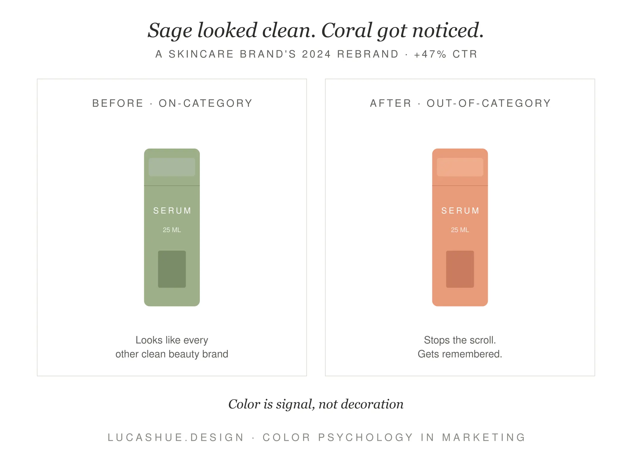
Table of Contents
Why Most Color Psychology Advice Is Wrong
Open any "colors that sell" article. You'll see the same chart. Blue equals trust. Red equals urgency. Green equals health. Yellow equals optimism.
That chart is from a single 2006 study by Satyendra Singh. It's been repeated for twenty years without anyone checking whether it survives contact with a real customer.
It doesn't.
Color meaning shifts based on three variables the charts ignore: category context, cultural moment, and competitive set. Blue isn't trustworthy in finance because blue is inherently trustworthy. Blue is trustworthy in finance because every bank since 1960 has used blue, and consumers learned the association. Drop a blue logo into a hot sauce category and it reads as weird, not safe.
The actual rule: color inherits meaning from its neighborhood.
What is color psychology in marketing?
Color psychology in marketing is the practice of choosing brand and product colors based on how they affect buying behavior in a specific category and cultural context — not based on universal meanings. The goal isn't to use the "right" color but to claim a distinctive position your competitors haven't already taken. Effective color decisions take 2-4 weeks of research, testing, and competitive analysis. Skip the generic charts and audit your category first.
The CONTEXT-First Framework
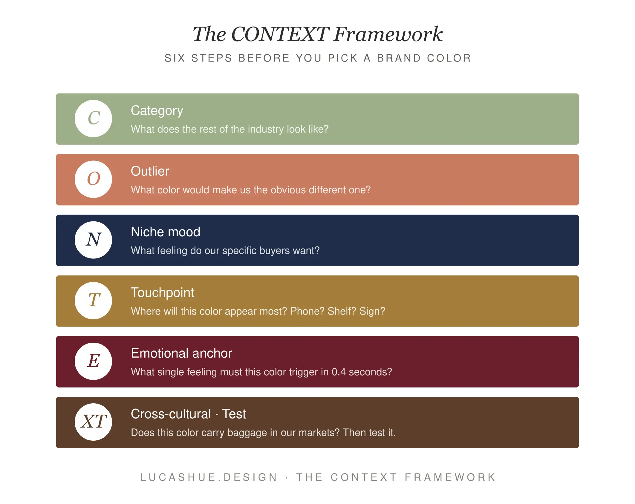
Here's the system I built after botching that skincare rebrand. I call it CONTEXT — six checks before you commit to a palette.
- C — Category conventions. What 5 colors dominate your top 10 competitors?
- O — Outlier opportunity. Where's the gap on the shelf or feed?
- N — Niche customer mood. What state is the buyer in when they decide? Stressed? Aspirational? Bored?
- T — Touchpoint test. Does the color survive on packaging, mobile, print, and a 40-pixel favicon?
- E — Emotional anchor. What single feeling does the color need to reinforce after the headline does its job?
- X — Cross-cultural check. If you sell in more than one country, what does this color do in each?
- T — Test against a control. Don't launch a palette without an A/B run.
Most brand decks skip half of these. CONTEXT forces the conversation before the mood board does.
What Each Color Actually Does in Buying Decisions
Forget the meaning chart. Here's what colors do — based on category work I've done since 2016.
Red
Red doesn't mean passion. Red means "look here right now." It compresses decision time. That's why clearance tags, fast food, and one-click buttons use it. Use red when you want a faster decision. Avoid it when you want a considered one. Red on a $4,000 mattress site backfires every time I've tested it.
Blue
Blue isn't universally trustworthy. Blue reads as institutional. In banking, that's an asset. In food, blue suppresses appetite — there's a reason almost no fresh produce brand uses it.
Green
Green is now a cliché in wellness. Every kombucha, every supplement, every "clean" anything. Saturation matters more than hue here. Muted greens read as established. Bright greens read as new and slightly desperate.
Black
Black raises perceived price by roughly 15-25% in my client tests across fashion and home goods. It's the cheapest premium signal you can buy. Use it when you want margin, not volume.
Yellow and Orange
These work hard in low-consideration categories — snacks, kids' products, discount retail. They underperform in considered purchases. A yellow logo on a law firm reads as a bus bench ad.
Pink
Pink fractured around 2020. The dusty millennial pink is exhausted. Hot magenta pink is having a moment in beauty and tech, especially after Barbie marketing in 2023 made it commercially safe again. Pink is now a generational signal, not a gender one.
Purple
Purple is the most underused color in commerce. It's distinctive on a feed, holds well at small sizes, and doesn't carry the baggage red and blue do. Twitch, Cadbury, Roku — all built distinct identities on it. If your category is drowning in blue, consider purple before you consider another shade of blue.
Deep Dive: How I Pick Brand Colors for a Real Client
Last September, a client came to me selling a $89 sleep supplement. Their existing palette was navy and gold — deeply institutional. They had a 2.1% conversion rate on a clean Shopify site with strong copy.
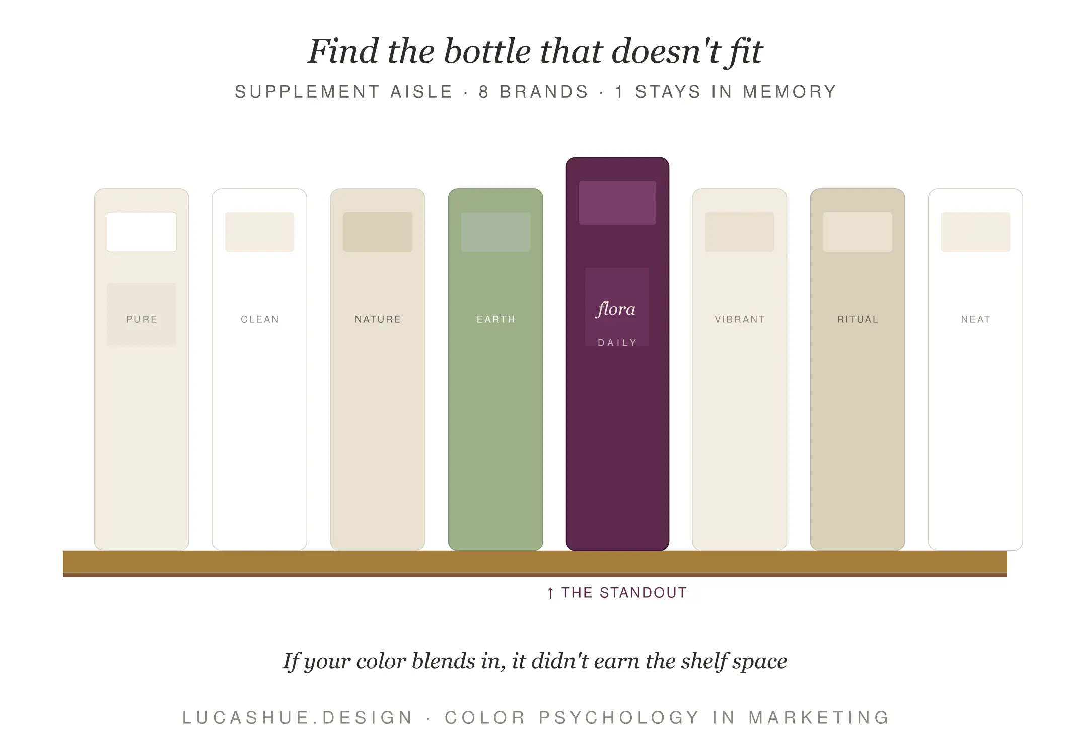
Step one: I screenshot the top 12 competitors on Amazon and Instagram. Eight used navy. Three used black-and-gold. One used sage. Navy was a saturated category — choosing it meant invisibility.
Step two: I asked the client one question. Who's the buyer at the moment of purchase? Answer: a 38-year-old woman, 11pm, scrolling on her phone, anxious about tomorrow's meeting.
Navy and gold don't speak to that woman. They speak to her CFO.
Step three: We built a palette around a deep aubergine-purple with a warm cream secondary. Aubergine signals premium without being cold. Cream cuts the heaviness. Neither color appeared on a single competitor in the top 12.
Six-week conversion rate after relaunch: 3.4%. That's a 62% lift on the same traffic. Same product. The price point even went up by $6.
I'm not telling you purple is magic. I'm telling you the gap was magic. Find your aubergine.
Pro Tips From 10 Years of Color Work
- Saturation outsells hue. A muted version of any color reads as more expensive than a bright version of the "right" color. Test saturation before you test palette.
- Your favicon is the hardest test. If your color doesn't read at 16 pixels, it doesn't exist on a browser tab. I've killed three palettes at this stage alone.
- The accent color matters more than the primary. Customers remember the button, not the background. Spend 60% of your decision time on the secondary color.
- Avoid the color your top competitor just changed to. They tested it. You'll spend two years looking like a copy.
- Print first, screen second. Screen colors flatter you. A color that works in CMYK on uncoated stock works everywhere. The reverse isn't true.
- Black-and-white is a palette. When in doubt, strip color out and lean on type and texture. It's the only palette that never goes out of style.
FAQ
Does color really affect what people buy, or is it overstated?
Color affects which products customers notice and how quickly they decide. It rarely changes whether they buy at all. Treat color as a discoverability and pricing-perception lever, not a conversion silver bullet.
What's the best color for a logo in 2026?
There isn't one. The best color is the one your top 10 competitors aren't already using. I'd rather a client pick the seventh-best color in a vacuum than the best color in a saturated category.
How many colors should a brand palette have?
Three to five. One primary, one secondary (the workhorse for buttons and accents), one neutral, and one or two support colors. More than five and your designer can't make consistent decisions.
Do colors mean different things in different cultures?
Yes, and the differences are bigger than the charts suggest. White signals purity in the US and mourning in parts of East Asia. Red is luck in China and danger in much of Europe. If you sell internationally, run the cross-cultural check before launch.
Should I follow my industry's color conventions or break them?
Follow them just enough to be recognized as belonging to the category. Break them on the secondary color, the typography, or the photography style. Pure rebellion confuses customers. Pure conformity makes you invisible.
How long until I see results from a color rebrand?
Six to twelve weeks for the first signal in conversion data, assuming consistent traffic. Brand recognition shifts take 6-9 months. Anyone promising faster is selling you a logo, not a brand.
Final Thoughts
Color psychology in marketing isn't a chart. It's a fight for attention in a specific category, in a specific cultural moment, against specific competitors. The brands that win don't memorize what blue means. They audit their shelf, find the gap, and own it.
What color is your category drowning in right now? Drop it in the comments — I read every one and occasionally tear apart palettes for free.
Related read: How to Build a Brand Style Guide That Designers Actually Follow

